SurrealismUI
- author:syf20020816@outlook.com
- createDate:20230908
- updateDate:20241208
- version:0.5.2
- email:syf20020816@outlook.com
- discord:Surrealism-UI
SurrealismUI is a third-party component library built entirely using Slint
If you have any ideas or wanna to be contributor, join Discord!
Ecology
| Project Name | Description | Github Repo |
|---|---|---|
| Slint | Slint is a declarative GUI toolkit to build native user interfaces for desktop and embedded applications written in Rust, C++, or JavaScript | Click Here |
| SurrealismUI | The Third Part Widgets Library for Slint | Click Here |
| SurrealismUI Book | The Book of SurrealismUI | Click Here |
| SurrealismUI Template | The Template of SurrealismUI + Slint | Click Here |
| SurrealismUI Update Plugin | VSCode Plugin for SurrealismUI Update | Click Here |
| Discord_SurrealismUI | Use SurrealismUI to make Discord as an example | Click Here |
Other learning materials
- slint_learn: Help everyone quickly learn Slint
Video for SurrealismUI
Video for Slint Learn
Install
This chapter will explain two installation methods:
- Cargo Generate
- Github
- Surrealism Plugin
Cargo-Generate
1. Install cargo-generate
you can use the following command to install cargo-generate
cargo install cargo-generate
2. generate your own project
input your project name to replace {project_name}
cargo generate --git https://github.com/Surrealism-All/surrealism-ui-template.git --name {project_name}
🔧   Destination: E:\Rust\test-surrealism ...
🔧   project-name: test-surrealism ...
🔧   Generating template ...
🔧   Moving generated files into: `E:\Rust\test-surrealism`...
🔧   Initializing a fresh Git repository
✨   Done! New project created E:\Rust\test-surrealism
3. run project
cargo run
Github
- GoTo:Release
- Find the latest release and download
- unzip and add into your project
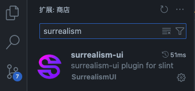
SurrealismUI Plugin
A Plugin help you quickly init Slint + SurrealismUI (latest version) project
QuickStart
1. install plugin
you can directly install in VSCode Plugin
2. set download src
add download src (where you wanna store your project)
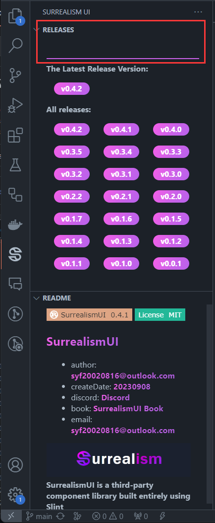
3. choose latest version and wait
click latest version tag and wait a moment...
you will get a zip which is the latest Slint + SurrealismUI Init Project Template
Warning
you need to keep your network open and can access Github normally
Quickstart
If you use Cargo-Generate to build your project, you can skip this!
Cargo Generate is a recommend way!
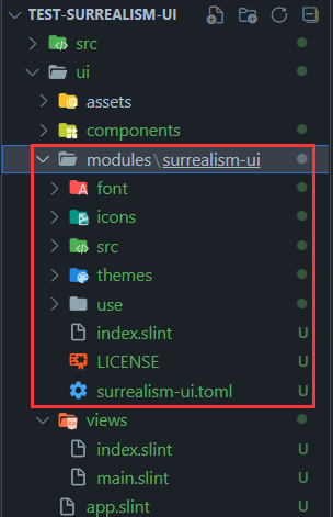
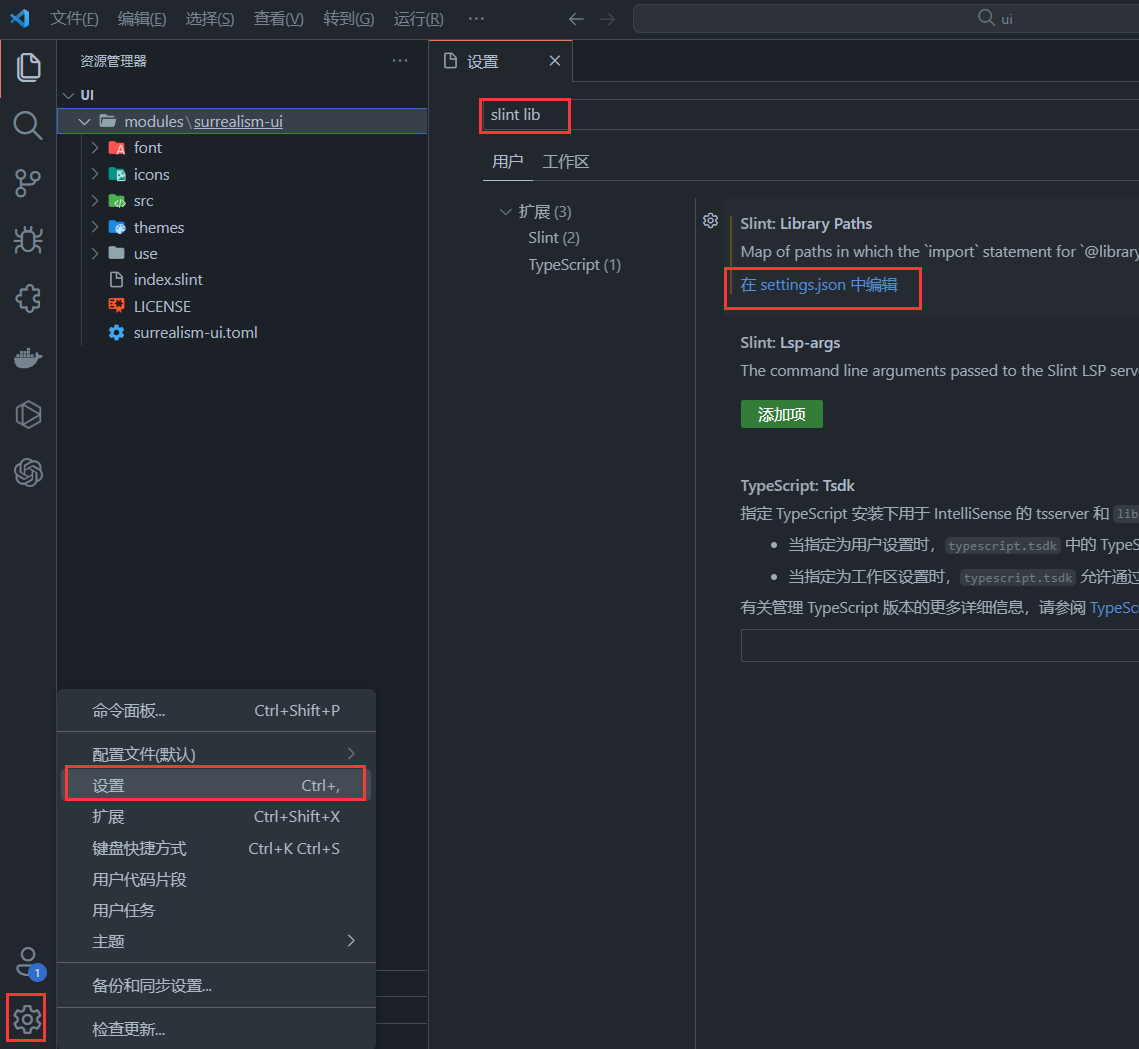
Config SurrealismUI as Library (optional)
- Open VsCode and choose Settings , then search
Slint:Library Paths - Choose edit in settings.json
- Find
slint.libraryPathsand add"SurrealismUI":"parent_file_path\\surrealism-ui\\index.slint"❗
  "slint.libraryPaths": {
    "SurrealismUI":"E:\\test_try\\test-surrealism\\ui\\modules\\surrealism-ui\\index.slint"
  },
Import and Use
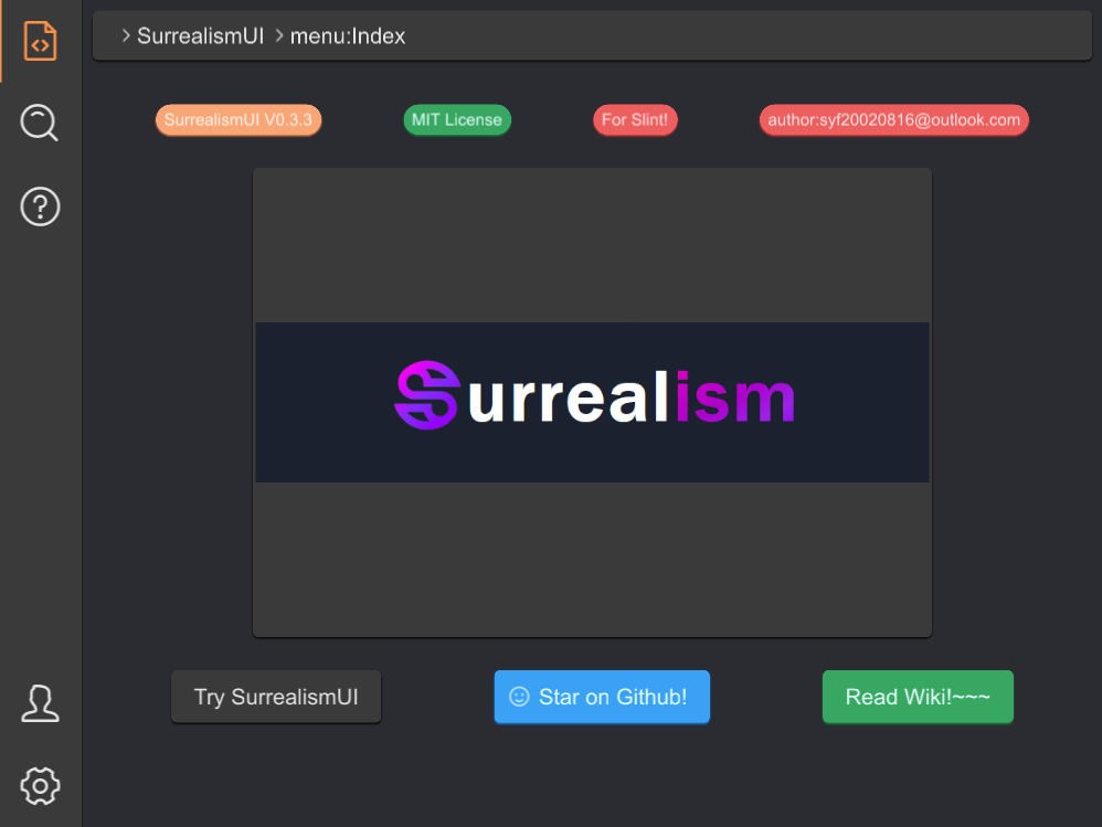
#![allow(unused)]
fn main() {
import { SMenu,SCard,SHeader,SIcon,SButton  } from "../index.slint";
import {UseIcons } from "../use/index.slint";
import { STip } from "../src/tip/index.slint";
import { STag } from "../src/tag/index.slint";
import { SAlert } from "../src/alert/index.slint";

export component App inherits Window {
    height: 600px;
    width: 800px;
    private property <int> router-index : 0;
    HorizontalLayout {
      left-wrapper:=Rectangle {
        z: 111;
        height: 100%;
        width: menu.width;
        clip: false;
        menu:=SMenu {
          change(index,data) => {
            debug(index);
          }
        }
      }
      right-wrapper:=Rectangle {
        z: 100;
        width: parent.width - menu.width;
        background: #2b2b32;
        if router-index==0:index-page:= Rectangle {
            height: 100%;
            width: 100%;
            VerticalLayout {
              HorizontalLayout {
                padding: 8px;
                alignment: center;
                Rectangle {
                  height:header.height ;
                  width: parent.width - 16px;
                  header:=SHeader {
                    value: [{label:"SurrealismUI",value:"1"},{label:"menu:Index",value:"2"}];
                  }
                }
              }
              HorizontalLayout {
                padding: 24px;
                alignment: space-around;
                STag {
                  theme: Warning;
                  text: "SurrealismUI V0.3.3";
                }
                STag {
                  theme: Success;
                  text: "MIT License";
                }
                STag {
                  theme: Error;
                  text: "For Slint!";
                }
                STag {
                  theme: Error;
                  text: "author:syf20020816@outlook.com";
                }
              }
              HorizontalLayout {
                alignment: center;
                SCard {
                  card-width: 460px;
                  card-height: 320px;
                  SIcon {
                    height: parent.height;
                    width: parent.width;
                    source: @image-url("../README/imgs/logo.png");
                  }
                }
              }
              HorizontalLayout {
                padding: 24px;
                alignment: space-around;
                SButton {
                  text: "Try SurrealismUI";
                  clicked => {
                    alert.success("Try SurrealismUI!!! Let's GO!");
                  }
                }

                SButton {
                  show-icon: true;
                  icon: UseIcons.icons.Smiling-face;
                  theme: Primary;
                  text: "Star on Github!";
                }
                STip {
                  text: "GO TO SurrealismUI WIKI?\n Click here!";
                  height: wiki-btn.height;
                  width: wiki-btn.width;
                  position: Bottom;
                  wiki-btn:=SButton {
                    theme: Success;
                    text: "Read Wiki!~~~";
                    clicked => {
                      parent.clicked();
                    }
                  }
                }
              }

            }
        }
      }
    }
    alert:=SAlert {
      result-type: Success;
      text: "";
    }
}
}
Themes
Built in 7 theme colors in SurrealismUI
themes-color
| Theme | weakest | weaker | normal | deeper | deepest | font | opacity |
|---|---|---|---|---|---|---|---|
| Light | #F6F6F6 | #E0E0E0 | #FFFFFF | #F6F6F6 | #F5F5F5 | #212121 | #E0E0E088 |
| Primary | #88D0EC | #6CB8F7 | #3AA1F5 | #1891F3 | #0B86F1 | #e5ffff | #3AA1F588 |
| Success | #8FCEC4 | #61BF84 | #38A762 | #21964A | #118A3D | #e5fffb | #38A76288 |
| Info | #F6F6F6 | #eaeaea | #E0E0E0 | #D2D2D2 | #BDBDBD | #484848 | #E0E0E088 |
| Warning | #ffd5bd | #FCBD99 | #F9A677 | #F9955C | #F8894A | #fff4ec | #F9A67788 |
| Error | #e9a7a7 | #f48989 | #ed5e5e | #ed4e4e | #ed3b3b | #ffe5e4 | #ed4e4e88 |
| Dark | #707070 | #616161 | #3a3a3a | #242424 | #000000 | #e4e4e4 | #42424288 |
Components(Widgets)
-
SText:It is the simplest and most common component in SurrealismUI -
SButton:SButtonis a button component that you can freely perform regular attribute operations on -
SIcon:this is a icon container , better than Image -
SInput:This is a basic input box, often used in forms, divided into two types: text and password -
SCard:A very simple universal card without any layout or restrictions , you can add anything you want to the card -
SStar:SStaris a scoring component -
SSelect:SSelectis a selector that provides three types of optional input parameter values -
STag:A small tag used to display data -
SHeader:SHeaderis a simple header component that is generated based on routing information -
STable:In fact, it is just the header of the table and needs to be used together withSTableColumnorSTableColumnFlexSTableColumn:It is table body , it covers the data of the table , It is easy for just show text in TableSTableColumnFlex:It is also a kind of table body , but this component is more flexible , you can use withSTableColumnItemtogether and define what will show in the tableSTableColumnItem:It is a component used to describe a cell in a table , It can help you define tables more easily.
-
SCollapse:SCollapseis a foldable panel. This is the outter of the Collapse, what really works isSCollapseItem. The outter only serves as a standard layout , this is a zero cost constructionSCollapseItem:SCollapseItemis a component ofSCollapse, without whichSCollapsewill not work , You can customize the components or use the default text display method in it
-
SResult:SResulthelps you easily build a quick prompt , you can build it in popup window -
SAvatar:SAvataris a avatar component that defaults to Icons.Avatar when there are no images available -
SLink:SLinkis commonly used to represent text connections or sharing -
SDivider:A divider groups sections of content to create visual rhythm and hierarchy. Use dividers along with spacing and headers to organize content in your layout. -
SPopup:A masked pop-up layer appears in the current window . And users will not be able to use the pop-up layer to cover the components under it. Clicking on the pop-up layer again will close it -
SCollection:SCollectionis an expandable box that can be zoomed in or out by clicking (internal can also be used) -
SRadio:Radiolet people select a single item -
SBadge:SBadgeis a quick way to display user status or events -
SPersona:This component is used to display simple user introduction information -
SProgress:SProgressis commonly used to display download progress or event processing progress . And you can fully control it through the progress property -
STip:A tip provides supplemental, contextual information elevated near its target component -
SLoading: This is a loading component that you can embed anywhere you want to add a loading animation -
SDialog:SDialogsare used to confirm messages or events and display text -
SMenu:SMenuis a menu bar located on the left side that you can quickly generate through the menu-data property -
SSwitch:SSwitchis a switch used for simple judgment scenarios -
SDrawer:Sometimes, the Dialogue component does not meet our needs , such as your form being too long, or if you need to temporarily display some documents, please use theSDrawer -
SAlert:SAlertis used to display important prompt information on the page -
SSwitchGroup:SSwitchGroupswitch group can contain more switch cases -
STree:STreecan be used to display directory structure, forming a parent-child relationship, and can be easily displayed -
SFile:SFilecan help users present file selectors GUI -
STab:provide tab functionality, so that users can switch between different content sections -
SCheckbox:SCheckboxlet people select multi items -
SPopover:A customizable popover component designed to display contextual information or interactive content, attached to an element and floating above the UI. It supports various positions and can be shown or hidden programmatically. -
SStep:The Step component visualizes the progress of a sequence by breaking it down into individual steps. It allows for custom theming and supports indicating the current, completed, and pending steps through visual cues. -
SKeyBoard:A customizable keyboard component for various input types including numbers, alphabets, and computer keyboard layouts. -
SPagination:A component designed for navigating through pages, providing options for customization and various interactions. -
SCarousel:The Carousel component is designed to display a sequence of images (or slides) that users can navigate through. It provides a dynamic and visually engaging way to showcase multiple images without occupying too much space on the screen. -
STimeLine:The timeline component is mainly used to display the changes of data over time, and it is usually used in data visualization to visually represent time series data -
SNumberInput:A numeric input component that inherits from SCard, designed for inputting numerical values within a specified range. It allows adjustments through increment and decrement actions. -
SCalendar:A calendar component that inherits from SCard. It is designed to display a month view with the ability to navigate and select dates. -
STabbar: provide bottom operation bar for page switching -
SSlider: The Slider component is used for creating a slider control that allows users to select a value within a range. It supports customization of orientation, theme, and visual properties. -
SCatalog: The Catalog component is used to display a series of catalog items, each of which can contain labels and icons, and has click interaction functionality.
OverAll
Basic Components
| name | description |
|---|---|
| SText(文字组件) | Display Text, SText inherits Text and add theme property |
| SButton(按钮组件) | SButton is a button component that you can freely perform regular properties operations on |
| SDivider(分割线) | A divider groups sections of content to create visual rhythm and hierarchy.Use dividers along with spacing and headers to organize content in your layout. |
| SIcon(图标) | this is a icon container, better than Image |
| SCard(卡片) | A very simple universal card without any layout or restrictions.You can add anything you want to the card |
Data Components
| name | description |
|---|---|
| STag(标签组件) | A small tag used to display data |
| STable and STableColumn(表格组件) | The table is split into table header and table content |
| SCollapse and SCollapseItem(折叠面板组件) | Ability to collapse content |
| SAvatar(头像组件) | SAvatar is a avatar component that defaults to Icons.Avatar when there are no images available |
| SCollection(收缩盒组件) | SCollection is an expandable box that can be zoomed in or out by clicking (internal can also be used) |
| SPersona(个人信息组件) | This component is used to display simple user introduction information |
| SBadge(勋章组件) | SBadge is a quick way to display user status or events |
| SProgress(进度条组件) | SProgress is commonly used to display download progress or event processing progress.And you can fully control it through the progress property |
| SSlider(滑块组件) | The Slider component is used for creating a slider control that allows users to select a value within a range. It supports customization of orientation, theme, and visual properties. |
| STree(树型组件) | STree can be used to display directory structure, forming a parent-child relationship, and can be easily displayed |
| SFile(文件组件) | SFile can help users present file selectors GUI |
| SStep(步骤组件) | The Step component visualizes the progress of a sequence by breaking it down into individual steps. It allows for custom theming and supports indicating the current, completed, and pending steps through visual cues. |
| SPagination(分页器) | A component designed for navigating through pages, providing options for customization and various interactions. |
| SKeyBoard(虚拟键盘) | A customizable keyboard component for various input types including numbers, alphabets, and computer keyboard layouts. |
| SCarousel(走马灯) | The Carousel component is designed to display a sequence of images (or slides) that users can navigate through. It provides a dynamic and visually engaging way to showcase multiple images without occupying too much space on the screen. |
| STimeLine(时间轴) | The timeline component is mainly used to display the changes of data over time, and it is usually used in data visualization to visually represent time series data |
| SCalendar(日历) | A calendar component that inherits from SCard. It is designed to display a month view with the ability to navigate and select dates. |
Form Components
| name | description |
|---|---|
| SInput(输入框组件) | This is a basic input box, often used in forms, divided into two types: text and password |
| SStar(评分组件) | SStar is a scoring component |
| SSelect(选择框组件) | SSelect is a selector that provides three types of optional input parameter values |
| SLink(链接组件) | SLink is commonly used to represent text connections or sharing |
| SRadio(单选框组件) | SRadio let people select a single item |
| SCheckbox(多选框组件) | SCheckbox let people select multi items |
| SSwitch(选项组件) | SSwitch is a switch used for simple judgment scenarios |
| SSwitchGroup(选项组组件) | SSwitchGroup switch group can contain more switch cases |
| SNumberInput(数字选择器) | A numeric input component that inherits from SCard, designed for inputting numerical values within a specified range. It allows adjustments through increment and decrement actions. |
Nav Components
| name | description |
|---|---|
| SHeader(页头组件) | SHeader is a simple header component that is generated based on routing information |
| SMenu(菜单组件) | SMenu is a menu bar located on the left side that you can quickly generate through the menu-data property |
| STab(标签页组件) | provide tab functionality, so that users can switch between different content sections |
| STabbar(底部导航栏组件) | provide bottom operation bar for page switching |
| SCatalog(目录组件) | The Catalog component is used to display a series of catalog items, each of which can contain labels and icons, and has click interaction functionality |
Feedback Components
| name | description |
|---|---|
| SResult(结果组件) | SResult helps you easily build a quick prompt , you can build it in popup window |
| SPopup(弹出框组件) | A masked popup layer appears in the current window.And users will not be able to use the popup layer to cover the components under it.Clicking on the popup layer again will close it |
| STip(提示组件) | A tip provides supplemental, contextual information elevated near its target component |
| SLoading(加载组件) | This is a loading component that you can embed anywhere you want to add a loading animation |
| SDialog(对话框组件) | SDialogs are used to confirm messages or events and display text |
| SDrawer(抽屉组件) | Sometimes, the Dialogue component does not meet our needs.Such as your form being too long, or if you need to temporarily display some documents, please use the SDrawer |
| SAlert(通知组件) | SAlert is used to display important prompt information on the page |
| SPopover(气泡卡片组件) | A customizable popover component designed to display contextual information or interactive content, attached to an element and floating above the UI. It supports various positions and can be shown or hidden programmatically. |
Basic
| name | description |
|---|---|
| SText(文字组件) | Display Text, SText inherits Text and add theme property |
| SButton(按钮组件) | SButton is a button component that you can freely perform regular properties operations on |
| SDivider(分割线) | A divider groups sections of content to create visual rhythm and hierarchy.Use dividers along with spacing and headers to organize content in your layout. |
| SIcon(图标) | this is a icon container, better than Image |
| SCard(卡片) | A very simple universal card without any layout or restrictions.You can add anything you want to the card |
SText
It is the simplest and most common component in SurrealismUI
It can display text , SText inherits Text and add theme property
properties inherits Text
in property <Themes> theme: Surrealism themes
callbacks:
functions:
pure public function get()->string: get contentpublic function set(content:string): set content
example
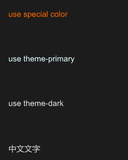
#![allow(unused)]
fn main() {
import {SText} from "../../index.slint";
import {Themes} from "../../use/index.slint";


component TestText inherits Window {
  height: 400px;
  width: 400px;
  VerticalLayout {
    padding: 20px;
    SText {
      color: #f60;
      text: "use special color";
    }
    SText {
      theme: Primary;
      text: "use theme-primary";
    }
    SText {
      theme: Dark;
      text: "use theme-dark";
    }
    SText {
      text: "中文文字";
    }
  }
}
}
SButton
SButton is a button component that you can freely perform regular properties operations on
properties inherits SCard
in property <image> icon: button icon in the left;in property <bool> show-icon: show icon or not;out property <bool> has-hover: hover button or not;in-out property <string> text: text display in button;in property <length> letter-spacing: text letter-spacing;in property <bool> round: button is round or not;in-out property <bool> disabled: disabled to click
functions
callbacks
clicked: run if you click the button
example
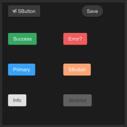
#![allow(unused)]
fn main() {
import {SButton} from "../../index.slint";
import {Themes} from "../../use/index.slint";

component TestButton inherits Window {
    height: 400px;
    width: 400px;
    SButton {
        x: 20px;
        y: 10px;
        show-icon: true;
        theme: Themes.Dark;
        icon: @image-url("../../icons/acceleration.svg");
        clicked => {
            self.text = "clicked"
        }
    }

    SButton {
        x: 260px;
        y: 10px;
        round: true;
        text: "Save";
        clicked => {
            self.text = "clicked";
        }
    }

    SButton {
        x: 20px;
        y: 100px;
        text: "Success";
        theme: Themes.Success;
    }

    SButton {
        x: 20px;
        y: 200px;
        text: "Primary";
        theme: Themes.Primary;
    }

    SButton {
        x: 20px;
        y: 300px;
        text: "Info";
        theme: Themes.Info;
    }

    SButton {
        x: 200px;
        y: 100px;
        text: "Error?";
        theme: Themes.Error;
        icon: @image-url("../../icons/magic-hat.svg");
    }

    SButton {
        x: 200px;
        y: 200px;
        theme: Themes.Warning;
    }

    SButton {
        x: 200px;
        y: 300px;
        text: "disabled";
        disabled: true;
        theme: Dark;
        clicked => {
            debug("cannot clicked")
        }
        pending => {
            debug("pending")
        }
    }
}
}
SDivider
A divider groups sections of content to create visual rhythm and hierarchy.
Use dividers along with spacing and headers to organize content in your layout.
properties inherits SCard
functions
callbacks
exmaple
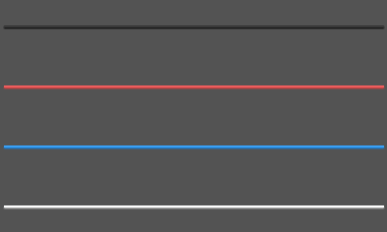
#![allow(unused)]
fn main() {
import {SDivider} from "../../index.slint";
import {Themes} from "../../use/index.slint";
component TestDivider inherits Window {
  height: 400px;
  width: 400px;
  background: #535353;

  SDivider {
    y: 60px;
    width: 380px;
  }
  SDivider {
    y: 120px;
    width: 380px;
    theme:Themes.Error;
  }
  SDivider {
    y: 180px;
    width: 380px;
    theme:Themes.Primary;
  }
  SDivider {
    y: 240px;
    width: 380px;
    theme:Themes.Light;
  }
}
}
SIcon
this is a icon container, better than Image
properties:
in property <MouseCursor> mouse-cursor: mouse cursor of the iconin property <Themes> theme: SurrealismUI themesin property <image> source: icon sourcein-out property <brush> colorize: icon colorin property <ImageFit> image-fit: icon image fitin property <ImageRendering> image-rendering: image renderingin-out property <RotationProps> rotation: image rotationin property <int> source-clip-x: icon clip xin property <int> source-clip-y: icon clip yin property <int> source-clip-height: icon clip heightin property <int> source-clip-width: icon clip widthout property <bool> has-hover: icon has hover
functions
pure public function get-colorize()->brush: get icon color
callbacks:
callback clicked: run if you click the icon
example
#![allow(unused)]
fn main() {
SIcon{
    height: 30px;
    width: 30px;
    colorize: self.get-colorize();
    source: @image-url("../../icons/sd-card.svg");
    theme: Themes.Primary;
}
}
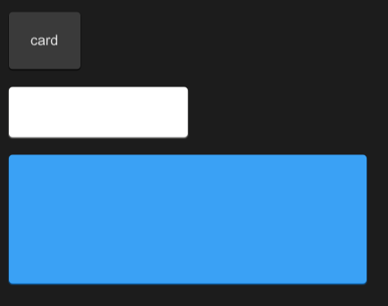
SCard
A very simple universal card without any layout or restrictions
you can add anything you want to the card
properties inherits Rectangle
in property <Themes> theme: Surrealism theme;in property <length> card-height: card height (not contain padding);in property <length> card-width: card width (not contain padding);in property <PaddingType> padding-type: padding type;in property <ShadowType> shadow-type: shadow type;in property <BorderType> border-type: border type;in property <int> font-weight: font weight;in property <length> font-size: font size;in property <brush> font-color: font color;in property <bool> font-italic: font italic;in property <string> font-family: font family;in-out property <PaddingProps> card-padding: inner card padding struct;in-out property <BorderProps> card-border: inner card border struct;in-out property <ShadowProps> card-shadow: inner card shadow struct;
example
#![allow(unused)]
fn main() {
import {SButton,SCard,SText} from "../../index.slint";
import {Themes} from "../../use/index.slint";


export component TestCard inherits Window {
  height: 400px;
  width: 600px;
  VerticalLayout {
    padding: 20px;
    spacing: 20px;
    SCard {
      SText {
        text: "card";
      }
    }
    SCard {
      card-height: 36px;
      card-width: 168px;
      theme: Light;
    }
    SCard {
      card-height: 124px;
      width: 400px;
      theme: Primary;
    }
  }
}
}
Data
| name | description |
|---|---|
| STag(标签组件) | A small tag used to display data |
| STable and STableColumn(表格组件) | The table is split into table header and table content |
| SCollapse and SCollapseItem(折叠面板组件) | Ability to collapse content |
| SAvatar(头像组件) | SAvatar is a avatar component that defaults to Icons.Avatar when there are no images available |
| SCollection(收缩盒组件) | SCollection is an expandable box that can be zoomed in or out by clicking (internal can also be used) |
| SPersona(个人信息组件) | This component is used to display simple user introduction information |
| SBadge(勋章组件) | SBadge is a quick way to display user status or events |
| SProgress(进度条组件) | SProgress is commonly used to display download progress or event processing progress.And you can fully control it through the progress property |
| STree(树型组件) | STree can be used to display directory structure, forming a parent-child relationship, and can be easily displayed |
| SFile(文件组件) | SFile can help users present file selectors GUI |
| SStep(步骤组件) | The Step component visualizes the progress of a sequence by breaking it down into individual steps. It allows for custom theming and supports indicating the current, completed, and pending steps through visual cues. |
| SPagination(分页器) | A component designed for navigating through pages, providing options for customization and various interactions. |
| SKeyBoard(虚拟键盘) | A customizable keyboard component for various input types including numbers, alphabets, and computer keyboard layouts. |
| SCarousel(走马灯) | The Carousel component is designed to display a sequence of images (or slides) that users can navigate through. It provides a dynamic and visually engaging way to showcase multiple images without occupying too much space on the screen. |
| STimeLine(时间轴) | The timeline component is mainly used to display the changes of data over time, and it is usually used in data visualization to visually represent time series data |
| SCalendar(日历) | A calendar component that inherits from SCard. It is designed to display a month view with the ability to navigate and select dates. |
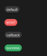
STag
A small tag used to display data
properties inherits SCard
- in property
text : text in tag
functions
- pure public function get() -> string : get tag text
- public function set(value:string) : set tag text
callbacks
- callback clicked(string) : run if you click the tag
example
#![allow(unused)]
fn main() {
import {STag} from "../../index.slint";
import {Themes} from "../../use/index.slint";

component TestWindow inherits Window {
  height: 400px;
  width: 400px;
  VerticalLayout {
    spacing: 20px;
    padding: 20px;
    STag {
      text:"default";
      clicked(text) => {
        debug(self.get());
        self.set(@tr("clicked -> {}",text));
      }
    }
    STag {
      text:"error!";
      theme:Themes.Error;
    }
    STag {
      text:"callback";
      theme:Themes.Dark;
      clicked(text)=>{
        self.font-color= #ddff00;
      }
    }
    STag {
      text:"success";
      theme:Themes.Success;
    }
  }
}
}
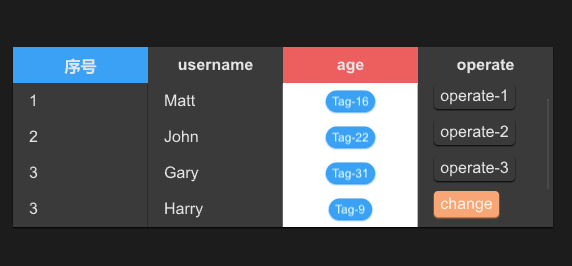
STable
In fact, it is just the header of the table and needs to be used together with STableColumn or STableColumnFlex
example
#![allow(unused)]
fn main() {
import {STable,STableColumn, SCard,STableColumnItem,STableColumnFlex, SButton} from "../../index.slint";
import {Themes,PaddingType,ShadowType,BorderType,PaddingProps,BorderProps,ShadowProps,UseSurrealismFn} from "../../use/index.slint";
import { ROOT-STYLES,DefaultSCardProps,ComponentSchema } from "../../themes/index.slint";
import { ScrollView } from "std-widgets.slint";
import { STag } from "../../src/tag/index.slint";


export component TestTable inherits Window {
  height: 500px;
  width: 600px;
  STable{
    theme: Dark;
    width: 90%;
    height: 36%;
    column-themes:[Themes.Primary,Themes.Dark,Themes.Error,Themes.Dark];
    viewport-height:col1.height;
    alignment: center;
    columns: [
      {label:"序号",value:"$index"},
      {label:"username",value:"name"},
      {label:"age",value:"age"},
      {label:"operate",value:"opt"},
    ];
    clicked(index,item)=>{
      debug(index);
      debug(item);
    }

    col1:=STableColumn {
      alignment: left;
      datas:[
        "1",
        "2",
        "3",
        "3",
        "3",
      ];
      width: parent.get-column-width(parent.width , 0);
    }
    STableColumn {
      index:1;
      width: parent.get-column-width(parent.width , 1);
      datas:[
        "Matt",
        "John",
        "Gary",
        "Harry",
        "Mary",
      ];
      clicked(col-index,index,value)=>{
        debug(col-index);
        debug(index);
        debug(value);
      }
    }
    STableColumnFlex {
      index: 2;
      theme: Light;
      width: parent.get-column-width(parent.width , 2);
      height: self.count-column-height(5);

      for item[index] in ["16","22","31","9","18"]: STableColumnItem {
        theme: parent.theme;
        height: parent.height / 5;
        callback row-click(string);
        clicked => {
          self.row-click(item);
        }
        row-click(row-item) => {
          debug(row-item);
        }
        Rectangle {
          STag {
            text: @tr("Tag-{}",item);
            theme: Primary;
          }
        }
      }
    }
    STableColumnFlex {
      index: 3;
      theme: Dark;
      width: parent.get-column-width(parent.width , 3);
      height: self.count-column-height(5);
      for item[index] in ["1","2","3"]: STableColumnItem {
        height: parent.height / 5;
        SButton {
          text: @tr("operate-{}",item);
          padding-type: PaddingType.Tag;
        }
      }
      for item[index] in ["change","delete"]: STableColumnItem {
        height: parent.height / 5;
        SButton {
          theme: Warning;
          text: item;
          padding-type: PaddingType.Tag;
          clicked => {
            debug("I am click!");
          }
        }
      }
    }
  }
}
}
properties inherits SCard
- in property <[Themes]> column-themes: table header columns' theme;
- in property
viewport-height: table body viewport height - in property
alignment : table header horizontal alignment - in property <[SOption]> columns : table columns
- in-out property <[length]> column-width : table column width
functions
- pure public function get-column-width(w:length,index:int)->length : get each column width depand on the index
callbacks
- callback clicked(int,SOption) : run if click the Table Header
STableColumn 简单表格列
It is table body , it covers the data of the table , It is easy for just show text in Table
properties inherits SCard
- in-out property
index : column index - in property <[string]> datas : column datas
- in property
alignment : row text horizontal alignment
functions
- pure public function count-column-height()->length : count column height
callbacks
- callback clicked(int,int,string) : run if click the row item
STableColumnFlex 灵活表格列 inherits STableColumn
It is also a kind of table body , but this component is more flexible , you can use with STableColumnItem together and define what will show in the table
STableColumnItem 表格单元格
It is a component used to describe a cell in a table , It can help you define tables more easily.
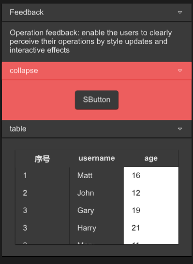
SCollapse
SCollapse is a foldable panel
This is the outter of the Collapse, what really works is SCollapseItem
The outter only serves as a standard layout , this is a zero cost construction
example
#![allow(unused)]
fn main() {
import {SCollapse,SCollapseItem,SButton,STable,STableColumn} from "../../index.slint";
import { UseIcons,Themes } from "../../use/index.slint";
import { SText } from "../../src/text/index.slint";

component TestWindow inherits Window {
  height: 600px;
  width: 400px;
  SCollapse {
    y: 10px;
    // you can set 0 , it has no impact
    // recommend use the following way
    height: item1.get-height() * 3;
    width: 360px;
    item1:=SCollapseItem {
      header-title:"Feedback";
      SText {
        wrap: word-wrap;
        height: item1.details-height;
        width: item1.width;
        text:"Operation feedback: enable the users to clearly perceive their operations by style updates and interactive effects";
      }
    }
    SCollapseItem {
      theme: Themes.Error;

      SButton {

      }
    }
    SCollapseItem {
      header-title:"table";
      theme: Themes.Dark;
      details-height:280px;
      STable{
        theme: Dark;
        width: 86%;
        height: 80%;
        column-themes:[Themes.Dark,Themes.Dark,Themes.Dark];
        viewport-height: col1.height;
        alignment: center;
        columns: [
          {label:"序号",value:"$index"},
          {label:"username",value:"name"},
          {label:"age",value:"age"},
        ];
        clicked(index,item)=>{
          debug(index);
          debug(item);
        }

        col1:=STableColumn {
          alignment: left;
          datas:[
            "1",
            "2",
            "3",
            "3",
            "3",
          ];
          width: parent.get-column-width(parent.width , 0);
        }
        STableColumn {
          index:1;
          width: parent.get-column-width(parent.width , 1);
          datas:[
            "Matt",
            "John",
            "Gary",
            "Harry",
            "Mary",
          ];
          clicked(col-index,index,value)=>{
            debug(col-index);
            debug(index);
            debug(value);
          }
        }
        STableColumn {
          theme: Light;
          width: parent.get-column-width(parent.width , 2);
          datas:[
            "16",
            "12",
            "19",
            "21",
            "11",
          ];
        }
      }
    }
  }

}
}
properties inherits Rectangle
SCollapseItem
SCollapseItem is a component of SCollapse, without which SCollapse will not work
You can customize the components or use the default text display method in it
properties
- in-out property
font-weight : font weight - in-out property
font-size: font size - in-out property
font-color : font color - in-out property
font-italic : font italic - in-out property
font-family : font family - in-out property
theme : SurrealismUI theme - in-out property
header-height : collapse header height - in-out property
header-title : collapse header title - in-out property
header-padding-type: collapse header padding type - in-out property
header-shadow-type: collapse header shadow type - in-out property
header-border-type : collapse header border type - in-out property
details-height : collapse detail height - in-out property
details-padding-type: collapse detail padding type - in-out property
details-shadow-type: collapse detail shadow type - in-out property
details-border-type : collapse detail border type - in-out property
is-show : the collapse detail is show or not; - in-out property
collapse-icon : collapse header expand icon
functions
- pure public function get-height()->length : get collapse header height
callbacks
- callback clicked() : run if you show collapse detail
SAvatar
SAvatar is a avatar component that defaults to Icons.Avatar when there are no images available
examples
#![allow(unused)]
fn main() {
import {SAvatar} from "../../index.slint";
import {ROOT-STYLES} from "../../themes/index.slint";

component TestWindow inherits Window {
  height: 400px;
  width: 400px;
  background: #F5F5F5;
  VerticalLayout {
    padding: 20px;
    spacing: 20px;
    SAvatar {
    }
    SAvatar {
      avatar-size : ROOT-STYLES.sur-size.small * 2;
      padding-type : Small;
      theme: Primary;
    }
    SAvatar {
      theme: Warning;
    }
    SAvatar {
      avatar-size : ROOT-STYLES.sur-size.small * 2;
      padding-type : Small;
      theme: Error;
    }
    SAvatar {
      avatar-size : ROOT-STYLES.sur-size.large * 2;
      padding-type : Large;
      theme: Dark;
      avatar:@image-url("../../README/imgs/logo.png");
    }
  }
}
}
properties inherits SCard
- in property
avatar-size : avatar image size; - in property
avatar : avatar image; - in-out property
alt : if the image can be displayed the default alt will instead; - in property
image-fit : image fit;
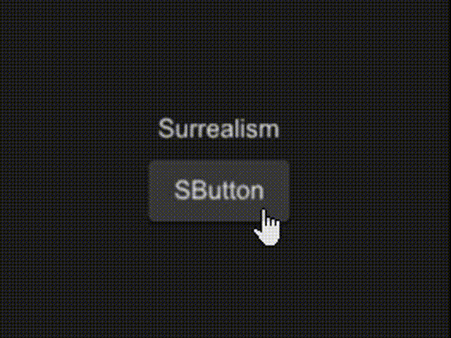
SCollection
SCollection is an expandable box that can be zoomed in or out by clicking (internal can also be used)
examples
#![allow(unused)]
fn main() {
import {SButton,SCollection, SText} from "../../index.slint";
import {Themes} from "../../use/index.slint";

component TestCollection inherits Window {
  height: 600px;
  width: 600px;

  c:=SCollection{
    height: 180px;
    width: 180px;
    scale : 3;
    clicked => {
      txt.font-size = self.toggle(txt.font-size,1.5);
      btn.width = self.toggle(btn.width , 1.6);
      btn.theme = c.is-scale ? Themes.Dark : Themes.Error;
    }
    VerticalLayout {
      padding: 20px;
      spacing: 20px;
      alignment: center;
      Rectangle {
        txt:=SText {
          text:"Surrealism";
        }
      }
      Rectangle {
        btn:=SButton{
        }
      }
    }
  }
}
}
properties (card)
- in property
scale : collection scale size; - in-out property
is-scale : collection is scale or not; - in property
easing : animation easing type; - in property
duration : animation duration;
functions
- pure public function toggle-default(target:length)->length
- pure public function toggle(target:length,scale-size:float)->length
callbacks
- clicked() : run if you click item in SCollection
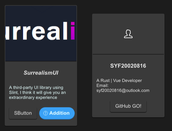
SPersona
This component is used to display simple user introduction information
example
#![allow(unused)]
fn main() {
import {SPersona} from "../../index.slint";
import {Themes,UseIcons} from "../../use/index.slint";
import { ComponentSchema,DefaultSButtonProps } from "../../themes/index.slint";

component TestPersona inherits Window {
  height: 500px;
  width: 600px;
  SPersona {
    x: 20px;
    avatar: @image-url("../../README/imgs/logo.png");
    avatar-height: 180px;
    name: "SurrealismUI";
    name-font-italic: true;
    name-font-weight: 900;
    des: @tr("A third-party UI library using Slint, I think it will give you an extraordinary experience");
    des-font-size: 14px;
    des-theme: Primary;
    btns: [
      ComponentSchema.button,
      {
        font-weight :700,
        font-size : DefaultSButtonProps.font-size,
        color : DefaultSButtonProps.color,
        font-italic : DefaultSButtonProps.font-italic,
        font-family : DefaultSButtonProps.font-family,
        theme : Themes.Primary,
        padding-type : DefaultSButtonProps.padding-type,
        shadow-type : DefaultSButtonProps.shadow-type,
        border-type : DefaultSButtonProps.border-type,
        icon :  UseIcons.icons.Help,
        show-icon : true,
        text : "Addition",
        letter-spacing : DefaultSButtonProps.letter-spacing,
        clip :DefaultSButtonProps.clip,
        round : true
      }
    ];
    clicked(e) => {
      debug(e);
    }
  }
  SPersona {
    x: 300px;
    btn-text: "GitHub GO!";
  }
}
}
properties inherits SCard
- in-out property
btn-text : button text - in property
spacing : spacing of persona - in property <[SButtonProps]> btns : buttons slot
- in property
avatar : persona avatar image - in property
avatar-height: persona avatar height - in property
avatar-theme : persona avatar theme - in-out property
name : persona name - in-out property
name-height: persona name height - in-out property
name-font-size: persona name font size - in-out property
name-font-weight : persona name font weight - in-out property
name-theme: persona name theme - in-out property
name-font-family : persona name font family - in-out property
name-font-italic : persona name font italic - in-out property
des : persona description text - in-out property
des-height: persona description height - in-out property
des-font-size: persona description font size - in-out property
des-font-weight : persona description font weight - in-out property
des-theme: persona description theme - in-out property
des-font-family : persona description font family - in-out property
des-font-italic : persona description font italic
functions
callbacks
- callback clicked(SButtonProps): run if you click the buttons
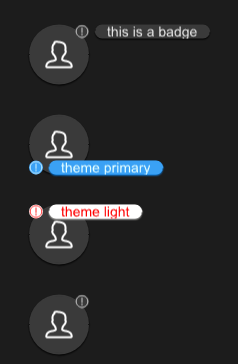
SBadge
SBadge is a quick way to display user status or events
example
#![allow(unused)]
fn main() {
import {SBadge,SAvatar} from "../../index.slint";
import {Themes} from "../../use/index.slint";

component TestCollection inherits Window {
  height: 460px;
  width: 400px;

  b1:=Rectangle {
    y: 30px;
    height: avatar.height;
    width: avatar.width;
    avatar:=SAvatar {
    }
    SBadge {
      text : "this is a badge";
      x: self.get-x(avatar.width);
      y: self.get-y(avatar.height);
    }
  }
  b2:=Rectangle {
    y: 120px;
    height: avatar2.height;
    width: avatar2.width;
    avatar2:=SAvatar {
    }
    SBadge {
      theme: Primary;
      text:"theme primary";
      x: self.get-x(avatar2.width);
      y: self.get-y(avatar2.height);
      position: LeftBottom;
    }
  }
  b3:=Rectangle {
    y: 210px;
    height: avatar3.height;
    width: avatar3.width;
    avatar3:=SAvatar {
    }
    SBadge {
      theme: Light;
      text:"theme light";
      x: self.get-x(avatar3.width);
      y: self.get-y(avatar3.height);
      position: LeftTop;
      icon-color:#ff0000;
      font-color:#ff0000;
    }
  }
  b4:=Rectangle {
    y: 300px;
    height: avatar4.height;
    width: avatar4.width;
    avatar4:=SAvatar {
    }
    SBadge {
      x: self.get-x(avatar4.width);
      y: self.get-y(avatar4.height);
      position: RightTop;
    }
  }
}
}
properties inherits SCard
- in property
position : badge position of the main component - in-out property
icon : badge icon; - in property
icon-color : badge icon color; - in-out property
text : text of the badge;
functions
- pure public function get-x(p_right:length)->length 👍
- pure public function get-y(p_bottom:length)->length 👍
callbacks
SProgress
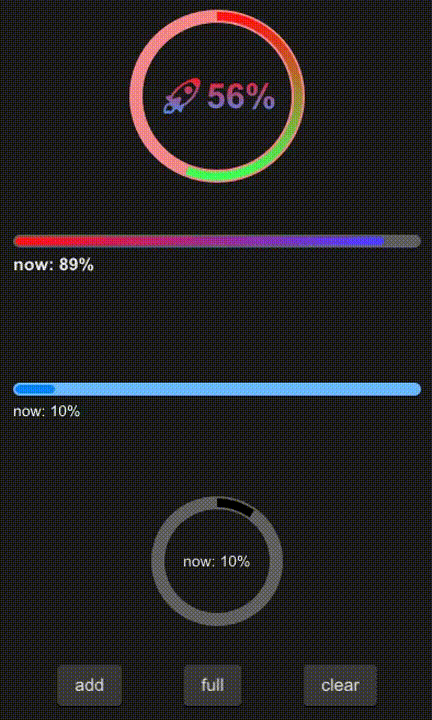
SProgress is commonly used to display download progress or event processing progress And you can fully control it through the progress property
example
#![allow(unused)]
fn main() {
import {SProgress,SButton} from "../../index.slint";
import {Themes} from "../../use/index.slint";

component TestProgress inherits Window {
  height: 680px;
  width: 400px;

  VerticalLayout {
    spacing: 20px;
    padding: 10px;
    SProgress {
      theme: Error;
      height: 160px;
      circle: true;
      progress: 56%;
      font-size: 32px;
      font-weight: 700;
      stroke-color: @linear-gradient(180deg, #ff1515 0%,  #41ff57 100%);
      text: @tr("🚀{}%",round(self.progress * 100));
      font-color: @linear-gradient(180deg, #ff1515 0%,  #4193ff 100%);
    }
    SProgress {
      height: 100px;
      circle: false;
      progress: 89%;
      font-size: 16px;
      font-weight: 700;
      stroke-color: @linear-gradient(90deg, #ff1515 0%,  #4741ff 100%);
    }
    b:= SProgress {
      theme: Primary;
      circle: false;
      progress: 10%;
    }
    a:= SProgress {
      height: 120px;
      circle: true;
      progress: 10%;
    }
    HorizontalLayout {
      padding: 16px;
      alignment: space-around;
      SButton{
        text: "add";
        clicked => {
          a.add(0.1);
          b.add(0.1);
        }
      }
      SButton{
        text: "full";
        clicked => {
          a.full();
          b.full();
        }
      }
      SButton{
        text: "clear";
        clicked => {
          a.clear();
          b.clear();
        }
      }
    }
  }

}
}
properties inherits Rectangle
- in property
theme : progress theme - in property
text : display text - in-out property
stroke-width : stroke width - in-out property
stroke-color : color of the progress - in-out property
progress : progress value - in-out property
font-weight : display text font weight - in-out property
font-size: display text font size - in-out property
font-color : display text font color - in-out property
font-italic : display text font italic - in-out property
font-family : display text font family - in property
circle: use circle progress
functions
- pure public function get-progress() : get timely progress
- public function full() : make progress 100%
- public function clear() : : make progress 0%
- public function add(num:float) : increase progress
callbacks
SSlider
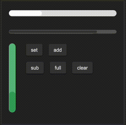
The Slider component is used for creating a slider control that allows users to select a value within a range. It supports customization of orientation, theme, and visual properties.
example
#![allow(unused)]
fn main() {
import {SSlider, SButton} from "../../index.slint";


component TestSlider inherits Window{
    height: 400px;
    width: 400px;
    VerticalLayout {
        spacing: 20px;
        padding: 20px;
        SSlider {
            theme: Light;
            width: 360px;
            height: 40px;
            stroke-width: 16px;
            progress: 0.3;
        }
        SSlider {
            width: 360px;
            height: 40px;
            progress: 80%;
        }

        HorizontalLayout {
            spacing: 30px;
            slider:= SSlider {
                theme: Success;
                width: 30px;
                height: 220px;
                stroke-width: 220px;
                progress: 30%;
                orientation: Orientation.vertical;
                moved(progress) => {
                    debug(progress);
                }
            }
            VerticalLayout {
                spacing: 20px;
                HorizontalLayout {
                    spacing: 20px;
                    SButton{
                        text: "set";
                        clicked => {
                            slider.set(0.45);
                        }
                    }
                    SButton{
                        text: "add";
                        clicked => {
                            slider.add(0.1);
                        }
                    }
                }
                HorizontalLayout {
                    spacing: 20px;
                    SButton{
                        text: "sub";
                        clicked => {
                            slider.sub(0.1);
                        }
                    }
                    SButton{
                        text: "full";
                        clicked => {
                            slider.full();
                        }
                    }
                    SButton{
                        text: "clear";
                        clicked => {
                            slider.clear();
                        }
                    }
                }
            }
        }
    }
}
}
properties
in property <Orientation> orientation: Sets the orientation of the slider.in property <Themes> theme: Sets the theme of the slider.in-out property <float> progress: Controls the progress value of the slider.in-out property <length> stroke-width: Sets the stroke width of the slider.in-out property <brush> stroke-color: Sets the stroke color of the slider.in property <length> border-radius: Sets the border radius of the slider bar, linked to bar.border-radius.
functions
public function set(progress: float): Sets the slider progress to a specific value and triggers the moved callback.public function add(len: float): Increases the slider progress by a specified value and triggers the moved callback.public function sub(len: float): Decreases the slider progress by a specified value and triggers the moved callback.public function full(): Sets the slider progress to 1 (full) and triggers the moved callback.public function clear(): Sets the slider progress to 0 (empty) and triggers the moved callback.
callbacks
callback moved(float): Triggered when the slider is moved, passing the current progress value as a float.
STree
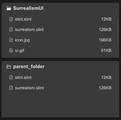
STree can be used to display directory structure, forming a parent-child relationship, and can be easily displayed
example
#![allow(unused)]
fn main() {
import {STree } from "../../index.slint";
import {UseIcons} from "../../use/index.slint";

component TestTree inherits Window {
  height: 400px;
  width: 400px;
  STree{
    y: 10px;
    theme: Dark;
    height: 45%;
    width: 96%;
    tree-data:{
      icon : UseIcons.icons.Folder_filled,
      label: "SurrealismUI",
      extra:"",
      children:[
        {
          icon:UseIcons.icons.FileCode,
          label:"slint.slint",
          extra:"12KB",
        },
        {
          icon:UseIcons.icons.FileCode,
          label:"surrealism.slint",
          extra:"126KB",
        },
        {
          icon:@image-url("../../icons/file-jpg.svg"),
          label:"icon.jpg",
          extra:"196KB",
        },
        {
          icon:@image-url("../../icons/file-gif.svg"),
          label:"ui.gif",
          extra:"91KB",
        },
        {
          icon:@image-url("../../icons/file-gif.svg"),
          label:"ui2.gif",
          extra:"107KB",
        }
      ]
    };
    clicked(i,n,e)=>{
      debug(n);
    }
  }
  STree {
    y: 200px;
    height: 46%;
    width: 96%;
  }
}
}
properties inherits SCard
- in property
item-font-family : tree item font family - in property
item-font-weight : tree item font weight - in property
item-font-size: tree item font size - in property
item-font-italic : tree item font italic - in-out property
tree-data : tree data
callbacks
- callback clicked(int,string,string) : run if you click an item
SFile
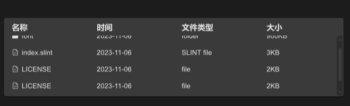
SFile can help users present file selectors GUI
example
#![allow(unused)]
fn main() {
import {SFile} from "../../index.slint";
import { Themes,PaddingType,UseIcons,FileItem} from "../../use/index.slint";

export component TestFile inherits Window {
  height: 400px;
  width: 800px;
  SFile{
    theme: Dark;
    width: 86%;
    height: 40%;
    item-font-size: 14px;
    tabs: [
      {label:"名称",value:"name"},
      {label:"时间",value:"dateTime"},
      {label:"文件类型",value:"file-type"},
      {label:"大小",value:"size"}
    ];
    files : [
      {icon:UseIcons.icons.Folder-filled , name : "font" , datetime : "2023-11-06" , file-type : "folder" , size : "900KB"},
      {icon:UseIcons.icons.FileCode , name : "index.slint" , datetime : "2023-11-06" , file-type : "SLINT file" , size : "3KB"},
      {icon:UseIcons.icons.FileCode , name : "LICENSE" , datetime : "2023-11-06" , file-type : "file" , size : "2KB"},
      {icon:UseIcons.icons.FileCode , name : "LICENSE" , datetime : "2023-11-06" , file-type : "file" , size : "2KB"},
      {icon:UseIcons.icons.FileCode , name : "LICENSE" , datetime : "2023-11-06" , file-type : "file" , size : "2KB"}
    ];
    tab-clicked(index,item)=>{
      debug(index);
      debug(item);
    }
    item-clicked(index,cindex,item)=>{
      debug(index);
      debug(cindex);
      debug(item);
    }
  }
}
}
properties
- in property
text-alignment : file item horizontal alignment - in property <[SOption]> tabs : file tabs
- in-out property <[length]> column-width : file item column width
- in-out property <[FileItem]> files : file item font files
- in-out property
item-font-family : file item font family - in-out property
item-font-weight : file item font weight - in-out property
item-font-size: file item font size - in-out property
item-font-italic : file item font italic - in-out property
item-padding-type: file item padding type
functions
- pure function get-column-width(w:length,index:int)->length : get file item column width
callbacks
- callback tab-clicked(int,SOption) : run if you click the tab
- callback item-clicked(int,int,FileItem) : run if you click a file item
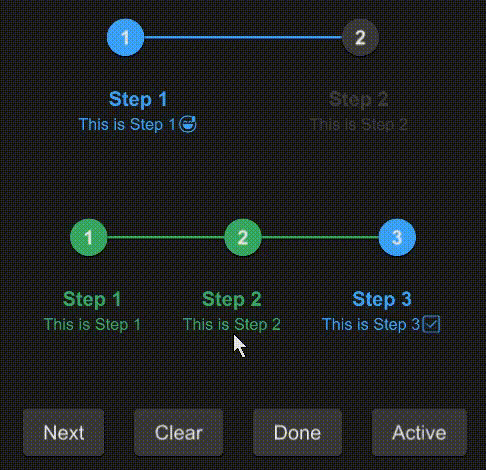
SStep
The Step component visualizes the progress of a sequence by breaking it down into individual steps. It allows for custom theming and supports indicating the current, completed, and pending steps through visual cues.
example
#![allow(unused)]
fn main() {
import { SButton,SStep } from "../../index.slint";
component TestStep {
  height: 400px;
  width: 400px;
  VerticalLayout {
    padding: 24px;
    spacing: 60px;
    SStep {
      active: 1;
      height: 100px;
      font-size: 16px;
      options: [
        {
          label: "Step 1",
          value: "1",
          info: "This is Step 1😅",
        },
        {
          label: "Step 2",
          value: "2",
          info: "This is Step 2",
        },
      ];
    }
    s:= SStep {
      height: 100px;
      font-size: 16px;
      active: 3;
      options: [
        {
          label: "Step 1",
          value: "1",
          info: "This is Step 1",
        },
        {
          label: "Step 2",
          value: "2",
          info: "This is Step 2",
        },
        {
          label: "Step 3",
          value: "3",
          info: "This is Step 3✅",
        }
      ];
    }
    HorizontalLayout {
      spacing: 24px;
      SButton {
        text: "Next";
        clicked => {
          s.next();
        }
      }
      SButton {
        text: "Clear";
        clicked => {
          s.clear();
        }
      }
      SButton {
        text: "Done";
        clicked => {
          s.done();
        }
      }
      SButton {
        text: "Active";
        clicked => {
          debug(s.get-active());
        }
      }
    }
  }
}
}
Properties
- in property
theme : The theme setting for the step component, defaulting to Dark. - in-out property
font-size : The font size used for step labels. - in-out property
font-weight : The font weight for step labels. - in-out property
font-italic : Specifies whether the font for step labels is italic. - in-out property
font-family : The font family for step labels. - in-out property
font-color : The color of the font used for step labels. - in-out property
active : The index of the currently active step. - in property
active-color : The color indicating an active step. - in property
done-color : The color indicating a completed step. - in property
undone-color : The color indicating a pending step. - in property <[SStepOption]> options : An array of step options defining the sequence of steps.
Functions
- public function next() : Advances the active step by one, unless it's the last step.
- public function clear() : Resets the active step to the first step.
- public function done() : Marks all steps as completed by setting the active step beyond the last step.
- pure public function get-active() -> int : Returns the index of the currently active step.
- pure function count-align(index:int) -> LayoutAlignment : Determines the alignment of a step based on its index in the sequence.
- pure function status-color(index:int) -> brush : Returns the color that should be used for a step at the given index based on its status (active, done, or undone).
SKeyBoard
A customizable keyboard component for various input types including numbers, alphabets, and computer keyboard layouts.
examples
Number
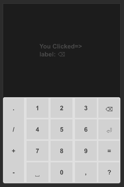
#![allow(unused)]
fn main() {
import {SText,SCard, SKeyBoard} from "../../index.slint";
import { KeyBoardType } from "../../use/index.slint";

component TestKeyBoardNumber {
    height: 460px;
    width: 300px;
    t:= SText {
        y: 100px;
        theme: kb.theme;
        font-weight: 700;
        text: "Click Keyboard !";
    }
    SCard {
        y: root.height - self.height;
        card-height: 200px;
        width: 100%;
        theme: Info;
        kb:= SKeyBoard {
            theme: parent.theme;
            keyboard-type: KeyBoardType.PhoneNumber;
            clicked(key) =>{
                t.text = @tr("You Clicked=> \nlabel: {}\n",key.label);
                // See enum KeyItems
                debug(key.value);
            }
        }
    }
}

}
Alpha
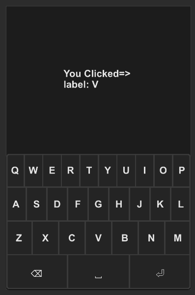
#![allow(unused)]
fn main() {
import {SText,SCard, SKeyBoard} from "../../index.slint";
import { KeyBoardType } from "../../use/index.slint";

component TestKeyBoardAlpha {
    height: 460px;
    width: 300px;
    t:= SText {
        y: 100px;
        theme: kb.theme;
        font-weight: 700;
        wrap: word-wrap;
        text: "Click Keyboard !";
    }

    SCard {
        y: root.height - self.height;
        card-height: 200px;
        width: 100%;
        theme: Dark;
        kb:= SKeyBoard {
            theme: parent.theme;
            keyboard-type: KeyBoardType.PhoneAlpha;
            clicked(key) =>{
                t.text = @tr("You Clicked=> \nlabel: {}\n",key.label);
                // See enum KeyItems
                debug(key.value);
            }
        }
    }

}

}
All
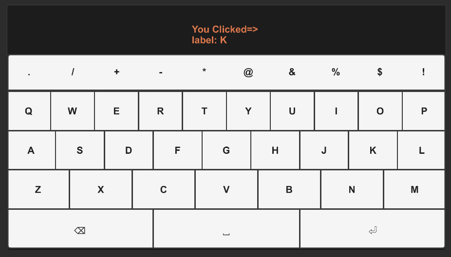
#![allow(unused)]
fn main() {
import {SText,SCard, SKeyBoard} from "../../index.slint";
import { KeyBoardType } from "../../use/index.slint";

component TestKeyBoardAll {
    height: 400px;
    width: 720px;
    t:= SText {
        y: 30px;
        theme: kb.theme;
        color: #dc774c;
        font-weight: 700;
        wrap: word-wrap;
        text: "Click Keyboard !";
    }

    SCard {
        y: root.height - self.height;
        card-height: 300px;
        width: 100%;
        theme: Dark;
        kb:= SKeyBoard {
            theme: Light;
            keyboard-type: KeyBoardType.Computer;
            clicked(key) =>{
                t.text = @tr("You Clicked=> \nlabel: {}\n",key.label);
                // See enum KeyItems
                debug(key.value);
            }
        }
    }
}

}
Properties
- in property
theme: Themes.Dark; The theme of the keyboard, defaulting to dark mode. - in property
font-size: 16px; The font size used in the keyboard. - in-out property
keyboard-type: KeyBoardType.PhoneNumber; The type of keyboard layout (e.g., phone number, phone alphabet, computer).
Callbacks
- callback clicked(SKeyItem): Triggered when a key is clicked, returning the key item clicked.
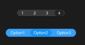
SPagination
A component designed for navigating through pages, providing options for customization and various interactions.
example
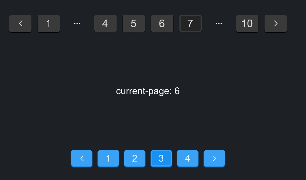
#![allow(unused)]
fn main() {
import { SPagination } from "../../index.slint";
import {Themes,UseIcons} from "../../use/index.slint";
export component TestPagination inherits Window {
    height: 400px;
    width: 560px;
    background: #1d2125;
    VerticalLayout {
        padding-top: 32px;
        padding-bottom: 32px;
        alignment: space-around;
        Rectangle {
            a := SPagination {
                page-size: 10;
                total: 100;
                visible-range: 6;
            }
        }

        Rectangle {
            Text {
                // current-page is index
                text: @tr("current-page: {}",a.active);
                font-size: 16px;
                color: #fff;
            }
        }

        Rectangle {
            p := SPagination {
                theme: Themes.Primary;
                active: 2;
                page-size: 30;
                total: 100;
                pre-icon: @image-url("../../icons/to-left.svg");
                size: 16px;
                next-icon: @image-url("../../icons/to-right.svg");
            }
        }
    }
}

}
Properties
- in property
theme: Themes.Dark; Specifies the theme of the pagination component, with a default of dark mode. - in-out property
active: 0; The current active page. - in property
page-size: 10; The number of items per page. - in property
total: 50; The total number of items across all pages. - in property
pre-icon: UseIcons.icons.Left; The icon used for the "previous page" button. - in property
next-icon: UseIcons.icons.Right; The icon used for the "next page" button. - in property
size: 18px; The size of the pagination component. - in property
visible-range: 5; The number of visible page buttons in the pagination component.
Functions
- pure function get-color(hover: bool, index: int, self-color: brush) -> brush; Determines the color of page buttons based on the hover state and if it's the active page.
- pure function to-left() -> bool; Determines if the "move to left" action should be available based on the current active page and the total number of pages.
- pure function to-right() -> bool; Determines if the "move to right" action should be available based on the current active page and the total number of pages.
Callbacks
- callback pre(int, int); Triggered when the "previous page" button is clicked.
- callback next(int, int); Triggered when the "next page" button is clicked.
- callback clicked(int, int); Triggered when a specific page number is clicked.
SCarousel
The Carousel component is designed to display a sequence of images (or slides) that users can navigate through. It provides a dynamic and visually engaging way to showcase multiple images without occupying too much space on the screen.
example
focus main
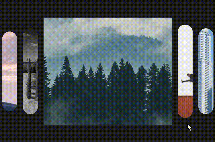
#![allow(unused)]
fn main() {
component TestCarousel {
    height: 400px;
    width: 600px;
    Rectangle {
        SCarousel {
            height: 300px;
            width: 100%;
            active: 3;
            focus-main: true;
            sources: [
                @image-url("../../README/imgs/sed1.jpeg"),
                @image-url("../../README/imgs/sed2.jpeg"),
                @image-url("../../README/imgs/sed3.png"),
                @image-url("../../README/imgs/sed4.png"),
                @image-url("../../README/imgs/sed5.png")
            ];
        }
    }
}
}
normal
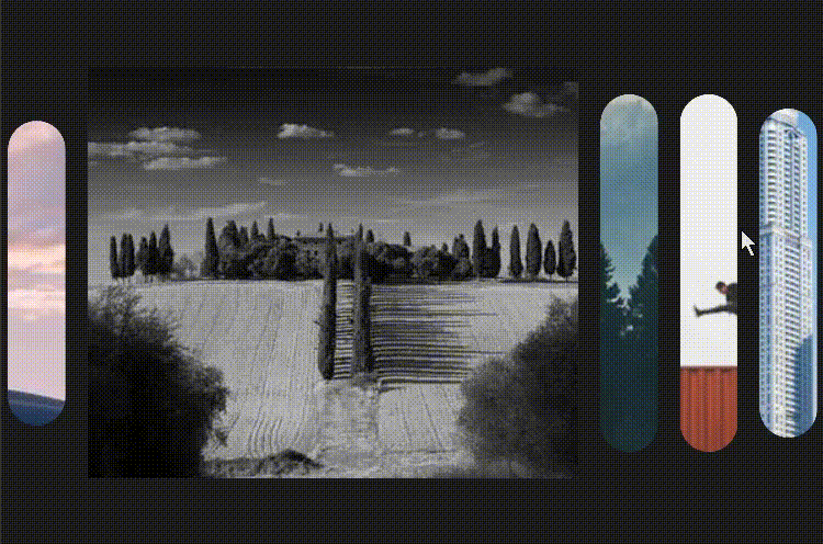
#![allow(unused)]
fn main() {
component TestCarousel2 {
    height: 400px;
    width: 600px;
    Rectangle {
        SCarousel {
            height: 300px;
            width: 100%;
            active: 1;
            sources: [
                @image-url("../../README/imgs/sed1.jpeg"),
                @image-url("../../README/imgs/sed2.jpeg"),
                @image-url("../../README/imgs/sed3.png"),
                @image-url("../../README/imgs/sed4.png"),
                @image-url("../../README/imgs/sed5.png")
            ];
        }
    }
}
}
Properties
in-out property <[image]> sources: An array of images that the carousel will display. This property can be both read and set, allowing dynamic update of the carousel's content.in property <float> fold-strench: A float value that determines the stretching effect of non-central folds/slides. It defaults toDefaultSCarouselProps.fold-stretch, which should be a predefined value in your system.in property <length> fold-width: Specifies the width of each fold/slide in the carousel. It uses a length value and defaults toDefaultSCarouselProps.fold-width.in property <length> fold-height: Determines the height of the folds/slides. By default, it matches the height of the root component (root.height).in property <ImageFit> fit: Defines how images should be fitted within their frames, utilizing predefinedImageFitoptions. It defaults toDefaultSCarouselProps.fit.in property <bool> focus-main: A boolean indicating whether the main (center) image should be focused. Defaults toDefaultSCarouselProps.focus-main.in-out property <int> active: An integer representing the currently active slide. It starts from0and can be read or set to change the active slide.
Callbacks
callback clicked(int): This callback is triggered when a slide is clicked. It passes the index of the clicked slide as an argument, allowing for custom interaction handling, such as navigating to a specific slide or performing an action related to the clicked slide's content.
STimeline
The timeline component is mainly used to display the changes of data over time, and it is usually used in data visualization to visually represent time series data
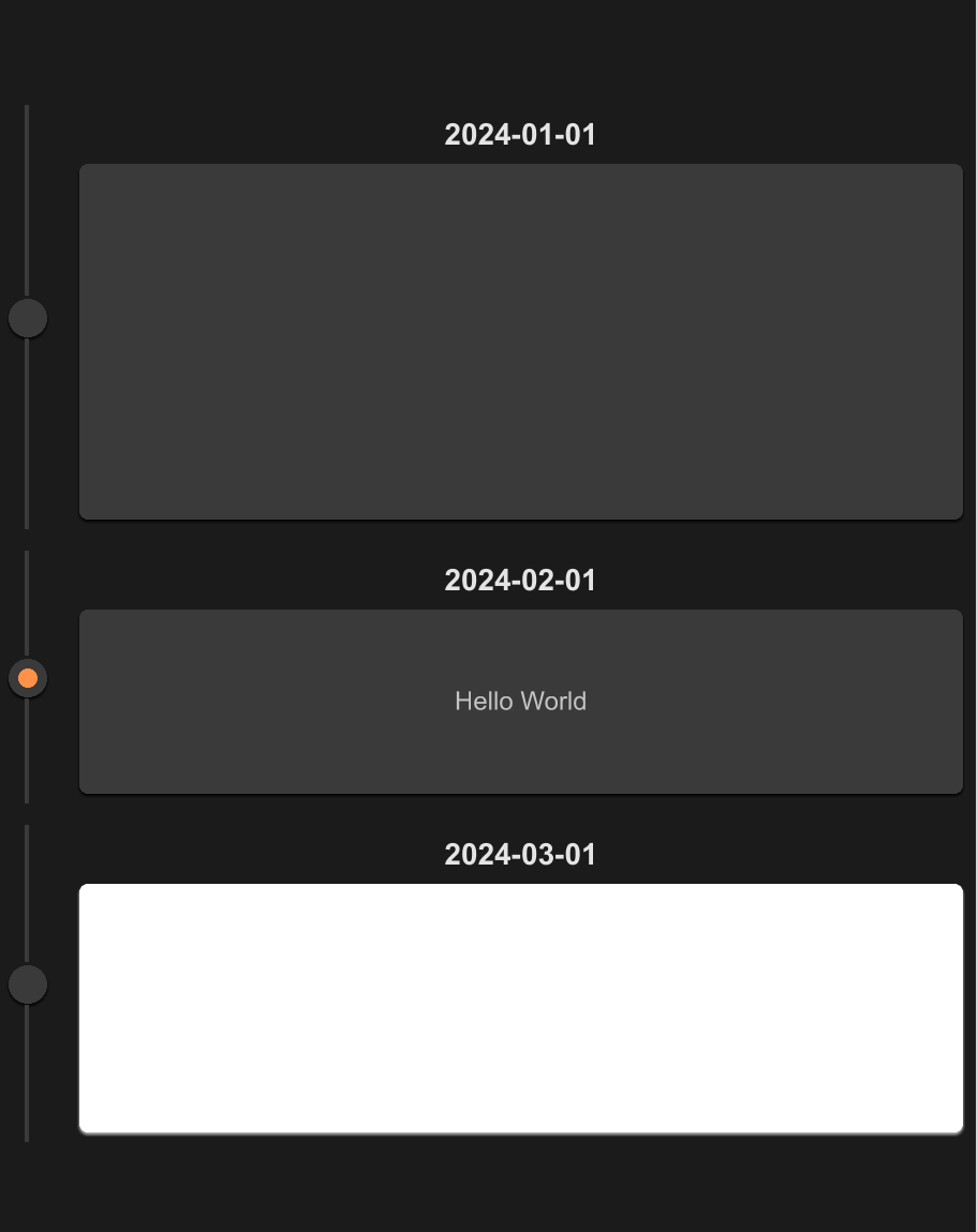
example
#![allow(unused)]
fn main() {
import {SCard,STimeLine,STimeLineItem} from "../../index.slint";


component TestTimeLine {
    height: 600px;
    width: 460px;
    Text {}
    STimeLine {
        width: 100%;
        STimeLineItem {
            id: "001";
            width: parent.width;
            height: root.height / 3;
            theme: Dark;
            date: "2024-01-01";
            SCard {
                height: parent.center-height();
                width: parent.center-width();
            }
        }
        STimeLineItem {
            width: parent.width;
            height: root.height / 5;
            theme: Dark;
            date: "2024-02-01";
            SCard {
                height: parent.center-height();
                width: parent.center-width();
                Text {
                    color: #fff;
                    text: "Hello World";
                }
            }
            clicked => {
                self.active = !self.active;
            }
        }
        STimeLineItem {
            width: parent.width;
            height: root.height / 4;
            theme: Dark;
            date: "2024-03-01";
            SCard {
                theme: Light;
                height: parent.center-height();
                width: parent.center-width();
            }
            clicked(is_active) => {
                debug(is-active);
                self.active = !self.active;
            }
        }
    }
}
}
STimeLine
The outer of Timeline
STimeLineItem
properties
in property <string> id: timeline idin property <Themes> theme: SurrealismUI themein property <string> date: the date of Timelinein property <TextHorizontalAlignment> header-alignment: date display alignmentin property <length> font-size: font sizein-out property <bool> active: is timeline item active or not
functions
pure public function center-height() -> length: get timeline center area heightpure public function center-width() -> length: get timeline center area width
callbacks
callback clicked(bool): is timeline item clicked or not
SCalendar
A calendar component that inherits from SCard. It is designed to display a month view with the ability to navigate and select dates.
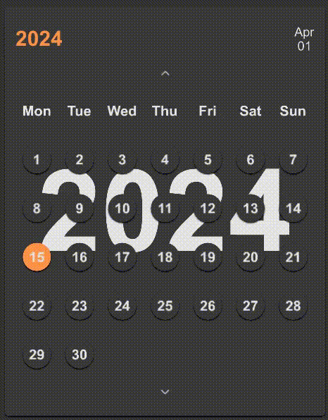
Example
normal
#![allow(unused)]
fn main() {
import {SCalendar} from "../../index.slint";
component TestCalendar inherits Window {
    height: 500px;
    width: 400px;
    background: #333;
    VerticalLayout {
        padding: 16px;
        SCalendar {
            bg-visible: false;
            theme: Dark;
            height: 464px;
            width: 364px;
        }
    }
}

}
define
#![allow(unused)]
fn main() {
component TestCalendar2 inherits Window {
    height: 500px;
    width: 700px;
    background: #333;
    VerticalLayout {
        padding: 16px;
        SCalendar {
            bg-visible: true;
            theme: Info;
            height: 464px;
            width: 664px;
            months: [
                "一月","二月","三月","四月","五月","六月",
                "七月","八月","九月","十月","十一月","十二月"
            ];
            today: {
                year: 2024,
                month: 1,
                day: 1,
            };
            weekdays: [
                "周日","周一","周二","周三","周四","周五","周六"
            ];
        }
    }
}
}
Properties
in-out property <SDate> today: Represents today's date.in property <bool> bg-visible: Linked with the visibility of the background.in-out property <SDate> active-date: Currently active date, synchronized with today's date by default.in-out property <SDate> current-date: The date currently displayed on the calendar, also synchronized with today's date by default.in-out property <[string]> months: List of month names, default values fetched fromDefaultSCalendarProps.months.in-out property <[string]> weekdays: List of weekday names, default values fetched fromDefaultSCalendarProps.weekdays.
Functions
pure function fmt(v: int): Formats a given integer to a string, adding a leading zero if the integer is less than 10.pure function get-line-length(index: int): Calculates the number of days to display in a given week row of the calendar view.pure function get-day(item: int, index: int): Calculates the actual day number to be displayed for a given position in the calendar.pure function get-line-num(): Computes the total number of lines (weeks) required to display the current month in the calendar view.function update(): Updates the leap year status, the number of days in the current month, and adjusts the weekdays for start and end of the month based on any change in the current date.
Callbacks
callback up(SDate): Triggered when the user navigates to the previous month or year.callback down(SDate): Triggered when the user navigates to the next month or year.callback change(SDate): Called when a new date is selected or changed in the calendar.
Form
| name | description |
|---|---|
| SInput(输入框组件) | This is a basic input box, often used in forms, divided into two types: text and password |
| SStar(评分组件) | SStar is a scoring component |
| SSelect(选择框组件) | SSelect is a selector that provides three types of optional input parameter values |
| SLink(链接组件) | SLink is commonly used to represent text connections or sharing |
| SRadio(单选框组件) | SRadio let people select a single item |
| SCheckbox(多选框组件) | SCheckbox let people select multi items |
| SSwitch(选项组件) | SSwitch is a switch used for simple judgment scenarios |
| SSwitchGroup(选项组组件) | SSwitchGroup switch group can contain more switch cases |
| SNumberInput(数字选择器) | A numeric input component that inherits from SCard, designed for inputting numerical values within a specified range. It allows adjustments through increment and decrement actions. |
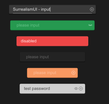
SInput
This is a basic input box, often used in forms, divided into two types: text and password
examples
#![allow(unused)]
fn main() {
import {SText,SInput,SButton, SIcon,SPopup} from "../../index.slint";
import {Themes} from "../../use/index.slint";
import { TextEdit , LineEdit} from "std-widgets.slint";
import { Invoke } from "./invoke_input.slint";

export component TestInput inherits Window {
  height: 500px;
  width: 600px;

  p:=SPopup {
    Invoke {}
  }
  SInput{
    y: 20px;
    placeholder :"please enter your username";
    card-width:300px;
    clearable: true;
    text:"SurrealismUI - input";
    accepted(res)=>{
      debug("content in input:" + res);
      p.open();
    }
    changed(change-res)=>{
      debug(change-res);
    }

  }

  w:=SInput{
    y: 80px;
    theme:Themes.Success;
    type:InputType.password;
    password:true;
  }
  SInput{
    y: 140px;
    card-width: 20rem;
    theme:Themes.Error;
    disabled:true;
    text:"disabled";
  }
  SInput{
    y: 200px;
    card-width: 18rem;
    theme:Themes.Dark;
  }

  SInput{
    y: 260px;
    card-width: 160px;
    theme:Themes.Warning;
    clearable:true;
  }
  SInput{
    y: 320px;
    card-width: 18rem;
    theme:Themes.Info;
    type:InputType.text;
    clearable:true;
    password:true;
    text:"test password";

  }
}
}
properties:
- in property
font-weight : font weight for input - in property
placeholder: default placeholder which you wanna show when no text - in property
theme: Surrealism themes - in property
input-width: Please do not use width to adjust the length of the input box , use this property to instead - in property
font-size: font size - in property
disabled: can input be edited - in property
clearable: can input be cleared - in property
password: can the password input display the password - out property
has-focus : input is focused or not - private property
placeholder-color : placeholder color - in-out property
type : input type (text or password) - in-out property
font-color : font color - in-out property
icon-color : icon color - in-out property
text : the text of the input
functions:
- pure public function get() ->string : get text
- public function set(text:string) : set text
- public function clear() : clear text
- public function select-all() : select all
- public function clear-selection() : clears the selection
- public function cut() : copies the selected text to the clipboard and removes it from the editable area
- public function copy() : copies the selected text to the clipboard
- public function paste() : pastes the text text of the clipboard at the cursor position
callbacks:
- callback accepted(string) : run when pressed down enter key
- callback changed(string) : run when text changed
SStar
SStar is a scoring component
example
#![allow(unused)]
fn main() {
import {SStar,SButton} from "../../index.slint";
import {Themes,UseIcons} from "../../use/index.slint";

component TestWindow inherits Window {
  height: 400px;
  width: 400px;
  SStar {
    y: 20px;
  }
  hs:=SStar {
    score: 2.2;
    y: 60px;
    theme: Error;

  }
  SButton {
    y: 320px;
    x:10px;
    text: "add half";
    clicked => {
      hs.add-half();
    }
  }
  SStar {
    score : 3.8;
    disabled: true;
    y: 100px;
    theme: Success;
  }
  os:=SStar {
    max-score : 7;
    score : 2.8;
    y: 140px;
    theme: Info;
  }
  SButton {
    y: 320px;
    x: 115px;
    text: "add one";
    clicked => {
      os.add-one();
    }
  }
  fs:=SStar {
    max-score : 10;
    score : 7.2;
    y: 180px;
    no-theme:true;
    clicked(whole,half) => {
      t.n = whole;
      t.m = half;
    }
  }
  SButton {
    y: 320px;
    x: 220px;
    text: "get A";
    clicked => {
      fs.full();
    }
  }
  SButton {
    y: 320px;
    x: 305px;
    text: "clear";
    clicked => {
      fs.clear();
    }
  }
  t:=Text{
    y: 250px;
    font-size: 18px;
    in-out property <int> n;
    in-out property <int> m;
    text: "whole stars:"+ n + " half stars:" + m;
  }
}
}
properties
- in property
no-theme : use Surrealism Theme or not - in property
score : the real score - in property
theme : Themes.Primary; - in property
disabled : can be scored if disabled is false - in property
max-score : max score (how many stars you wanna show)
functions
- pure function get-half-stars()->bool : count the number of half stars ⛔
- pure function get-whole-stars()->int : count the number of whole stars ⛔
- pure function get-empty-stars()->int : count the number of empty stars ⛔
- public function full() : star all 👍
- public function clear() : no star 👍
- public function add-one() : add one star 👍
- public function add-half() : add half stars 👍
callbacks
- callback clicked(float,float) : get how many whole stars and half stars
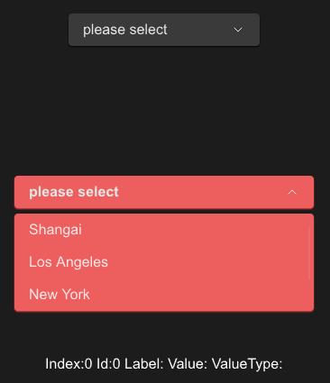
SSelect
SSelect is a selector that provides three types of optional input parameter values
example
#![allow(unused)]
fn main() {
import {SSelect} from "../../index.slint";
import {Themes} from "../../use/index.slint";
import { SButton } from "../../src/button/index.slint";

component TestWindow inherits Window {
  height: 440px;
  width: 400px;
  SSelect {
    y: 20px;
    options: [
      {id:0,label:"Shangai",value:"s01"},
      {id:1,label:"Los Angeles",value:"l02"},
      {id:2,label:"New York",value:"n03"},
      {id:3,label:"Hong Kong",value:"h04"},
    ];
  }

  SSelect {
    y: 200px;
    font-weight: 700;
    is-show: true;
    theme: Error;
    options: [
      {id:0,label:"Shangai",value:"s01"},
      {id:1,label:"Los Angeles",value:"l02"},
      {id:2,label:"New York",value:"n03"},
      {id:3,label:"Hong Kong",value:"h04"},
    ];
    changed(index,label,value)=>{
      debug(index);
      debug(label);
      debug(value);
    }
  }
  t:=Text{
    y: 400px;
    font-size: 16px;
    in-out property <int> index;
    in-out property <int> id;
    in-out property <string> label;
    in-out property <string> vt;
    in-out property <string> value;
    text: @tr("Index:{} Id:{} Label:{} Value:{} ValueType:{}",index,id,label,value,vt);
  }
}
}
properties inherits SCard
- in property
item-font-weight : select item font weight - in property
item-font-size: select item font size - in property
item-font-italic : select item font - in property
item-font-family : select item font - in property <[SOption]> options : select options
- in property
placeholder : select placeholder - in-out property
is-show : select is show or not
functions
- public function open() : open select
- public function close() : close select
- public function toggle() : toggle status (if open then close)
callbacks
- callback changed(int,string,string) : run if you choose an item of list
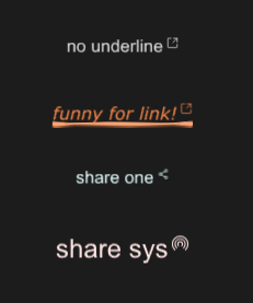
SLink
SLink is commonly used to represent text connections or sharing
example
#![allow(unused)]
fn main() {
import {SLink} from "../../index.slint";
import {Themes,UseIcons} from "../../use/index.slint";

component TestWindow inherits Window {
  height: 420px;
  width: 400px;

  SLink {
    y: 100px;
    theme: Dark;
    text: "no underline";
    underline: false;
  }
  SLink {
    y: 160px;
    funny:true;
    theme: Warning;
    text: "funny for link!";
    font-italic : true;
    font-weight: 200;
    font-family : "Verdana";
  }
  SLink {
    y: 220px;
    theme: Primary;

    icon: @image-url("../../icons/share-one.svg");
    text: "share one";
  }
  SLink {
    y: 280px;
    funny:true;
    theme: Error;
    icon : @image-url("../../icons/share-sys.svg");
    font-size: 24px;
    text: "share sys";
    clicked(link-text)=>{
      debug("share sys!")
    }
  }
}
}
properties
- in property
icon : link share icon - in property
funny : use funny underline - in property
underline : has underline or not - out property
has-hover : link has hover or not - in property
mouse-cursor : link mouse cursor - in property
theme : SurrealismUI theme - in property
font-size : link font size - in-out property
text : link text - in property
font-weight : link font weight - in property
font-italic : link font italic - in property
font-family : link font family - private property
text-color : link text color
callbacks
- callback clicked(string) : run if you click share icon
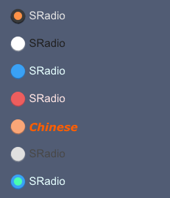
SRadio
SRadio let people select a single item
example
#![allow(unused)]
fn main() {
import {SRadio} from "../../index.slint";
import {Themes} from "../../use/index.slint";
import { SText } from "../../src/text/index.slint";

component TestCollection inherits Window {
  height: 560px;
  width: 600px;
  background: #515c74;
  VerticalLayout {
    spacing: 20px;
    padding: 20px;
    SRadio{
      actived: true;
    }
    SRadio{theme: Light;}
    SRadio{theme: Primary;}
    SRadio {theme: Error;}
    SRadio {
      theme: Warning;
      font-weight: 700;
      text : "Chinese";
      font-color: #ff5e00;
      font-italic: true;
      font-family: "Verdana";
    }
    SRadio {
      theme: Info;
      clicked(text,value,actived) => {
        debug(text);
        debug(value);
        debug(actived);
      }
    }
    SRadio{
      active-color : #4affae;
      theme:Primary;
      actived : true;
    }
  }
}
}
properties inherits Rectangle
- in property
font-weight : display text font weight - in property
font-size: display text font size - in property
font-color : display text font color - in property
font-italic : display text font italic - in property
font-family : display text font family - in property
theme : SurrealismUI theme - in property
card-height: radio height (contain padding) - in property
card-width: radio width (contain padding) - in property
text : display text - in-out property
value : radio value - in-out property
actived : is actived or not - in-out property
active-color: active radio color - in property
padding-type : radio padding type - in property
shadow-type : radio shadow type - in property
border-type : radio border type
functions
callbacks
- callback clicked(string,string,bool) : run if you click the radio
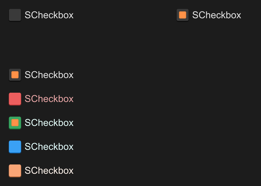
SCheckbox
SCheckbox let people select multi items
example
#![allow(unused)]
fn main() {
import { SCheckbox } from "../../index.slint";
component TestCheckbox {
    height: 400px;
    width: 600px;
    VerticalLayout {
        spacing: 20px;
        padding: 20px;
        HorizontalLayout {
            height: 80px;
            SCheckbox {
                height: 40px;
            }
            SCheckbox {}
        }
        SCheckbox {
            actived: true;
            clicked(text, value, actived) => {
                debug(text,value,actived)
            }
        }

        SCheckbox {
            disabled: true;
            theme: Error;
            clicked(text, value, actived) => {
                debug(text,value,actived)
            }
            pending => {
                debug("pending")
            }
        }

        SCheckbox {
            theme: Success;
        }

        SCheckbox {
            theme: Primary;
        }

        SCheckbox {
            theme: Warning;
        }
    }
}

}
properties inherits Rectangle
in property <int> font-weight: display text font weightin property <length> font-size: display text font sizein property <brush> font-color: display text font colorin property <bool> font-italic: display text font italicin property <string> font-family: display text font familyin property <Themes> theme: SurrealismUI themein property <length> card-height: radio height (contain padding)in property <length> card-width: radio width (contain padding)in property <string> text: display textin-out property <string> value: radio valuein-out property <bool> actived: is actived or notin-out property <brush> active-color: active radio colorin property <PaddingType> padding-type: radio padding typein property <ShadowType> shadow-type: radio shadow typein property <BorderType> border-type: radio border type
functions
callbacks
callback clicked(string,string,bool): run if you click the radio
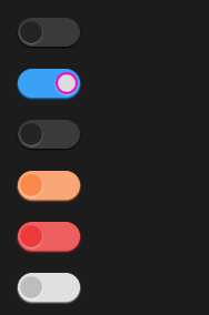
SSwitch
SSwitch is a switch used for simple judgment scenarios
example
#![allow(unused)]
fn main() {
import { SSwitch , SCard} from "../../index.slint";

component TestSwitch inherits Window {
  height: 400px;
  width: 400px;


    VerticalLayout {
      spacing: 20px;
      padding: 20px;
      SSwitch {
      }
      SSwitch {
        active: true;
        theme: Primary;
        switch-background-color:#ddd;
        switch-border-color:#ff00bb;
      }
      SSwitch {
        theme: Dark;
        active: false;
        clicked(active-or-not)=>{
          debug(active-or-not);
        }
      }
      SSwitch {
        theme: Warning;
      }
      SSwitch {
        theme: Error;
      }
      SSwitch {
        theme: Info;
      }
    }
}
}
properties
- in-out property
active : is actived or not - in property
switch-background-color : switch background color - in property
switch-border-color : switch border color - in property
switch-drop-shadow-color switch drop shadow color - in property
switch-height : switch height - in property
switch-width : switch width - in property
switch-padding-type: switch padding type - in property
switch-shadow-type: switch shadow type - in property
switch-border-type : switch border type
callbacks
- callback clicked(bool) : run if you click the switch
SSwitchGroup
SSwitchGroup switch group can contain more switch cases
example
#![allow(unused)]
fn main() {
import { SSwitchGroup } from "../../index.slint";
import { PaddingType } from "../../use/index.slint";
component TestSwitchGroup inherits Window {
  height: 400px;
  width: 400px;
  SSwitchGroup {
  active: "2";
   theme: Primary;
   width: 240px;
   switchs:[
    {label:"Option1",value:"0"},
    {label:"Option2",value:"2"},
    {label:"Option3",value:"3"},
  ];
    clicked(i,name) => {
      debug(i);
      debug(name);
    }
  }
  SSwitchGroup {
    active: "1";
    y: 120px;
    theme:Dark;
    padding-type: PaddingType.Small;
    switchs:[
      {label:"1",value:"0"},
      {label:"2",value:"2"},
      {label:"3",value:"3"},
      {label:"4",value:"1"},
    ];
     clicked(i,name) => {
       debug(i);
       debug(name);
     }
   }
}
}
properties inherits SCard
- in-out property
active : active option value - in-out property <[SOption]> switchs : switch options
- in property
font-size : font size , it will effect switch component height - private property
theme-color : inner theme color
callbacks
- callback clicked(int,SOption) : run if you click the switch , it will back option index and option name
SNumberInput
A numeric input component that inherits from SCard, designed for inputting numerical values within a specified range. It allows adjustments through increment and decrement actions.
example
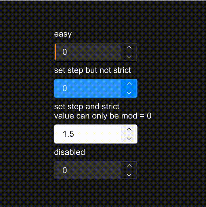
#![allow(unused)]
fn main() {
import { SNumberInput } from "../../index.slint";

component TestNumberInput {
    height: 400px;
    width: 400px;
    HorizontalLayout {
        alignment: center;
        VerticalLayout {
            spacing: 8px;
            alignment: center;
            Text {text:"easy";font-size: 16px;}
            SNumberInput {}
            Text {text:"set step but not strict";font-size: 16px;}
            SNumberInput {
                theme: Primary;
                step: 0.5;
            }
            Text {text:"set step and strict\nvalue can only be mod = 0";font-size: 16px;}
            SNumberInput {
                value: 1.5;
                theme: Light;
                strict: true;
                step: 0.5;
                unexpect(num) => {
                    debug("unexpected number:" + num);
                }
            }
            Text {text:"disabled";font-size: 16px;}
            SNumberInput {
                disabled: true;
            }
        }
    }
}
}
Properties
in-out property <float> minimum: The minimum value that the input can hold, default set to 0.in-out property <float> maximum: The maximum value that the input can hold, default set to 100.in-out property <float> value: The current numerical value of the input, initialized at 0.in-out property <bool> disabled: A boolean indicating whether the input is disabled (non-interactive), default set to false.in property <float> step: The step increment or decrement applied when adjusting the value, set to 1.0.in property <bool> strict: A boolean to enforce strict bounds. If true, inputs outside of the min-max range are not accepted.in-out property <InputType> input-type: Defines the type of numerical input allowed (e.g., integer, decimal), set toInputType.decimal.
Functions
public function up(): Increases the input's value by the step size unless it exceeds the maximum limit or the input is disabled.public function down(): Decreases the input's value by the step size unless it is less than the minimum limit or the input is disabled.
Callbacks
callback accepted(float): Triggered when a new value is input and accepted within the valid range.callback changed(float): Triggered every time the value is changed through user interaction.callback unexpect(float): Triggered when an input is provided that does not conform to the specified restrictions (ifstrictis true).
Nav
| name | description |
|---|---|
| SHeader(页头组件) | SHeader is a simple header component that is generated based on routing information |
| SMenu(菜单组件) | SMenu is a menu bar located on the left side that you can quickly generate through the menu-data property |
| STab(标签页组件) | provide tab functionality, so that users can switch between different content sections |
SHeader
SHeader is a simple header component that is generated based on routing information
example
#![allow(unused)]
fn main() {
import {SHeader} from "../../index.slint";
import {Themes} from "../../use/index.slint";

component TestHeader inherits Window {
  width: 600px;
  height: 400px;
  VerticalLayout {
    padding: 30px;
    spacing: 30px;
    SHeader {
      theme: Dark;
    }
    SHeader {
      theme: Error;
    }
    SHeader {
      theme: Primary;
      font-size: 16px;
      clicked(index,node)=>{
        txt.index = index;
        txt.name = node.label;
      }
    }
    txt:=Text{
      font-size: 18px;
      in-out property <int> index;
      in-out property <string> name;
      text: "route-index:" + index + " route-name:" + name;
    }
  }
}
}
properties inherits SCard
- in property
spacing : the spacing of header - in property <[SOption]> value : route value of header
- in property
source : split icon of header
functions
callbacks
- callback clicked(int,SOption) : run if you click the header
SMenu
SMenu is a menu bar located on the left side that you can quickly generate through the menu-data property
example
#![allow(unused)]
fn main() {
import { SMenu , SIcon} from "../../index.slint";
import {UseIcons} from "../../use/index.slint";

component TestMenu inherits Window {
    height: 600px;
    width: 300px;
    Rectangle {
      x: 1px;
      y: 0;
      height:parent.height;
      width: menu.width;

      menu:=SMenu {
        more-width :180px;
        theme: Dark;
        change(index,item)=>{
          debug(index);
          debug(item);
        }
      }
    }
}
}
properties
- in-out property
icon-box-size : menu item size ⛔ - in-out property
icon-size : menu item icon size ⛔; - in property <[MenuData]> menu-data : menu item data (generate menus through it)
- in-out property
active : which item is active - private property
hover-icon-color : menu item icon color changed when hover
callbacks
- callback change(int,MenuData) : run if you click menu item
[!NOTE]
drop callback:
clicked-accountandclicked-setting
STab
provide tab functionality, so that users can switch between different content sections
example
#![allow(unused)]
fn main() {
import { STab , STabPanel} from "../../index.slint";
import { SText } from "../../src/text/index.slint";
export component TestTab {
    height: 400px;
    width: 400px;
    function show-panel(index:string) {
        panel1.visible = false;
        panel2.visible = false;
        if(index==panel1.index){
            panel1.visible = true;
        }else if(index==panel2.index){
            panel2.visible = true;
        }else{
            panel1.visible = true;
        }
    }
    STab {
        tabs:[
            {label:"test1",value:"0"},
            {label:"test2",value:"1"},
            {label:"test3",value:"2"}
          ];
        changed(kv) => {
            show-panel(kv.value);
        }
        mounted(index) => {
            show-panel(index);
        }
        panel1:=STabPanel {
            index: "0";
            SText {
                text: "This is a Panel -> test1";
            }
        }
        panel2:=STabPanel {
            index: "1";
            SText {
                text: "This is a Panel -> test2";
            }
        }
    }
}
}
properties inherits SCard
- in property
theme : Surrealism Themes - in property
font-size : header font size - in property
font-weight : header font weight - in property <[SOption]> tabs : tab datas
- in-out property
active : active item
functions
- function to-left() : let tab header to pre page
- function to-right() : let tab header to next page
callbacks
- callback change(SOption) : run after you change the tab
- callback mounted(string) : run when init callback happend
STabbar
provide bottom operation bar for page switching
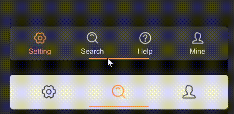
example
#![allow(unused)]
fn main() {
import { STabbar } from "../../index.slint";
import { UseIcons } from "../../use/index.slint";
component TestTabbar {
    height: 160px;
    width: 360px;
    VerticalLayout {
        alignment: space-around;
        // have label name
        STabbar {
            theme: Dark;
            tabs: [
                {
                    id: 0,
                    name: "Setting",
                    icon: UseIcons.icons.Setting-two
                },
                {
                    id: 1,
                    name: "Search",
                    icon: UseIcons.icons.Search
                },
                {
                    id: 2,
                    name: "Help",
                    icon: UseIcons.icons.Help
                },
                {
                    id: 3,
                    name: "Mine",
                    icon: UseIcons.icons.Avatar
                }
            ];
        }
        // no label name
        STabbar {
            theme: Info;
            show-text: false;
            icon-scale: 1.4;
            active: 1;
            tabs: [
                {
                    id: 0,
                    name: "Setting",
                    icon: UseIcons.icons.Setting-two
                },
                {
                    id: 1,
                    name: "Search",
                    icon: UseIcons.icons.Search
                },
                {
                    id: 2,
                    name: "Mine",
                    icon: UseIcons.icons.Avatar
                }
            ];
        }
    }
}
}
properties
in-out property <[MenuData]> tabs: the array of menu data for the tabs.in property <float> icon-scale: the scale factor for the icons.in property <length> tab-size: the size of each tab.in-out property <int> active: the index of the currently active tab.in property <bool> show-text: whether text should be displayed alongside icons.
functions
callbacks
callback change(MenuData): This callback is triggered when the active tab is changed.
SCatalog
The Catalog component is used to display a series of catalog items, each of which can contain labels and icons, and has click interaction functionality.
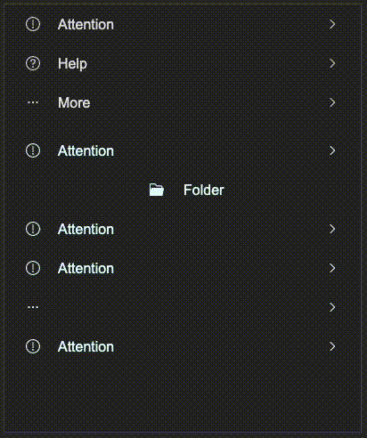
example
#![allow(unused)]
fn main() {
import {SCatalog} from "../../index.slint";
import { CatalogItem, UseIcons } from "../../use/index.slint";
component TestCatalog inherits Window{
    height: 480px;
    width: 400px;
    in property <CatalogItem> base: {
        left-icon: UseIcons.icons.Attention,
        show-left-icon: true,
        label: "Attention",
        show-label: true,
        value: "8uyf23rfgd",
        right-icon: UseIcons.icons.Right,
        show-right-icon: true,
        align: LayoutAlignment.space-between,
    };

    VerticalLayout {
        spacing: 10px;
        SCatalog {
            height: self.real-height;
            items: [
                {
                    left-icon: UseIcons.icons.Attention,
                    show-left-icon: true,
                    label: "Attention",
                    show-label: true,
                    value: "8uyf23rfgd",
                    right-icon: UseIcons.icons.Right,
                    show-right-icon: true,
                    align: LayoutAlignment.space-between,
                },
                {
                    left-icon: UseIcons.icons.Help,
                    show-left-icon: true,
                    label: "Help",
                    show-label: true,
                    value: "8uyf23rfgd1",
                    right-icon: UseIcons.icons.Right,
                    show-right-icon: true,
                    align: LayoutAlignment.space-between,
                },
                {
                    left-icon: UseIcons.icons.More,
                    show-left-icon: true,
                    label: "More",
                    show-label: true,
                    value: "8uyf23rfgd2",
                    right-icon: UseIcons.icons.Right,
                    show-right-icon: true,
                    align: LayoutAlignment.space-between,
                }
            ];
        }
        SCatalog {
            theme: Primary;
            height: self.real-height;
            items: [
                base,
                {
                    left-icon: UseIcons.icons.Folder-filled,
                    show-left-icon: true,
                    label: "Folder",
                    show-label: true,
                    value: "8uyf23rfgd2",
                    right-icon: UseIcons.icons.Right,
                    show-right-icon: false,
                    align: LayoutAlignment.center,
                },
                base,
                base,
                {
                    left-icon: UseIcons.icons.More,
                    show-left-icon: true,
                    label: "More",
                    show-label: false,
                    value: "8uyf23rfgd2",
                    right-icon: UseIcons.icons.Right,
                    show-right-icon: true,
                    align: LayoutAlignment.space-between,
                },
                base,
            ];
            clicked(index, item) => {
                debug(index);
                debug(item.value);
            }
        }
    }
}
}
properties
in property <PaddingType> padding-type: catalog padding typein property <Themes> theme: SurrealismUI themein property <[CatalogItem]> items: catalog items seeCatalogItemin property <length> font-size: catalog label font size, which affect the height of the catalog itemin property <int> font-wight: catalog label font weightin property <string> font-family: catalog label font familyin property <bool> font-italic: catalog label font italicin property <length> spacing: spacing between left icon and labelin property <brush> active-color: catalog item active colorout property <length> real-height: real height of the catalog, you can use it to set the height of the catalog (recommend)in-out property <length> item-height: height of the catalog item
functions
pure function has-active(hover: bool, pressed: bool) -> bool: judge whether the catalog item is active
callbacks
callback clicked(int, CatalogItem): click event callback, return the index of the clicked item and the item object
Feedback
| name | description |
|---|---|
| SResult(结果组件) | SResult helps you easily build a quick prompt , you can build it in popup window |
| SPopup(弹出框组件) | A masked popup layer appears in the current window.And users will not be able to use the popup layer to cover the components under it.Clicking on the popup layer again will close it |
| STip(提示组件) | A tip provides supplemental, contextual information elevated near its target component |
| SLoading(加载组件) | This is a loading component that you can embed anywhere you want to add a loading animation |
| SDialog(对话框组件) | SDialogs are used to confirm messages or events and display text |
| SDrawer(抽屉组件) | Sometimes, the Dialogue component does not meet our needs.Such as your form being too long, or if you need to temporarily display some documents, please use the SDrawer |
| SAlert(通知组件) | SAlert is used to display important prompt information on the page |
| SPopover(气泡卡片组件) | A customizable popover component designed to display contextual information or interactive content, attached to an element and floating above the UI. It supports various positions and can be shown or hidden programmatically. |
Result
SResult helps you easily build a quick prompt , you can build it in popup window
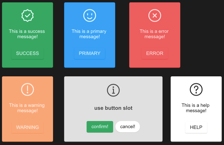
example
#![allow(unused)]
fn main() {
import {SResult} from "../../index.slint";
import {Themes,ResultType} from "../../use/index.slint";
import {DefaultSButtonProps} from "../../themes/index.slint";
export component TestResult inherits Window {
  height: 500px;
  width: 800px;
  SResult {
    x: 10px;
    y: 10px;
  }
  SResult {
    x: 220px;
    y: 10px;
    result-type:ResultType.Primary;
    clicked(e) => {
      //没有设置btns获取的是空SButtonProps
      debug(e);
    }
  }
  SResult {
    x: 220px;
    y: 260px;
    card-width: 300px;
    text : "use button slot";
    font-size: 18px;
    font-weight: 700;
    result-type:ResultType.Info;
    btns:[
      {
        font-weight : DefaultSButtonProps.font-weight,
        font-size : DefaultSButtonProps.font-size,
        font-italic : DefaultSButtonProps.font-italic,
        font-family : DefaultSButtonProps.font-family,
        theme : Themes.Success,
        padding-type : DefaultSButtonProps.padding-type,
        shadow-type : DefaultSButtonProps.shadow-type,
        border-type : DefaultSButtonProps.border-type,
        icon : DefaultSButtonProps.icon,
        show-icon : DefaultSButtonProps.show-icon,
        text : "confirm!",
        letter-spacing : DefaultSButtonProps.letter-spacing,
        clip : DefaultSButtonProps.clip,
        round : DefaultSButtonProps.round
      },
      {
        font-weight : DefaultSButtonProps.font-weight,
        font-size : DefaultSButtonProps.font-size,
        font-italic : DefaultSButtonProps.font-italic,
        font-family : DefaultSButtonProps.font-family,
        theme : Themes.Light,
        padding-type : DefaultSButtonProps.padding-type,
        shadow-type : DefaultSButtonProps.shadow-type,
        border-type : DefaultSButtonProps.border-type,
        icon : DefaultSButtonProps.icon,
        show-icon : DefaultSButtonProps.show-icon,
        text : "cancel!",
        letter-spacing : DefaultSButtonProps.letter-spacing,
        clip : DefaultSButtonProps.clip,
        round : true
      }
    ];
  }
  SResult {
    x: 10px;
    y: 260px;
    result-type:ResultType.Warning;
  }

  SResult {
    x: 440px;
    y: 10px;
    result-type:ResultType.Error;
  }
  SResult {
    x: 580px;
    y: 260px;
    result-type:ResultType.Help;
  }
}
}
properties
- in-out property
btn-text : result button text - in property
icon-size : result icon size - in property <[SButtonProps]> btns : result buttons
- in property
result-type: result type - in-out property
text : text of the result - in-out property
icon : result icon
functions
callbacks
- callback clicked(SButtonProps) : run if you click the button
SPopup
A masked popup layer appears in the current window And users will not be able to use the popup layer to cover the components under it. Clicking on the popup layer again will close it
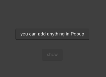
example
import {SPopup,SButton} from "../../index.slint";
import {Themes} from "../../use/index.slint";

component TestPopup inherits Window {
  height: 500px;
  width: 500px;
  background: #535353;

  SButton {
    text: "show";
    clicked => {
      p.open();
      debug("sds1")
    }
  }
  p:=SPopup {
    SButton {
      text: "you can add anything in Popup";
      y: 160px;
    }
  }
}
properties inherits Window
- in-out property
is-show : popup is show or not - in property
theme : SurrealismUI theme - in property
mask-opacity : popup mask opacity
functions
- public function open() : open the popup
- public function close() : close the popup
callbacks
SPopover
A customizable popover component designed to display contextual information or interactive content, attached to an element and floating above the UI. It supports various positions and can be shown or hidden programmatically.
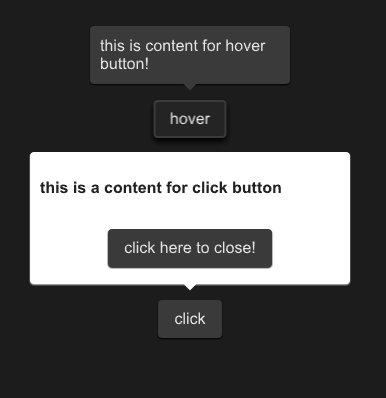
example
#![allow(unused)]
fn main() {
import {SPopover,SButton,SText } from "../../index.slint";
import {Themes} from "../../use/index.slint";
component TestPopover {
  height: 400px;
  width: 400px;
  hover-btn:=SButton {
    y: 100px;
    text: "hover";
  }
  SPopover{
    y: hover-btn.y;
    x: hover-btn.x;
    owner-width:hover-btn.width;
    owner-height:hover-btn.height;
     height:inner.height;
     width: inner.width;
     theme: Themes.Dark;
     position: Right;
     is-show:hover-btn.has-hover;
     inner:= Rectangle{
      height: 46px;
      width: 180px;
      VerticalLayout {
        SText {
          text: "this is content for hover button!";
        }
      }
    }
  }
  click-btn:=SButton {
    y: 300px;
    text: "click";
    clicked => {
      click-pop.clicked();
    }
  }
  click-pop:= SPopover{
    y: click-btn.y;
    x: click-btn.x;
    owner-width: click-btn.width;
    owner-height: click-btn.height;
     height:inner2.height;
     width: inner2.width;
     theme: Themes.Light;
     position: Top;
     inner2:= Rectangle{
      height: 120px;
      width: 300px;
      VerticalLayout {
        alignment: space-around;
        SText {
          font-weight: 700;
          theme: Light;
          text: "this is a content for click button";
        }
        Rectangle {
          SButton {
            text:"click here to close!";
            clicked => {
              click-pop.close();
            }
          }
        }
      }
    }
  }
}
}
Properties
- in-out property
theme : The theme of the popover, allowing customization of its appearance according to the provided theme settings. - in-out property
position : The position of the popover relative to its owner element, determining where the popover is displayed around the owner. - in-out property
is-show : A boolean value indicating whether the popover is currently shown or hidden. - in-out property
owner-height : The height of the owner element to which the popover is attached, used in positioning calculations. - in-out property
owner-width : The width of the owner element to which the popover is attached, used in positioning calculations.
Functions
- public function open() : Shows the popover by setting the is-show property to true.
- public function close() : Hides the popover by setting the is-show property to false.
- pure public function count-x(w:length) -> length : Calculates the X-coordinate for the popover's position based on the specified width and the position relative to the owner.
- pure public function count-y(h:length) -> length : Calculates the Y-coordinate for the popover's position based on the specified height and the position relative to the owner.
Callbacks
- callback clicked: Triggered when the popover is clicked. Toggles the visibility of the popover by changing the is-show property.
STip
A tip provides supplemental, contextual information elevated near its target component
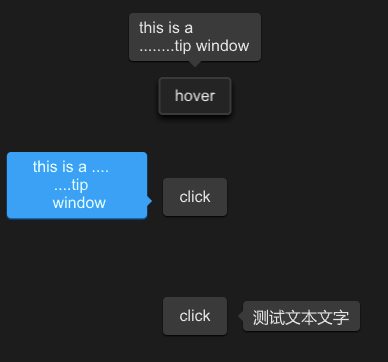
example
#![allow(unused)]
fn main() {
import {STip,SButton } from "../../index.slint";
import {Themes} from "../../use/index.slint";


component TestWindow inherits Window {
  height: 400px;
  width: 400px;
  STip{
    y: 80px;
     height:inner0.height;
     width: inner0.width;
     theme: Dark;
     position:Top;
     text:"this is a \n........tip window";
     is-show:inner0.has-hover;
     inner0:=SButton {
       text: "hover";
     }
   }
  STip{

    height:inner.height;
    width: inner.width;
    theme: Primary;
    position:LeftBottom;
    overflow: TextOverflow.elide;
    tip-width : 120px;
    horizontal-alignment: center;
    text:"this is a ....\n....tip\n window";
    inner:=SButton {
      text: "click";
      clicked => {
        parent.clicked();
      }
    }
  }
  STip{
   y: 300px;
    height:inner2.height;
    width: inner2.width;
    theme: Dark;
    position:Right;
    // wrap: TextWrap.no-wrap;
    text:"测试文本文字";
    font-size: 16px;
    inner2:=SButton {
      text: "click";
      clicked => {
        parent.clicked();
      }
    }
  }

}
}
properties
- in-out property
font-family : tip text font family - in-out property
font-weight : tip text font weight - in-out property
font-size: tip text font size - in-out property
font-color : tip text font color - in-out property
font-italic : tip text font italic - in-out property
theme : tip theme - in-out property
wrap : tip text wrap - in-out property
overflow : tip text overflow - in-out property
letter-spacing : tip text letter spacing - in-out property
horizontal-alignment : tip text horizontal alignment - in-out property
vertical-alignment : tip text vertical alignment - in-out property
position : the position of tip - in-out property
is-show : tip is show or not - in-out property
text : tip text - in property
tip-width : tip width
functions
- public function open() : open the tip
- public function close() : close the tip
- pure public function count-x(w:length) ->length : count x for angle
- pure public function count-y(w:length) ->length : count y for angle
callbacks
- callback clicked() : use to open|close the tip
SLoading
This is a loading component that you can embed anywhere you want to add a loading animation
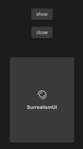
example
#![allow(unused)]
fn main() {
import {SLoading,SButton,SCard} from "../../index.slint";

export component TestLoading inherits Window {
    height: 600px;
    width: 400px;
    SButton {
      y: 100px;
      text: "show";
      clicked => {
        p.open();
      }
    }
    SButton {
      y: 160px;
      text: "close";
      clicked => {
        p.close();
      }
    }
    SCard{
      y: 260px;
      clip: true;
      card-height: 260px;
      card-width: 180px;
      p:=SLoading {
        text : "SurrealismUI";
        font-weight:700;
      }
    }
}
}
properties inherits Window
- in property
font-weight : loading text font weight - in property
font-size: loading text font size - in property
font-color : loading text font color - in property
font-italic : loading text font italic - in property
font-family : loading text font family - in property
loading-icon : loading icon - in-out property
duration : loading animation duration - in property
text : loading text - in-out property
is-show : loading is show or not - in property
theme : SurrealismUI theme - in property
easing : loading animation easing type - in-out property
iteration-count : loading animation iteration count
functions
callbacks
- callback open() : open the loading
- callback close() : close the loading
SDialog
SDialogs are used to confirm messages or events and display text
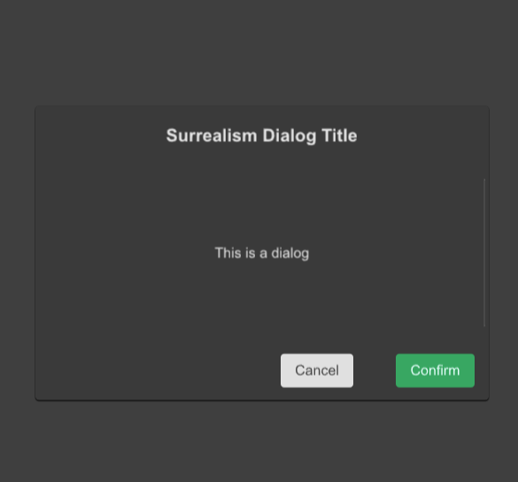
example
#![allow(unused)]
fn main() {
import {SDialog,SButton,STable,STableColumn} from "../../index.slint";
import {Themes} from "../../use/index.slint";

component TestDialog inherits Window {
  height: 600px;
  width: 600px;
  background: #535353;

  SButton {

    text: "show";
    clicked => {
      p.open();
    }
  }


  p:=SDialog {
    dialog-details : "";
    confirm-btn-theme: Success;
    dialog-width:80%;
    dialog-height:52%;
    dialog-title: "Surrealism Dialog Title";
    dialog-title-size: 20px;
    dialog-details-padding-top : 16px;
    // do after confirm btn clicked
    viewport-height : dialog-detail.height;
    // viewport-width : dialog-detail.width;
    confirm=>{
      debug("confirm btn clicked~!")
    }
    dialog-detail:=Rectangle {
      height: 200px;

    }
  }
}
}
properties
- in property
theme : Dialog mask theme - in property
cancel-btn-theme : Dialog cancel button theme - in property
confirm-btn-theme : Dialog confirm button theme - in property
cancel-btn-text : Dialog cancel button text - in property
confirm-btn-text : Dialog confirm button text - in-out property
is-show: Dialog is show or not - in property
mask-opacity : Dialog mask opacity - in property
spacing : Dialog spacing - in property
font-weight : Dialog text font weight - in property
font-size: Dialog text font size; - in property
font-color : Dialog text font color; - in property
font-italic : Dialog text font italic; - in property
font-family : Dialog text font family; - in property
dialog-theme : Dialog theme - in property
dialog-title : Dialog title - in property
dialog-title-size : Dialog title size - in property
dialog-details : Dialog detail text - in property
dialog-height : Dialog height - in property
dialog-title-height : Dialog title height - in property
dialog-view-height : Dialog view height - in property
btn-view-height : Dialog button view height - in property
dialog-width : Dialog width - in property
dialog-details-padding-top: Dialog details padding top - in property
dialog-details-padding-bottom: Dialog details padding bottom - in property
dialog-details-padding-left: Dialog details padding left - in property
dialog-details-padding-right: Dialog details padding right - in property
padding-type: Dialog padding type - in property
shadow-type: Dialog shadow type - in property
border-type : Dialog border type - in property
viewport-height : Dialog viewport height - in property
viewport-width : Dialog viewport width - in property
dialog-details-alignment: Dialog details alignment
functions
- public function open() : open dialog
- public function close() : close dialog
callbacks
- callback confirm() : run after confirm button click
- callback cancel() : run after cancel button click
SDrawer
Sometimes, the Dialogue component does not meet our needs such as your form being too long, or if you need to temporarily display some documents, please use the SDrawer
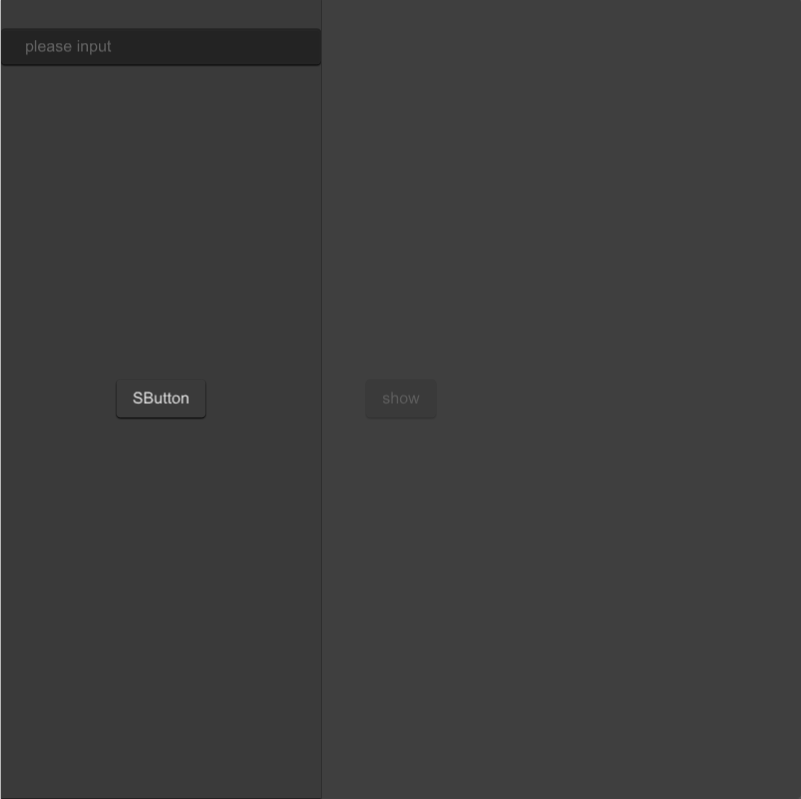
example
#![allow(unused)]
fn main() {
import {SDrawer,SButton, SInput} from "../../index.slint";
import {Themes} from "../../use/index.slint";

component TestDrawer inherits Window {
  height: 800px;
  width: 800px;
  background: #535353;

  SButton {
    text: "show";
    clicked => {
      p.open();

      debug("sds1")
    }
  }


  p:=SDrawer {
    proportion:40%;
    drawer-theme: Dark;
    SButton {
      theme: Dark;
    }
    SInput {
      y: 30px;
     }
  }
}
}
properties
- in property
drawer-theme : drawer theme - in property
drawer-background-color : drawer background color - in property
padding-type: drawer padding type - in property
position : the position of the drawer - in property
proportion : the percentage of the drawer
functions
- function default-height-width()->{height:percent,width:percent} : count drawer height and width ⛔
- function get-position()->{x:length,y:length} : count position ⛔
SAlert
SAlert is used to display important prompt information on the page
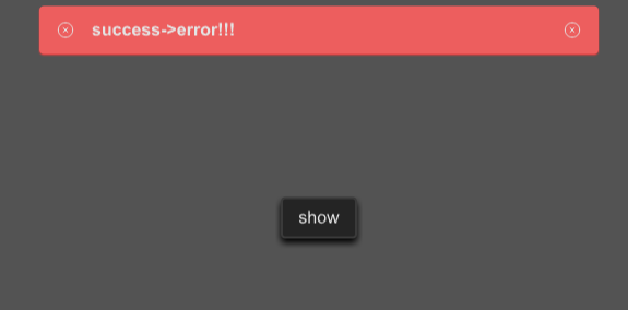
example
#![allow(unused)]
fn main() {
import {SButton, SAlert} from "../../index.slint";
import {ResultType,Themes,UseIcons} from "../../use/index.slint";

component TestAlert inherits Window {
  height: 400px;
  width: 600px;
  background: #535353;

  SButton {
    text: "show";
    clicked => {
      p.error("success->error!!!");

      debug("sds1")
    }
  }


  p:=SAlert {
    result-type:ResultType.Success ;
    text:"this is a success message!";
  }
}
}
properties
- in property
font-weight :font weight; - in property
font-size: font size; - in property
font-color : font color; - in property
font-italic : font italic; - in property
font-family : font family; - in property
overflow : text overflow; - in property
spacing : spacing among icons and text in alert; - in-out property
text : display text in alert; - in-out property
is-show : is alert show or not; - in property
alert-height : alert height; - in-out property
result-type: the result type of the alert; - in property
close-icon : close icon; - in property
icon-size : icon size;
functions
- public function open() : open alert
- public function close() : close alert
- public function success(text:string) : open success alert
- public function warning(text:string) : open warning alert
- public function error(text:string) : open error alert
- public function info(text:string) : open info alert
- public function help(text:string) : open help alert
- public function primary(text:string) : open primary alert
Build-In
If you want to explore more powerful features, please read this chapter; otherwise, you can skip it
Global
ROOT_STYLES
Root Theme Styles
- out property
sur-font : SurrealismUI default font styles - in-out property
tag-size : tag size to STag - out property
font-light : font color - light #fff - out property
font-black : font color - black #000 - in-out property
sur-theme-colors : SurrealismUI theme colors - in-out property
radio-active : radio active color - out property
sur-padding : theme padding - out property
sur-border : theme border - out property <{low:{shadow1:percent,shadow2:percent},high:{shadow1:percent,shadow2:percent}}> sur-opacity : theme opacity
- out property
sur-an-duration : theme animation duration - out property
sur-an-easing : theme animation easing - in-out property
sur-size : the size of components - out property
scroll-bar-width : scroll bar width - out property
sur-shadow : theme shadow - out property
sur-spacing : theme spacing
source code
#![allow(unused)]
fn main() {
export global ROOT_STYLES {
  out property <FontProps> sur-font:{
    font-family:"Arial",
    font-weight:400,
    font-size:16px,
    font-italic:false,
  };
  in-out property <length> tag-size : 12px;
  out property <brush> font-light : #ffffff;
  out property <brush> font-black : #000;
  in-out property <ThemeColor> sur-theme-colors : {
    light:{name:"light",weakest:#F6F6F6,weaker:#E0E0E0,normal:#FFFFFF,deeper:#F5F5F5,deepest:#C8C8C6,font:#212121,opacity:#E0E0E088},
    primary:{name:"primary",weakest:#88D0EC,weaker:#6CB8F7,normal:#3AA1F5,deeper:#1891F3,deepest:#0B86F1,font:#e5ffff,opacity:#3AA1F588},
    success:{name:"success",weakest:#8FCEC4,weaker:#61BF84,normal:#38A762,deeper:#21964A,deepest:#118A3D,font:#e5fffb,opacity:#38A76288},
    info:{name:"info",weakest:#F6F6F6,weaker:#eaeaea,normal:#E0E0E0,deeper:#D2D2D2,deepest:#BDBDBD,font:#484848,opacity:#E0E0E088},
    warning:{name:"warning",weakest:#ffd5bd,weaker:#FCBD99,normal:#F9A677,deeper:#F9955C,deepest:#F8894A,font:#fff4ec,opacity:#F9A67788},
    error:{name:"error",weakest:#e9a7a7,weaker:#f48989,normal:#ed5e5e,deeper:#ed4e4e,deepest:#ed3b3b,font:#ffe5e4,opacity:#ed4e4e88},
    dark:{name:"dark",weakest:#707070,weaker:#616161,normal:#3a3a3a,deeper:#242424,deepest:#000000,font:#e4e4e4,opacity:#42424288}
  };
  in-out property <brush> radio-active : #FF9248;
  out property <ThemePadding> sur-padding : {
    none:{
      padding-top:0,
      padding-bottom:0,
      padding-left:0,
      padding-right:0,
      padding-same:0
    },
    tag:{
      padding-top:4px,
      padding-bottom:4px,
      padding-left:6px,
      padding-right:6px,
      padding-same:5px
    },
    icon:{
      padding-top:2px,
      padding-bottom:2px,
      padding-left:2px,
      padding-right:2px,
      padding-same:2px
    },
    tip:{
      padding-top:6px,
      padding-bottom:6px,
      padding-left:10px,
      padding-right:10px,
      padding-same:8px
    },
    small: {
      padding-top:8px,
      padding-bottom:8px,
      padding-left:12px,
      padding-right:12px,
      padding-same:10px
    },
    normal:{
      padding-top:10px,
      padding-bottom:10px,
      padding-left:16px,
      padding-right:16px,
      padding-same:14px
    },
    large:{
      padding-top:16px,
      padding-bottom:16px,
      padding-left:24px,
      padding-right:24px,
      padding-same:20px
    }
  };

  out property <ThemeBorder> sur-border:{
    none:{border-radius:0px,border-width:0px,border-color:ROOT-STYLES.sur-theme-colors.dark.normal},
    small:{border-radius:2px,border-width:1px,border-color:ROOT-STYLES.sur-theme-colors.dark.normal},
    normal:{border-radius:4px,border-width:2px,border-color:ROOT-STYLES.sur-theme-colors.dark.normal},
    large:{border-radius:8px,border-width:4px,border-color:ROOT-STYLES.sur-theme-colors.dark.normal},
    x-large:{border-radius:12px,border-width:6px,border-color:ROOT-STYLES.sur-theme-colors.dark.normal},
    circle:{
      none:{border-radius:1000in,border-width:0px,border-color:ROOT-STYLES.sur-theme-colors.dark.normal},
      small:{border-radius:1000in,border-width:1px,border-color:ROOT-STYLES.sur-theme-colors.dark.normal},
      normal:{border-radius:1000in,border-width:2px,border-color:ROOT-STYLES.sur-theme-colors.dark.normal},
      large:{border-radius:1000in,border-width:4px,border-color:ROOT-STYLES.sur-theme-colors.dark.normal},
      x-large:{border-radius:1000in,border-width:6px,border-color:ROOT-STYLES.sur-theme-colors.dark.normal},
    }
  };
  out property <{
    low:{shadow1:percent,shadow2:percent},
    high:{shadow1:percent,shadow2:percent}
  }> sur-opacity : {
    low:{shadow1:28%,shadow2:14%},
    high:{shadow1:28%,shadow2:20%}
  };
  out property <duration> sur-an-duration :200ms;
  out property <easing> sur-an-easing : ease-in-out;
  in-out property <SizeProps> sur-size:{
    small:12px,
    normal:16px,
    large:24px,
    largest:48px
  };
  out property <length> scroll-bar-width : 14px;
  out property <ThemeShadow> sur-shadow:{
    low1:{x:0,y:1px,blur:2px},
    low2:{x:0,y:2px,blur:4px},
    low3:{x:0,y:4px,blur:8px},
    high1:{x:0,y:4px,blur:14px},
    high2:{x:0,y:8px,blur:28px},
    high-empty:{x:0,y:0px,blur:28px}
  };
  out property <ThemeSpace> sur-spacing:{
    none:0,
    len20:2px,
    len40:4px,
    len60:6px,
    len80:8px,
    len120:12px,
    len160:16px,
    len200:20px,
    len240:24px,
    len280:28px,
    len320:32px,
    len360:36px,
    len400:40px,
    len440:44px,
    len480:48px,
    len520:52px,
    len560:56px,
  };
}

}
GlobalProps
default global properties
- in-out property
font - in-out property
theme - in-out property
- in property
text-alignment - in-out property
line-height - in-out property
standard-height - in-out property
standard-width - in-out property
standard-icon-size - in-out property
clip - in-out property
active-color
source code
#![allow(unused)]
fn main() {
export global GlobalProps {
  /**global font style */
  in-out property <FontProps> font : {
    font-family : ROOT-STYLES.sur-font.font-family,
    font-size : ROOT-STYLES.sur-font.font-size,
    font-weight : ROOT-STYLES.sur-font.font-weight,
    font-italic : ROOT-STYLES.sur-font.font-italic,
    color : ROOT-STYLES.sur-theme-colors.dark.font
  };
  /**global theme */
  in-out property <Themes> theme : Themes.Dark;
  in-out property <TextActionProps> text-action : {
    wrap : TextWrap.word-wrap,
    overflow : TextOverflow.elide,
    letter-spacing : 0,
  };
  in property <TextAlignmentProps> text-alignment : {
    horizontal-alignment : TextHorizontalAlignment.left,
    vertical-alignment : TextVerticalAlignment.center,
  };
  in-out property <length> line-height : ROOT-STYLES.sur-font.font-size * 1.5;
  in-out property <length> standard-height : UseSurrealismFn.count-height(line-height,ROOT-STYLES.sur-padding.normal.padding-top);
  in-out property <length> standard-width : UseSurrealismFn.count-width(ROOT-STYLES.sur-font.font-size,ROOT-STYLES.sur-padding.normal.padding-left);
  in-out property <length> standard-icon-size : ROOT-STYLES.sur-font.font-size;
  in-out property <bool> clip : true;
  in-out property <brush> active-color : ROOT-STYLES.radio-active;
}
}
UseIcons (Global)
a quicker way to use SurrealismUI built in icons
- icons
DefaultProps
- default props can help you know
SurrealismUIWidgets' props - each widget has default prop
- so you can change the default prop to change the widget
- all default props are exported by schema
- you can find these default props in themes dir
DefaultSAlertProps
#![allow(unused)]
fn main() {
export global DefaultSAlertProps {
  in-out property <int> font-weight : 700;
  in-out property <length> font-size: GlobalProps.font.font-size;
  in-out property <brush> color : GlobalProps.font.color;
  in-out property <bool> font-italic : GlobalProps.font.font-italic;
  in-out property <string> font-family : GlobalProps.font.font-family;
  in-out property <TextOverflow> overflow : TextOverflow.elide;
  in-out property <length> spacing : 16px;
  in-out property <string> text : "this is a alert message!";
  in-out property <bool> is-show : false;
  in-out property <length> alert-height : font-size * 1.5;
  in-out property <ResultType> result-type: ResultType.Success;
  in-out property <image> close-icon : UseIcons.icons.Close-one;
  in-out property <length> icon-size : 16px;
}
}
DefaultSAvatarProps
#![allow(unused)]
fn main() {
export global DefaultSAvatarProps {
  in-out property <length> card-height : avatar-size;
  in-out property <length> card-width : avatar-size;
  in-out property <PaddingType> padding-type: PaddingType.Normal;
  in-out property <ShadowType> shadow-type: ShadowType.Low1;
  in-out property <BorderType> border-type : Circle-Normal;
  in-out property <length> avatar-size : ROOT-STYLES.sur-size.normal * 2;
  in-out property <image> avatar;
  in-out property <image> alt : UseIcons.icons.Avatar;
  in-out property <ImageFit> image-fit : ImageFit.cover;
}
}
DefaultSBadgeProps
#![allow(unused)]
fn main() {
export global DefaultSBadgeProps {
  //font
  in-out property <int> font-weight : GlobalProps.font.font-weight;
  in-out property <length> font-size: GlobalProps.font.font-size - 2px;
  in-out property <brush> font-color : GlobalProps.font.color;
  in-out property <bool> font-italic : GlobalProps.font.font-italic;
  in-out property <string> font-family : GlobalProps.font.font-family;
  //theme
  in-out property <Themes> theme : GlobalProps.theme;
  //hight-width
  in-out property <length> card-height : font-size;
  in-out property <length> card-width : font-size;
  in-out property <string> text : "";
  in-out property <image> icon : UseIcons.icons.Attention;
  in-out property <Position> position : Position.RightTop;
  in-out property <brush> icon-color : GlobalProps.font.color;
}
}
DefaultSButtonProps
#![allow(unused)]
fn main() {
export global DefaultSButtonProps {
  //font
  in-out property <int> font-weight : GlobalProps.font.font-weight;
  in-out property <length> font-size: GlobalProps.font.font-size;
  in-out property <brush> color : GlobalProps.font.color;
  in-out property <bool> font-italic : GlobalProps.font.font-italic;
  in-out property <string> font-family : GlobalProps.font.font-family;
  //theme
  in-out property <Themes> theme : GlobalProps.theme;
  in property <PaddingType> padding-type:PaddingType.Normal;
  in property <ShadowType> shadow-type: ShadowType.Low1;
  in property <BorderType> border-type : BorderType.Normal;
  in property <image> icon;
  in property <bool> show-icon : false;
  in-out property <string> text : "SButton";
  in property <length> letter-spacing : GlobalProps.text-action.letter-spacing;
  in property <bool> clip : GlobalProps.clip;
  in property <bool> round : false;
}
}
DefaultSCalendarProps
#![allow(unused)]
fn main() {
export global DefaultSCalendarProps {
    //font
    in-out property <int> font-weight : GlobalProps.font.font-weight;
    in-out property <length> font-size: GlobalProps.font.font-size;
    in-out property <brush> font-color : GlobalProps.font.color;
    in-out property <bool> font-italic : GlobalProps.font.font-italic;
    in-out property <string> font-family : GlobalProps.font.font-family;
    //theme
    in-out property <Themes> theme : GlobalProps.theme;
    //hight-width
    in-out property <length> card-height : GlobalProps.standard-height;
    in-out property <length> card-width : GlobalProps.standard-width;
    in-out property <PaddingType> padding-type:PaddingType.Normal;
    in-out property <ShadowType> shadow-type: ShadowType.Low1;
    in-out property <BorderType> border-type : BorderType.Normal;
    in-out property <bool> clip : GlobalProps.clip;
    in-out property <SDate> today;
    // zeller algorithm
    // https://en.wikipedia.org/wiki/Zeller%27s_congruence
    in property <bool> bg-visible : false;
    in-out property <SDate> active-date: today;
    in-out property <SDate> current-date: today;
    in-out property <[string]> months: ["Jan","Fab","Mar", "Apr","May","Jun","Jul","Aug","Sep","Oct","Nov","Dec"];
    in-out property <[string]> weekdays : ["Mon", "Tue", "Wed", "Thu", "Fri", "Sat","Sun"];
}
}
DefaultSCardProps
#![allow(unused)]
fn main() {
export global DefaultSCardProps {
  //font
  in-out property <int> font-weight : GlobalProps.font.font-weight;
  in-out property <length> font-size: GlobalProps.font.font-size;
  in-out property <brush> font-color : GlobalProps.font.color;
  in-out property <bool> font-italic : GlobalProps.font.font-italic;
  in-out property <string> font-family : GlobalProps.font.font-family;
  //theme
  in-out property <Themes> theme : GlobalProps.theme;
  //hight-width
  in-out property <length> card-height : GlobalProps.standard-height;
  in-out property <length> card-width : GlobalProps.standard-width;
  in-out property <PaddingType> padding-type:PaddingType.Normal;
  in-out property <ShadowType> shadow-type: ShadowType.Low1;
  in-out property <BorderType> border-type : BorderType.Normal;
  in-out property <bool> clip : GlobalProps.clip;
}
}
DefaultSCarouselProps
#![allow(unused)]
fn main() {
export global DefaultSCarouselProps {
    in-out property <[image]> sources;
    in property <float> fold-strench: 1.1;
    in property <length> fold-width: 42px;
    in property <length> fold-height: 108px;
    in property <ImageFit> fit: ImageFit.preserve;
    in property <bool> focus-main: false;
    in-out property <int> active: 0;
}
}
DefaultSCheckboxProps
#![allow(unused)]
fn main() {
export global DefaultSCheckboxProps {
    in-out property <int> font-weight: GlobalProps.font.font-weight;
    in-out property <length> font-size: GlobalProps.font.font-size;
    in-out property <brush> color: GlobalProps.font.color;
    in-out property <bool> font-italic: GlobalProps.font.font-italic;
    in-out property <string> font-family: GlobalProps.font.font-family;
    in-out property <length> card-height: GlobalProps.font.font-size;
    in-out property <length> card-width: GlobalProps.font.font-size;
    in-out property <Themes> theme: GlobalProps.theme;
    in-out property <brush> active-color: GlobalProps.active-color;
    in-out property <PaddingType> padding-type: PaddingType.Icon;
    in-out property <ShadowType> shadow-type: ShadowType.Low1;
    in-out property <BorderType> border-type: BorderType.Small;
    in-out property <string> text: "SCheckbox";
    in-out property <string> value: "checkbox";
    in-out property <bool> actived: false;
    in-out property <bool> disabled: false;
}

}
DefaultSCollapseProps
#![allow(unused)]
fn main() {
export global DefaultSCollapseProps {
  //font
  in-out property <int> font-weight : GlobalProps.font.font-weight;
  in-out property <length> font-size: GlobalProps.font.font-size;
  in-out property <brush> font-color : GlobalProps.font.color;
  in-out property <bool> font-italic : GlobalProps.font.font-italic;
  in-out property <string> font-family : GlobalProps.font.font-family;
  //theme
  in-out property <Themes> theme : GlobalProps.theme;
  //header
  in-out property <length> header-height : GlobalProps.font.font-size;
  in-out property <string> header-title : "collapse";
  in-out property <PaddingType> header-padding-type:PaddingType.Normal;
  in-out property <ShadowType> header-shadow-type: ShadowType.Low1;
  in-out property <BorderType> header-border-type : BorderType.Normal;
  //details
  in-out property <length> details-height : 120px;
  in-out property <PaddingType> details-padding-type:PaddingType.Normal;
  in-out property <ShadowType> details-shadow-type: ShadowType.Low1;
  in-out property <BorderType> details-border-type : BorderType.Normal;
  in-out property <bool> is-show : false;
  in-out property <image> collapse-icon : UseIcons.icons.Right-one;
}
}
DefaultSCollectionProps
#![allow(unused)]
fn main() {
export global DefaultSCollectionProps {
  in-out property <float> scale : 2;
  in-out property <bool> is-scale : false;
  in-out property <easing> easing : ease-in-out;
  in-out property <duration> duration : 200ms;
}
}
DefaultSDialogProps
#![allow(unused)]
fn main() {
export global DefaultSDialogProps {
  //theme
  in-out property <Themes> theme : Dark;
  in-out property <Themes> cancel-btn-theme : Info;
  in-out property <Themes> confirm-btn-theme : Primary;
  in-out property <string> cancel-btn-text : "Cancel";
  in-out property <string> confirm-btn-text : "Confirm";
  in-out property <bool> is-show:false;
  in-out property <percent> mask-opacity : 80%;
  in-out property <length> spacing : 16px;
  //font
  in-out property <int> font-weight : GlobalProps.font.font-weight;
  in-out property <length> font-size: GlobalProps.font.font-size;
  in-out property <brush> font-color : GlobalProps.font.color;
  in-out property <bool> font-italic : GlobalProps.font.font-italic;
  in-out property <string> font-family : GlobalProps.font.font-family;
  //dialog
  in-out property <Themes> dialog-theme : Dark;
  in-out property <string> dialog-title : "Dialog Title";
  in-out property <length> dialog-title-size : 18px;
  in-out property <string> dialog-details : "This is a dialog info";
  in-out property <float> dialog-height : 0.36;
  in-out property <float> dialog-title-height : 0.2;
  in-out property <float> dialog-view-height : 0.6;
  in-out property <float> btn-view-height : 0.2;
  in-out property <float> dialog-width : 0.6;
  in-out property <length> dialog-details-padding-top : 0;
  in-out property <length> dialog-details-padding-bottom : 0;
  in-out property <length> dialog-details-padding-left : 0;
  in-out property <length> dialog-details-padding-right : 0;
  in-out property <LayoutAlignment> dialog-details-alignment : end;
  in-out property <PaddingType> padding-type:PaddingType.Normal;
  in-out property <ShadowType> shadow-type: ShadowType.Low1;
  in-out property <BorderType> border-type : BorderType.Normal;
}
}
DefaultSDividerProps
#![allow(unused)]
fn main() {
export global DefaultSDividerProps {
  //theme
  in-out property <Themes> theme : GlobalProps.theme;
  in-out property <length> height : 2px;
  in-out property <length> width : 100%;
  in-out property <PaddingType> padding-type:PaddingType.None;
  in-out property <ShadowType> shadow-type: ShadowType.Low1;
  in-out property <BorderType> border-type : BorderType.None;
}
}
DefaultSDrawerProps
#![allow(unused)]
fn main() {
export global DefaultSDrawerProps {
  //theme
  in-out property <Themes> theme : GlobalProps.theme;
  in-out property <bool> is-show : false;
  in-out property <percent> mask-opacity : 80%;
  in-out property <PaddingType> padding-type:PaddingType.Normal;
  in-out property <Themes> drawer-theme : Light;
  in-out property <Position> position : Left;
  in-out property <percent> proportion : 30%;
}
}
DefaultSFileProps
#![allow(unused)]
fn main() {
export global DefaultSFileProps {
  //theme
  in-out property <Themes> theme :GlobalProps.theme;
  in-out property <[SOption]> tabs : [];
  in-out property <[length]> column-width : [];
  //tab
  in-out property <string> font-family : GlobalProps.font.font-family;
  in-out property <int> font-weight : 700;
  in-out property <length> font-size: GlobalProps.font.font-size;
  in-out property <brush> font-color : GlobalProps.font.color;
  in-out property <bool> font-italic : GlobalProps.font.font-italic;
  in-out property <PaddingType> padding-type:PaddingType.Normal;
  in-out property <ShadowType> shadow-type: ShadowType.Low1;
  in-out property <BorderType> border-type : BorderType.Normal;
  in-out property <TextHorizontalAlignment> text-alignment: TextHorizontalAlignment.left;
  // item
  in-out property <[FileItem]> files : [];
  in-out property <string> item-font-family : GlobalProps.font.font-family;
  in-out property <int> item-font-weight : GlobalProps.font.font-weight;
  in-out property <length> item-font-size: GlobalProps.font.font-size;
  in-out property <bool> item-font-italic : GlobalProps.font.font-italic;
  in-out property <PaddingType> item-padding-type:PaddingType.Normal;
}
}
DefaultSHeaderProps
#![allow(unused)]
fn main() {
export global DefaultSHeaderProps {
  in-out property <length> spacing: 2px;
  in-out property <image> source :UseIcons.icons.Right;
  in-out property <[SOption]> options : [
    {label:"src",value:"src"},
    {label:"header",value:"header"},
    {label:"SHeader",value:"SHeader"}
  ];
  in-out property <int> font-weight : GlobalProps.font.font-weight;
  in-out property <length> font-size: GlobalProps.font.font-size;
  in-out property <brush> font-color : GlobalProps.font.color;
  in-out property <bool> font-italic : GlobalProps.font.font-italic;
  in-out property <string> font-family : GlobalProps.font.font-family;
  //theme
  in-out property <Themes> theme : GlobalProps.theme;
  //hight-width
  in-out property <length> card-height : font-size;
  in-out property <length> card-width : GlobalProps.standard-width;
  in-out property <PaddingType> padding-type:PaddingType.Normal;
  in-out property <ShadowType> shadow-type: ShadowType.Low1;
  in-out property <BorderType> border-type : BorderType.Normal;
}
}
DefaultSIconProps
#![allow(unused)]
fn main() {
export global DefaultSIconProps {
  in-out property <MouseCursor> mouse-cursor : MouseCursor.pointer;
  in-out property <Themes> theme : GlobalProps.theme;
  in-out property <length> height : GlobalProps.standard-icon-size;
  in-out property <length> width : GlobalProps.standard-icon-size;
  in-out property <length> padding : 0;
  //image props
  in-out property <image> source;
  in-out property <brush> colorize;
  in property <ImageFit> image-fit : ImageFit.contain;
  in property <ImageRendering> image-rendering : ImageRendering.smooth;
  in-out property <RotationProps> rotation : {
    rotation-angle : 0,
    rotation-origin-x : 0,
    rotation-origin-y: 0,
  };
  in-out property <int> source-clip-x : 0;
  in-out property <int> source-clip-y : 0;
  in-out property <int> source-clip-height : 0;
  in-out property <int> source-clip-width : 0;
}
}
DefaultSInputProps
#![allow(unused)]
fn main() {
export global DefaultSInputProps {
  //font
  in-out property <int> font-weight : GlobalProps.font.font-weight;
  in-out property <length> font-size: GlobalProps.font.font-size;
  in-out property <brush> font-color : GlobalProps.font.color;
  in-out property <bool> font-italic : GlobalProps.font.font-italic;
  in-out property <string> font-family : GlobalProps.font.font-family;
  //theme
  in-out property <Themes> theme : GlobalProps.theme;
  //hight-width
  in-out property <length> card-height : font-size;
  in-out property <length> card-width : 18 * font-size;
  in-out property <PaddingType> padding-type:PaddingType.Normal;
  in-out property <ShadowType> shadow-type: ShadowType.Low1;
  in-out property <BorderType> border-type : BorderType.Normal;

  in-out property <string> placeholder : "please input";
  in-out property <bool> disabled:false;
  in-out property <bool> clearable:false;
  //use eye-icon
  in-out property <bool> password:false;
  in-out property <bool> has-focus:false;
  in-out property <InputType> type : InputType.text;
  in-out property <brush> icon-color;
  in-out property <string> text :"";
}
}
DefaultKeyBoardProps
#![allow(unused)]
fn main() {
export global DefaultKeyBoardProps {
    in property <Themes> theme: Themes.Dark;
    in property <length> font-size: 16px;
    in-out property <KeyBoardType> keyboard-type: KeyBoardType.PhoneNumber;
}
}
DefaultSLinkProps
#![allow(unused)]
fn main() {
export global DefaultSLinkProps {
  in-out property <image> icon : UseIcons.icons.Share;
  in-out property <bool> funny :  false;
  in-out property <bool> underline : true;
  in-out property <MouseCursor> mouse-cursor : pointer;
  in-out property <Themes> theme : GlobalProps.theme;
  in-out property <length> font-size : GlobalProps.font.font-size;
  in-out property <string> text:"";
  in-out property <int> font-weight : 500;
  in-out property <string> font-family : GlobalProps.font.font-family;
  in-out property <bool> font-italic : GlobalProps.font.font-italic;
}
}
DefaultSLoadingProps
#![allow(unused)]
fn main() {
export global DefaultSLoadingProps {
  in-out property <int> font-weight : GlobalProps.font.font-weight;
  in-out property <length> font-size: GlobalProps.font.font-size;
  in-out property <brush> font-color : GlobalProps.font.color;
  in-out property <bool> font-italic : GlobalProps.font.font-italic;
  in-out property <string> font-family : GlobalProps.font.font-family;
  in-out property <float> opacity : 1;
  in-out property <bool> is-show : false;
  in-out property <Themes> theme : GlobalProps.theme;
  in-out property <image> loading-icon : UseIcons.icons.Loading;
  in-out property <duration> duration : 1200ms;
  in-out property <string> text : "Loading ...";
  in-out property <easing> easing : ease-in-out;
  in-out property <int> iteration-count : -1;
}
}
DefaultSMenuProps
#![allow(unused)]
fn main() {
export global DefaultSMenuProps {
  in-out property <Themes> theme : GlobalProps.theme;
  in-out property <length> height : 100%;
  in-out property <length> width : 60px;
  in-out property <length> tip-width;
  in-out property <length> icon-box-size : 60px;
  in-out property <length> icon-size : GlobalProps.font.font-size * 2 ;
  in-out property <string> active : "0";
  in-out property <brush> active-color : GlobalProps.active-color;
  in-out property <[MenuData]> menu-data : [
    {id:"0",icon:UseIcons.icons.FileCode,name:"Code"},
    {id:"1",icon:UseIcons.icons.Search,name:"Search"},
    {id:"2",icon:UseIcons.icons.Help,name:"Help"},
  ];
  in-out property <[MenuData]> sub-menu-data : [
    {id:"2-1",icon:UseIcons.icons.Avatar,name:"User"},
    {id:"2-2",icon:UseIcons.icons.Setting-two,name:"Settings"}
  ];
  in-out property <length> more-height;
  in-out property <length> more-width;
}
}
DefaultSNumberInputProps
#![allow(unused)]
fn main() {
export global DefaultSNumberInputProps {
    //font
    in-out property <int> font-weight : GlobalProps.font.font-weight;
    in-out property <length> font-size: GlobalProps.font.font-size;
    in-out property <brush> font-color : UseSurrealismFn.get-color(root.theme, ColorLevel.Font);
    in-out property <bool> font-italic : GlobalProps.font.font-italic;
    in-out property <string> font-family : GlobalProps.font.font-family;
    //theme
    in-out property <Themes> theme : GlobalProps.theme;
    //hight-width
    in-out property <length> card-height : self.font-size;
    in-out property <length> card-width : GlobalProps.standard-width;
    in-out property <PaddingType> padding-type:PaddingType.Normal;
    in-out property <ShadowType> shadow-type: ShadowType.Low1;
    in-out property <BorderType> border-type : BorderType.Normal;
    in-out property <bool> clip : true;
    in-out property <float> minimum: 0;
    in-out property <float> maximum: 100;
    in-out property <float> value: 0;
    in-out property <bool> disabled : false;
    in property <float> step : 1.0;
    in property <bool> strict : false;
    in-out property <InputType> input-type : InputType.decimal;
}
}
DefaultSPaginationProps
#![allow(unused)]
fn main() {
export global DefaultSPaginationProps {
    in property <Themes> theme: Themes.Dark;
    in-out property <int> active: 0;
    in property <int> page-size: 10;
    in property <int> total: 50;
    in property <image> pre-icon: UseIcons.icons.Left;
    in property <image> next-icon: UseIcons.icons.Right;
    in property <length> size: 18px;
    in property <int> visible-range: 5;
}
}
DefaultSPersonaProps
#![allow(unused)]
fn main() {
export global DefaultSPersonaProps {
  in-out property <string> btn-text : "Click";
  in-out property <[SButtonProps]> btns : [];
  in-out property <image> avatar : @image-url("");
  in-out property <length> avatar-height:130px;
  in-out property <Themes> avatar-theme : GlobalProps.theme;
  in-out property <length> card-width : 200px;
  in-out property <length> spacing : 8px;
  //name
  in-out property <string> name : "SYF20020816";
  in-out property <length> name-height: GlobalProps.font.font-size * 3;
  in-out property <length> name-font-size: GlobalProps.font.font-size + 2px;
  in-out property <int> name-font-weight : 700;
  in-out property <Themes> name-theme: GlobalProps.theme;
  in-out property <string> name-font-family : GlobalProps.font.font-family;
  in-out property <bool> name-font-italic : GlobalProps.font.font-italic;
  //des
  in-out property <string> des : @tr("A Rust | Vue Developer\nEmail:\nsyf20020816@outlook.com");
  in-out property <length> des-height: des-font-size * 1.5 * 3;
  in-out property <length> des-font-size: GlobalProps.font.font-size - 2px;
  in-out property <int> des-font-weight : GlobalProps.font.font-weight;
  in-out property <Themes> des-theme: GlobalProps.theme;
  in-out property <string> des-font-family : GlobalProps.font.font-family;
  in-out property <bool> des-font-italic : GlobalProps.font.font-italic;
}
}
DefaultSPopoverProps
#![allow(unused)]
fn main() {
export global DefaultSPopoverProps {
  in-out property <Themes> theme : GlobalProps.theme;
  in-out property <Position> position : Position.Top;
  in-out property <bool> is-show : false;
  in-out property <length> owner-height;
  in-out property <length> owner-width;
}
}
DefaultSPopupProps
#![allow(unused)]
fn main() {
export global DefaultSPopupProps {
  in-out property <bool> is-show : false;
  in-out property <Themes> theme : GlobalProps.theme;
  in-out property <percent> mask-opacity : 80%;
}
}
DefaultSProgressProps
#![allow(unused)]
fn main() {
export global DefaultSProgressProps {
  //font
  in-out property <int> font-weight : GlobalProps.font.font-weight;
  in-out property <length> font-size: GlobalProps.font.font-size - 2px;
  in-out property <brush> font-color : GlobalProps.font.color;
  in-out property <bool> font-italic : GlobalProps.font.font-italic;
  in-out property <string> font-family : GlobalProps.font.font-family;
  //theme
  in-out property <Themes> theme : GlobalProps.theme;
  //hight-width
  in-out property <length> height : 8px + font-size * 2;
  in-out property <length> width : 100%;
  in-out property <string> text : @tr("now: {}%" , round(progress * 100));
  in-out property <float> progress : 0;
  in-out property <length> stroke-width: 8px;
  in-out property <brush> stroke-color;
  in property <bool> circle:false;
}
}
DefaultSRadioProps
#![allow(unused)]
fn main() {
export global DefaultSRadioProps {
    in-out property <int> font-weight: GlobalProps.font.font-weight;
    in-out property <length> font-size: GlobalProps.font.font-size;
    in-out property <brush> color: GlobalProps.font.color;
    in-out property <bool> font-italic: GlobalProps.font.font-italic;
    in-out property <string> font-family: GlobalProps.font.font-family;
    in-out property <length> card-height: GlobalProps.font.font-size;
    in-out property <length> card-width: GlobalProps.font.font-size;
    in-out property <Themes> theme: GlobalProps.theme;
    in-out property <brush> active-color: GlobalProps.active-color;
    in-out property <PaddingType> padding-type: PaddingType.Icon;
    in-out property <ShadowType> shadow-type: ShadowType.Low1;
    in-out property <BorderType> border-type: BorderType.Small;
    in-out property <string> text: "SRadio";
    in-out property <string> value: "radio";
    in-out property <bool> actived: false;
    in-out property <bool> disabled: false;
}
}
DefaultSResultProps
#![allow(unused)]
fn main() {
export global DefaultSResultProps {
  in-out property <length> card-height : 200px;
  in-out property <length> card-width : 140px;
  in-out property <length> icon-size : 48px;
  in-out property <[SButtonProps]> btns : [];
  in-out property <string> btn-text : "CLICK!";
  in-out property <ResultType> result-type:ResultType.Success;
  in-out property <string> text : "This is a success message!";
  in-out property <PaddingType> padding-type: PaddingType.Normal;
  in-out property <ShadowType> shadow-type: ShadowType.Low1;
  in-out property <BorderType> border-type : BorderType.Normal;
  in-out property <image> icon : UseIcons.icons.Success;
  in-out property <Themes> theme : Success;
  in-out property <int> font-weight : GlobalProps.font.font-weight;
  in-out property <length> font-size: GlobalProps.font.font-size;
  in-out property <brush> color : ROOT-STYLES.sur-theme-colors.success.font;
  in-out property <bool> font-italic : GlobalProps.font.font-italic;
  in-out property <string> font-family : GlobalProps.font.font-family;
}
}
DefaultSSelectProps
#![allow(unused)]
fn main() {
export global DefaultSSelectProps {
  //font
  in-out property <int> font-weight : GlobalProps.font.font-weight;
  in-out property <length> font-size: GlobalProps.font.font-size;
  in-out property <bool> font-italic : GlobalProps.font.font-italic;
  in-out property <string> font-family : GlobalProps.font.font-family;
  in-out property <int> item-font-weight : GlobalProps.font.font-weight;
  in-out property <length> item-font-size: GlobalProps.font.font-size;
  in-out property <bool> item-font-italic : GlobalProps.font.font-italic;
  in-out property <string> item-font-family : GlobalProps.font.font-family;
  //theme
  in-out property <Themes> theme : GlobalProps.theme;
  //hight-width
  in-out property <length> card-height : font-size;
  in-out property <length> card-width : 180px;
  in-out property <PaddingType> padding-type:PaddingType.Normal;
  in-out property <ShadowType> shadow-type: ShadowType.Low1;
  in-out property <BorderType> border-type : BorderType.Normal;
  in-out property <[SOption]> options;
  in-out property <string> placeholder : "please select";
  in-out property <bool> is-show : false;
}
}
DefaultSSwitchProps
#![allow(unused)]
fn main() {
export global DefaultSSwitchProps {
  //container
  in-out property <length> card-height : 6px;
  in-out property <length> card-width : 24px;
  in-out property <PaddingType> padding-type: PaddingType.Normal;
  in-out property <ShadowType> shadow-type: ShadowType.Low1;
  in-out property <BorderType> border-type : BorderType.Small;
  in-out property <bool> active : false;
  in-out property <Themes> theme:GlobalProps.theme;
  //switch-circle
  in-out property <length> switch-height : 6px + ROOT-STYLES.sur-padding.normal.padding-same;
  in-out property <length> switch-width : 6px + ROOT-STYLES.sur-padding.normal.padding-same;
  in-out property <PaddingType> switch-padding-type: PaddingType.None;
  in-out property <ShadowType> switch-shadow-type: ShadowType.Low1;
  in-out property <BorderType> switch-border-type : Normal;
  in-out property <brush> switch-background-color : ROOT-STYLES.sur-theme-colors.dark.deepest;
  in-out property <brush> switch-border-color : ROOT-STYLES.sur-theme-colors.dark.deepest;
  in-out property <color> switch-drop-shadow-color : ROOT-STYLES.sur-theme-colors.dark.weakest;
}
}
DefaultStepProps
#![allow(unused)]
fn main() {
export global DefaultStepProps {
  in property <Themes> theme : Dark;
  in-out property <string> font-family : GlobalProps.font.font-family;
  in-out property <int> font-weight : GlobalProps.font.font-weight;
  in-out property <length> font-size: GlobalProps.font.font-size;
  in-out property <brush> font-color : GlobalProps.font.color;
  in-out property <bool> font-italic : GlobalProps.font.font-italic;
  in-out property <int> active: 1;
  in property <brush> active-color: ROOT-STYLES.sur-theme-colors.primary.normal;
  in property <brush> done-color: ROOT-STYLES.sur-theme-colors.success.normal;
  in property <brush> undone-color: ROOT-STYLES.sur-theme-colors.dark.normal;
  in property <[SStepOption]> options : [];
}
}
DefaultSSwitchProps
#![allow(unused)]
fn main() {
export global DefaultSSwitchProps {
  //container
  in-out property <length> card-height : 6px;
  in-out property <length> card-width : 24px;
  in-out property <PaddingType> padding-type: PaddingType.Normal;
  in-out property <ShadowType> shadow-type: ShadowType.Low1;
  in-out property <BorderType> border-type : BorderType.Small;
  in-out property <bool> active : false;
  in-out property <Themes> theme:GlobalProps.theme;
  //switch-circle
  in-out property <length> switch-height : 6px + ROOT-STYLES.sur-padding.normal.padding-same;
  in-out property <length> switch-width : 6px + ROOT-STYLES.sur-padding.normal.padding-same;
  in-out property <PaddingType> switch-padding-type: PaddingType.None;
  in-out property <ShadowType> switch-shadow-type: ShadowType.Low1;
  in-out property <BorderType> switch-border-type : Normal;
  in-out property <brush> switch-background-color : ROOT-STYLES.sur-theme-colors.dark.deepest;
  in-out property <brush> switch-border-color : ROOT-STYLES.sur-theme-colors.dark.deepest;
  in-out property <color> switch-drop-shadow-color : ROOT-STYLES.sur-theme-colors.dark.weakest;
}
}
DefaultSSwitchGroupProps
#![allow(unused)]
fn main() {
export global DefaultSSwitchGroupProps {
  in-out property <Themes> theme:GlobalProps.theme;
  in-out property <length> card-height : self.font-size / 2;
  in-out property <length> card-width : 140px;
  in-out property <PaddingType> padding-type: PaddingType.Normal;
  in-out property <ShadowType> shadow-type: ShadowType.Low1;
  in-out property <BorderType> border-type : BorderType.None;
  in-out property <string> active ;
  in-out property <[SOption]> switchs : [];
  in-out property <string> font-family : GlobalProps.font.font-family;
  in-out property <int> font-weight : GlobalProps.font.font-weight;
  in-out property <length> font-size: 14px;
  in-out property <bool> font-italic : GlobalProps.font.font-italic;
}
}
DefaultSTabbarProps
#![allow(unused)]
fn main() {
export global DefaultSTabbarProps {
  //font
  in-out property <int> font-weight : GlobalProps.font.font-weight;
  in-out property <length> font-size: 12px;
  in-out property <brush> font-color : GlobalProps.font.color;
  in-out property <bool> font-italic : GlobalProps.font.font-italic;
  in-out property <string> font-family : GlobalProps.font.font-family;
  //theme
  in-out property <Themes> theme : GlobalProps.theme;
  //hight-width
  in-out property <length> card-height :36px;
  in-out property <length> card-width : GlobalProps.standard-width;
  in-out property <PaddingType> padding-type:PaddingType.Normal;
  in-out property <ShadowType> shadow-type: ShadowType.Low1;
  in-out property <BorderType> border-type : BorderType.Normal;
  in-out property <bool> clip : GlobalProps.clip;
  in-out property <[MenuData]> tabs;
  in property <float> icon-scale: 1.66;
  in property <length> tab-size: card-height / icon-scale;
  in-out property <int> active: 0;
  in property <bool> show-text: true;
}
}
DefaultSTableProps
#![allow(unused)]
fn main() {
export global DefaultSTableProps {
  //theme
  in-out property <Themes> theme :GlobalProps.theme;
  in-out property <[SOption]> columns : [];
  in-out property <[length]> column-width : [];
  in-out property <[Themes]> column-themes:[];
  in-out property <length> viewport-height;
  //tab
  in-out property <string> font-family : GlobalProps.font.font-family;
  in-out property <int> font-weight : 700;
  in-out property <length> font-size: GlobalProps.font.font-size;
  in-out property <brush> font-color : GlobalProps.font.color;
  in-out property <bool> font-italic : GlobalProps.font.font-italic;
  in-out property <PaddingType> padding-type:PaddingType.Normal;
  in-out property <ShadowType> shadow-type: ShadowType.Low1;
  in-out property <BorderType> border-type : BorderType.None;
  in-out property <TextHorizontalAlignment> alignment: TextHorizontalAlignment.left;
}
}
DefaultSTableColumnProps
#![allow(unused)]
fn main() {
export global DefaultSTableColumnProps {
  //theme
  in-out property <Themes> theme :GlobalProps.theme;
  in-out property <int> index;
  in-out property <[string]> datas;
  in-out property <length> height;
  in-out property <length> width;
  //tab
  in-out property <string> font-family : GlobalProps.font.font-family;
  in-out property <int> font-weight : GlobalProps.font.font-weight;
  in-out property <length> font-size: GlobalProps.font.font-size;
  in-out property <brush> font-color : GlobalProps.font.color;
  in-out property <bool> font-italic : GlobalProps.font.font-italic;
  in-out property <PaddingType> padding-type:PaddingType.Normal;
  in-out property <ShadowType> shadow-type: ShadowType.Low1;
  in-out property <BorderType> border-type : BorderType.None;
  in-out property <TextHorizontalAlignment> alignment: TextHorizontalAlignment.left;
}
}
DefaultSTagProps
#![allow(unused)]
fn main() {
export global DefaultSTagProps {
  in-out property <string> text : "";
  in property <length> font-size : ROOT-STYLES.tag-size;
  in-out property <int> font-weight : GlobalProps.font.font-weight;
  in-out property <string> font-family : GlobalProps.font.font-family;
  in-out property <bool> font-italic : GlobalProps.font.font-italic;
  in-out property <PaddingType> padding-type : PaddingType.Tag;
  in-out property <BorderType> border-type : BorderType.Normal;
  in-out property <ShadowType> shadow-type : ShadowType.Low1;
  in-out property <Themes> theme : GlobalProps.theme;
}
}
DefaultSTextProps
#![allow(unused)]
fn main() {
export global DefaultSTextProps {
  //font
  in-out property <string> font-family : GlobalProps.font.font-family;
  in-out property <int> font-weight : GlobalProps.font.font-weight;
  in-out property <length> font-size: GlobalProps.font.font-size;
  in-out property <brush> color : GlobalProps.font.color;
  in-out property <bool> font-italic : GlobalProps.font.font-italic;
  //theme
  in-out property <Themes> theme : GlobalProps.theme;
  in-out property <TextWrap> wrap :GlobalProps.text-action.wrap;
  in-out property <TextOverflow> overflow : GlobalProps.text-action.overflow;
  in-out property <length> letter-spacing : GlobalProps.text-action.letter-spacing;
  in-out property <TextHorizontalAlignment> horizontal-alignment : GlobalProps.text-alignment.horizontal-alignment;
  in-out property <TextVerticalAlignment> vertical-alignment : GlobalProps.text-alignment.vertical-alignment;
}
}
DefaultSTimeLineProps
#![allow(unused)]
fn main() {
export global DefaultSTimeLineProps {
    in property <string> id;
    in property <Themes> theme: GlobalProps.theme;
    in property <string> date;
    in property <TextHorizontalAlignment> header-alignment: TextHorizontalAlignment.center;
    in property <length> font-size: 14px;
    in-out property <bool> active;
}
}
DefaultSTipProps
#![allow(unused)]
fn main() {
export global DefaultSTipProps {
  //font
  in-out property <string> font-family : GlobalProps.font.font-family;
  in-out property <int> font-weight : GlobalProps.font.font-weight;
  in-out property <length> font-size: GlobalProps.font.font-size;
  in-out property <brush> font-color : GlobalProps.font.color;
  in-out property <bool> font-italic : GlobalProps.font.font-italic;
  //theme
  in-out property <Themes> theme : GlobalProps.theme;
  in-out property <TextWrap> wrap :word-wrap;
  in-out property <TextOverflow> overflow : GlobalProps.text-action.overflow;
  in-out property <length> letter-spacing : GlobalProps.text-action.letter-spacing;
  in-out property <TextHorizontalAlignment> horizontal-alignment : GlobalProps.text-alignment.horizontal-alignment;
  in-out property <TextVerticalAlignment> vertical-alignment : GlobalProps.text-alignment.vertical-alignment;
  in-out property <Position> position : Top;
  in-out property <bool> is-show : false;
  in-out property <string> text : "default tips";
  in-out property <length> tip-width : 0;
}
}
DefaultSTreeProps
#![allow(unused)]
fn main() {
export global DefaultSTreeProps {
  //font
  in-out property <string> font-family : GlobalProps.font.font-family;
  in-out property <int> font-weight : 700;
  in-out property <length> font-size: GlobalProps.font.font-size;
  in-out property <bool> font-italic : GlobalProps.font.font-italic;
  //font
  in-out property <string> item-font-family : GlobalProps.font.font-family;
  in-out property <int> item-font-weight : GlobalProps.font.font-weight;
  in-out property <length> item-font-size: GlobalProps.font.font-size - 2px;
  in-out property <bool> item-font-italic : GlobalProps.font.font-italic;
  //theme
  in-out property <Themes> theme : GlobalProps.theme;
  //hight-width
  in-out property <length> height : 100%;
  in-out property <length> width : 100%;
  in-out property <PaddingType> padding-type:PaddingType.Normal;
  in-out property <ShadowType> shadow-type: ShadowType.Low1;
  in-out property <BorderType> border-type : BorderType.Normal;
  in-out property <TreeData> tree-data : {
    icon : UseIcons.icons.Folder,
    label: "parent_folder",
    extra:"",
    children:[
      {
        icon:UseIcons.icons.FileCode,
        label:"slint.slint",
        extra:"12KB",
      },
      {
        icon:UseIcons.icons.FileCode,
        label:"surrealism.slint",
        extra:"126KB",
      }
    ]
  };
}
}
DefaultSCatalogProps
#![allow(unused)]
fn main() {
export global DefaultSCatalogProps {
    in property <PaddingType> padding-type: PaddingType.Normal;
    in property <Themes> theme: GlobalProps.theme;
    in property <[CatalogItem]> items;
    in property <length> font-size: GlobalProps.font.font-size;
    in property <int> font-wight: GlobalProps.font.font-weight;
    in property <string> font-family: GlobalProps.font.font-family;
    in property <bool> font-italic: GlobalProps.font.font-italic;
    in property <length> spacing;
    in property <brush> active-color;
    out property <length> real-height: items.length * root.item-height;
    in-out property <length> item-height;
}
}
DefaultSSliderProps
#![allow(unused)]
fn main() {
export global DefaultSSliderProps {
    in property <Orientation> orientation: Orientation.horizontal;
    in property <Themes> theme :DefaultSProgressProps.theme;
    in-out property <float> progress : 0;
    in-out property <length> stroke-width: DefaultSProgressProps.stroke-width;
    in-out property <brush> stroke-color: UseSurrealismFn.get-color(root.theme, ColorLevel.Normal);
    in property <length> border-radius: 6px;
}
}
SurrealismUI ComponentSchema
export global ComponentSchema {}
ComponentSchema is a global which can export all default SurrealismUI widget prop
you can use this global to generate half dyn widget
Example
In this example, we use SButtonProps to make a error-btn and then send into DynWidget.
Since SButtonProps is a property description of SButton, SButton can use the passed in properties to change its own properties at will
It can let you change widget props easily when use Rust, C++, JS
#![allow(unused)]
fn main() {
import { ComponentSchema } from "../../../themes/index.slint";
import { SButtonProps, Themes } from "../../../use/index.slint";
import { SButton } from "../../../index.slint";


component DynWidget {
    in property <[SButtonProps]> btns;

    VerticalLayout {
      spacing: 20px;
      Text{
        text: "Dynamic Widget: Buttons";
      }
      for btn in btns: SButton {
        text: btn.text;
        theme: btn.theme;
      }
    }
}


export component TestDyn inherits Window {
  height: 400px;
  width: 400px;
  in property <SButtonProps> error-btn: {
    text:"Error Button",
    theme: Themes.Error
  };
  DynWidget {
    btns: [
      error-btn,
      ComponentSchema.button,
    ];
  }
}


}
Struct Enum
FontProps
- font-family (string) : font family
- font-size (length) : font size (16px👍)
- font-weight (int) : font weight [100,900] 500==Normal
- font-italic (bool) : font italic
- color (brush) : font color
ThemeColor
- light (ColorProps) : theme light
- primary (ColorProps) : theme primary
- success (ColorProps) : theme success
- info (ColorProps) : theme info
- warning (ColorProps) : theme warning
- error (ColorProps) : theme error
- dark (ColorProps) : theme dark
ColorProps
- name (string) : color name
- weakest (brush) : weakest color
- weaker (brush) : weaker color
- normal (brush) : normal color
- deeper (brush) : deeper color
- deepest (brush) : deepest color
- font (brush) : font color
- opacity (brush) : opacity color
ColorLevel
- Weakest
- Weaker
- Normal
- Deeper
- Deepest
- Font
- Opacity
UseIcons (Global)
a quicker way to use SurrealismUI built in icons
- icons
ThemePadding
- none (PaddingProps) : theme padding none
- tip (PaddingProps) : theme padding tip
- tag (PaddingProps) : theme padding tag
- icon (PaddingProps) : theme padding icon
- small (PaddingProps) : theme padding small
- normal (PaddingProps) : theme padding normal
- large (PaddingProps) : theme padding large
PaddingProps
- padding-top (length) : padding top
- padding-bottom: (length) : padding bottom
- padding-left (length) : padding left
- padding-right (length) : padding right
- padding-same (length) : padding
ThemeBorder
- none (BorderProps) : no border
- small (BorderProps) : small border
- normal (BorderProps) : normal border
- large (BorderProps) : large border
- x-large (BorderProps) : x-large border
- circle:
({ none:BorderProps, small:BorderProps, normal:BorderProps, large:BorderProps, x-large:BorderProps, }): circle border
BorderProps
- border-radius (length) : border radius
- border-width (length) : border width
- border-color (brush) : color of border
SizeProps
- small (length) : size small
- normal (length) : size normal
- large (length) : size large
- largest (length) : size largest
ThemeShadow
- low1 (ShadowProps) : lowest shadow
- low2 (ShadowProps) : lower shadow
- low3 (ShadowProps) : low shadow
- high1 (ShadowProps) : high shadow
- high2 (ShadowProps) : higher shadow
- high-empty (ShadowProps) : high blur but no x and y shadow
ShadowProps
- x (length) : shadow x
- y (length) : shadow y
- blur (length) : shadow blur
ThemeSpace
- none (length) : spacing when width == none(0px)
- len20 (length) : spacing when width == 20px
- len40 (length) : spacing when width == 40px
- len60 (length) : spacing when width == 60px
- len80 (length) : spacing when width == 80px
- len120 (length) : spacing when width == 120px
- len160 (length) : spacing when width == 160px
- len200 (length) : spacing when width == 200px
- len240 (length) : spacing when width == 240px
- len280 (length) : spacing when width == 280px
- len320 (length) : spacing when width == 320px
- len360 (length) : spacing when width == 360px
- len400 (length) : spacing when width == 400px
- len440 (length) : spacing when width == 440px
- len480 (length) : spacing when width == 480px
- len520 (length) : spacing when width == 520px
- len560 (length) : spacing when width == 560px
SOption
#![allow(unused)]
fn main() {
export struct SOption {label:string,value:string}
}
ResultType
#![allow(unused)]
fn main() {
export enum ResultType{
  Primary,
  Success,
  Info,
  Error,
  Warning,
  Help
}
}
Position
#![allow(unused)]
fn main() {
export enum Position {
  Left,
  LeftTop,
  LeftBottom,
  Right,
  RightTop,
  RightBottom,
  Top,
  TopLeft,
  TopRight,
  Bottom,
  BottomLeft,
  BottomRight
}
}
SDate
#![allow(unused)]
fn main() {
export struct SDate{
    year: int,
    month: int,
    day: int,
    hour: int,
    minute: int,
    second: int,
}
}
SStepOption
#![allow(unused)]
fn main() {
export struct SStepOption {
  label: string,
  value: string,
  info: string,
}
}
SAlertProps
#![allow(unused)]
fn main() {
export struct SAlertProps {
  font-weight : int,
  font-size: length,
  color : brush,
  font-italic : bool,
  font-family : string,
  overflow : TextOverflow,
  spacing : length,
  text : string,
  is-show : bool,
  alert-height : length,
  result-type: ResultType,
  close-icon : image,
  icon-size : length,
}
}
SAvatarProps
#![allow(unused)]
fn main() {
export struct SAvatarProps {
  card-height : length,
  card-width : length,
  padding-type: PaddingType,
  shadow-type: ShadowType,
  border-type : BorderType,
  avatar-size : length,
  avatar : image,
  alt : image,
  image-fit : ImageFit,
}
}
SBadgeProps
#![allow(unused)]
fn main() {
export struct SBadgeProps {
  //font
  font-weight : int,
  font-size: length,
  font-color : brush,
  font-italic : bool,
  font-family : string,
  //theme
  theme : Themes,
  //hight-width
  card-height : length,
  card-width : length,
  text : string,
  icon : image,
  position :Position,
  icon-color : brush,
}
}
SButtonProps
#![allow(unused)]
fn main() {
export struct SButtonProps {
  font-weight : int,
  font-size : length,
  color : brush,
  font-italic : bool,
  font-family : string,
  theme : Themes,
  padding-type : PaddingType,
  shadow-type : ShadowType,
  border-type : BorderType,
  icon : image,
  show-icon : bool,
  text : string,
  letter-spacing : length,
  clip : bool,
  round : bool
}
}
SCalendarProps
#![allow(unused)]
fn main() {
export struct SCalendarProps {
    //font
    font-weight : int,
    font-size: length,
    font-color : brush,
    font-italic : bool,
    font-family : string,
    //theme
    theme : Themes,
    //hight-width
    card-height : length,
    card-width : length,
    padding-type: PaddingType,
    shadow-type: ShadowType,
    border-type : BorderType,
    clip : bool,
    today: SDate,
    // zeller algorithm
    // https://en.wikipedia.org/wiki/Zeller%27s_congruence
    bg-visible : bool,
    active-date: SDate,
    current-date: SDate,
    months: [string],
    weekdays :[string],
  }
}
SCardProps
#![allow(unused)]
fn main() {
export struct SCardProps {
  //font
  font-weight : int,
  font-size: length,
  font-color : brush,
  font-italic : bool,
  font-family : string,
  //theme
  theme : Themes,
  //hight-width
  card-height : length,
  card-width : length,
  padding-type: PaddingType,
  shadow-type: ShadowType,
  border-type : BorderType,
  clip : bool,
}
}
SCollapseProps
#![allow(unused)]
fn main() {
export struct SCollapseProps {
  //font
  font-weight : int,
  font-size: length,
  font-color : brush,
  font-italic : bool,
  font-family : string,
  //theme
  theme : Themes,
  //header
  header-height : length,
  header-title : string,
  header-padding-type: PaddingType,
  header-shadow-type: ShadowType,
  header-border-type : BorderType,
  //details
  details-height : length,
  details-padding-type: PaddingType,
  details-shadow-type: ShadowType,
  details-border-type : BorderType,
  is-show : bool,
  collapse-icon : image,
}
}
SCarouselProps
#![allow(unused)]
fn main() {
export struct SCarouselProps {
    sources: [image],
    fold-strench: float,
    fold-width: length,
    fold-height: length,
    fit: ImageFit,
    focus-main: bool,
    active: int,
}
}
SCheckboxProps
#![allow(unused)]
fn main() {
export struct SCheckboxProps {
  font-weight : int,
  font-size: length,
  color : brush,
  font-italic : bool,
  font-family : string,
  card-height : length,
  card-width : length,
  theme : Themes,
  active-color: brush,
  padding-type: PaddingType,
  shadow-type: ShadowType,
  border-type : BorderType,
  text : string,
  value : string,
  actived : bool,
  disabled : bool,
}
}
SCollectionProps
#![allow(unused)]
fn main() {
export struct SCollectionProps {
  scale : float,
  is-scale : bool,
  easing : easing,
  duration : duration,
}
}
SDialogProps
#![allow(unused)]
fn main() {
export struct SDialogProps {
  //theme
  theme : Themes,
  cancel-btn-theme : Themes,
  confirm-btn-theme : Themes,
  cancel-btn-text : string,
  confirm-btn-text : string,
  is-show: bool,
  mask-opacity : percent,
  spacing : length,
  //font
  font-weight : int,
  font-size: length,
  font-color : brush,
  font-italic : bool,
  font-family : string,
  //dialog
  dialog-theme : Themes,
  dialog-title : string,
  dialog-title-size : length,
  dialog-details : string,
  dialog-height : float,
  dialog-title-height : float,
  dialog-view-height : float,
  btn-view-height : float,
  dialog-width : float,
  dialog-details-padding-top : length,
  dialog-details-padding-bottom : length,
  dialog-details-padding-left : length,
  dialog-details-padding-right : length,
  dialog-details-alignment : LayoutAlignment,
  padding-type:PaddingType,
  shadow-type: ShadowType,
  border-type : BorderType,
}
}
SDividerProps
#![allow(unused)]
fn main() {
export struct SDividerProps {
  //theme
  theme : Themes,
  height : length,
  width : length,
  padding-type: PaddingType,
  shadow-type: ShadowType,
  border-type : BorderType,
}
}
SDrawerProps
#![allow(unused)]
fn main() {
export struct SDrawerProps {
  theme : Themes,
  is-show : bool,
  mask-opacity : percent,
  padding-type: PaddingType,
  drawer-theme : Themes,
  position : Position,
  proportion : percent,
}
}
FileItem
#![allow(unused)]
fn main() {
export struct FileItem {
  icon:image,
  name:string,
  datetime:string,
  file-type:string,
  size:string,
}
}
SFileProps
#![allow(unused)]
fn main() {
export struct SFileProps {
  //theme
  theme : Themes,
  tabs : [SOption],
  column-width : [length],
  //tab
  font-family : string,
  font-weight : int,
  font-size: length,
  font-color : brush,
  font-italic : bool,
  padding-type:PaddingType,
  shadow-type: ShadowType,
  border-type : BorderType,
  text-alignment: TextHorizontalAlignment,
  // item
  files : [FileItem],
  item-font-family : string,
  item-font-weight : int,
  item-font-size: length,
  item-font-italic : bool,
  item-padding-type:PaddingType,
}
}
SHeaderProps
#![allow(unused)]
fn main() {
export struct SHeaderProps {
  spacing: length,
  source : image,
  options : [SOption],
  font-weight : int,
  font-size: length,
  font-color : brush,
  font-italic : bool,
  font-family : string,
  //theme
  theme : Themes,
  //hight-width
  card-height : length,
  card-width : length,
  padding-type: PaddingType,
  shadow-type: ShadowType,
  border-type : BorderType,
}
}
Icons
#![allow(unused)]
fn main() {
struct Icons {
  Null:image,
  Loading:image,
  Avatar:image,
  Success:image,
  Smiling_face:image,
  Info:image,
  Close_one:image,
  Attention:image,
  Help:image,
  Share:image,
  Up:image,
  Down:image,
  Down_one:image,
  Right:image,
  Right_one:image,
  Link_left:image,
  Preview_close:image,
  Preview_open:image,
  Close_one:image,
  Setting_two:image,
  Folder:image,
  Folder_filled:image,
  FileCode:image
}
}
IconProps
#![allow(unused)]
fn main() {
struct IconProps {
  name:string,
  source:image
}
}
SIconProps
#![allow(unused)]
fn main() {
struct SIconProps {
  mouse-cursor : MouseCursor,
  theme : Themes,
  height : length,
  width : length,
  padding : length,
  //image props
  source : image,
  colorize : brush,
  image-fit : ImageFit,
  image-rendering : ImageRendering,
  rotation : RotationProps,
  source-clip-x : int,
  source-clip-y : int,
  source-clip-height : int,
  source-clip-width : int
}
}
SInputProps
#![allow(unused)]
fn main() {
export struct SInputProps {
  //font
  font-weight : int,
  font-size: length,
  font-color : brush,
  font-italic : bool,
  font-family : string,
  //theme
  theme : Themes,
  //hight-width
  card-height : length,
  card-width : length,
  padding-type:PaddingType,
  shadow-type: ShadowType,
  border-type : BorderType,
  placeholder : string,
  disabled:bool,
  clearable:bool,
  //use eye-icon
  password:bool,
  has-focus:bool,
  type : InputType,
  icon-color : brush,
  text : string,
}
}
KeyBoardType
#![allow(unused)]
fn main() {
export enum KeyBoardType {
    PhoneAlpha,
    PhoneNumber,
    Computer,
}
}
SKeyItem
#![allow(unused)]
fn main() {
export struct SKeyItem {
    label: string,
    value: KeyItems
}
}
SKeyBoardProps
#![allow(unused)]
fn main() {
export struct SKeyBoardProps {
    theme: Themes,
    font-size:length,
    keyboard-type: KeyBoardType,
}
}
SLinkProps
#![allow(unused)]
fn main() {
export struct SLinkProps {
  icon : image,
  funny :  bool,
  underline : bool,
  mouse-cursor : MouseCursor,
  theme : Themes,
  font-size : length,
  text:string,
  font-weight : int,
  font-family : string,
  font-italic : bool,
}
}
SLoadingProps
#![allow(unused)]
fn main() {
export struct SLoadingProps {
  font-weight : int,
  font-size: length,
  font-color : brush,
  font-italic : bool,
  font-family : string,
  opacity : float,
  is-show : bool,
  theme : Themes,
  loading-icon : image,
  duration : duration,
  text : string,
  easing : easing,
  iteration-count : int,
}
}
MenuData
#![allow(unused)]
fn main() {
export struct MenuData {
  id:string,
  icon : image,
  name : string,
}
}
SMenuProps
#![allow(unused)]
fn main() {
export struct SMenuProps {
  theme : Themes,
  height : length,
  width :length,
  tip-width: length,
  icon-box-size : length,
  icon-size : length ,
  active : string,
  active-color : brush,
  menu-data : [MenuData],
  sub-menu-data : [MenuData],
  more-height : length,
  more-width : length,
}
}
SNumberInputProps
#![allow(unused)]
fn main() {
export struct SNumberInputProps {
  //font
  font-weight : int,
  font-size: length,
  font-color : brush,
  font-italic : bool,
  font-family : string,
  //theme
  theme : Themes,
  //hight-width
  card-height : length,
  card-width : length,
  padding-type: PaddingType,
  shadow-type: ShadowType,
  border-type : BorderType,
  clip : bool,
  minimum: float,
  maximum: float,
  value: float,
  disabled : bool,
  step : float,
  strict : bool,
  input-type : InputType,
}
}
SPaginationProps
#![allow(unused)]
fn main() {
export struct SPaginationProps {
    theme: Themes,
    active: int,
    page-size: int,
    total: int,
    pre-icon: image,
    next-icon: image,
    size: length,
    visible-range: int,
}
}
SPersonaProps
#![allow(unused)]
fn main() {
export struct SPersonaProps {
  btn-text : string,
  btns : [SButtonProps],
  //avatar
  avatar : image,
  avatar-height: length,
  avatar-theme : Themes,
  card-width : length,
  spacing : length,
  //name
  name : string,
  name-height: length,
  name-font-size: length,
  name-font-weight : int,
  name-theme: Themes,
  name-font-family: string,
  name-font-italic: bool,
  //des
  des : string,
  des-height: length,
  des-font-size: length,
  des-font-weight : int,
  des-theme: Themes,
  des-font-family: string,
  des-font-italic: bool,
}
}
SPopoverProps
#![allow(unused)]
fn main() {
export struct SPopoverProps {
  theme : Themes,
  position : Position,
  is-show : bool,
  owner-height:length,
  owner-width:length
}
}
SPopupProps
#![allow(unused)]
fn main() {
export struct SPopupProps {
  is-show : bool,
  theme : Themes,
  mask-opacity : percent,
}
}
SProgressProps
#![allow(unused)]
fn main() {
export struct SProgressProps {
  //font
  font-weight : int,
  font-size: length,
  font-color : brush,
  font-italic : bool,
  font-family : string,
  //theme
  theme : Themes,
  //hight-width
  height : length,
  width : length,
  text : string,
  progress : float,
}
}
SRadioProps
#![allow(unused)]
fn main() {
export struct SRadioProps {
  font-weight : int,
  font-size: length,
  color : brush,
  font-italic : bool,
  font-family : string,
  card-height : length,
  card-width : length,
  theme : Themes,
  active-color: brush,
  padding-type: PaddingType,
  shadow-type: ShadowType,
  border-type : BorderType,
  text : string,
  value : string,
  actived : bool,
  disabled: bool,
}
}
SResultProps
#![allow(unused)]
fn main() {
export struct SResultProps {
  card-height : length,
  card-width : length,
  icon-size : length,
  btns : [SButtonProps],
  btn-text : string,
  result-type: ResultType,
  text : string,
  padding-type: PaddingType,
  shadow-type: ShadowType,
  border-type : BorderType,
  icon : image,
  theme : Themes,
}
}
SSelectProps
#![allow(unused)]
fn main() {
export struct SSelectProps {
  //font
  font-weight : int,
  font-size: length,
  font-italic : bool,
  font-family : string,
  item-font-weight : int,
  item-font-size: length,
  item-font-italic : bool,
  item-font-family : string,
  //theme
  theme : Themes,
  //hight-width
  card-height : length,
  card-width : length,
  padding-type:PaddingType,
  shadow-type: ShadowType,
  border-type : BorderType,
  options : [SOption],
  placeholder : string,
  is-show : bool,
}
}
SStepProps
#![allow(unused)]
fn main() {
export struct SStepProps {
  theme : Themes,
  font-family : string,
  font-weight : int,
  font-size: length,
  font-color : brush,
  font-italic : bool,
  active: int,
  active-color: brush,
  done-color: brush,
  undone-color: brush,
  options : [SStepOption],
}
}
SSwitchProps
#![allow(unused)]
fn main() {
export struct SSwitchProps {
  //container
  card-height : length,
  card-width : length,
  padding-type: PaddingType,
  shadow-type: ShadowType,
  border-type : BorderType,
  active : bool,
  theme: Themes,
  //switch-circle
  switch-height : length,
  switch-width : length,
  switch-padding-type: PaddingType,
  switch-shadow-type: ShadowType,
  switch-border-type : BorderType,
  switch-background-color : brush,
  switch-border-color : brush,
  switch-drop-shadow-color : color,
}
}
SSwitchGroupProps
#![allow(unused)]
fn main() {
export struct SSwitchGroupProps {
  card-height : length,
  card-width : length,
  padding-type: PaddingType,
  shadow-type: ShadowType,
  border-type : BorderType,
  active : string,
  theme: Themes,
  switchs : [SOption],
  font-family : string,
  font-weight : int,
  font-size: length,
  font-italic : bool,
}
}
STabbarProps
#![allow(unused)]
fn main() {
export struct STabbarProps {
    //font
    font-weight: int,
    font-size: length,
    font-color : brush,
    font-italic : bool,
    font-family : string,
    //theme
    theme : Themes,
    //hight-width
    card-height : length,
    card-width : length,
    padding-type: PaddingType,
    shadow-type: ShadowType,
    border-type : BorderType,
    clip : bool,
    tabs: [MenuData],
    icon-scale: float,
    tab-size: length,
    active: int,
    show-text:bool,
}
}
STableProps
#![allow(unused)]
fn main() {
export struct STableProps {
  //theme
  columns : [SOption],
  column-width : [length],
  column-themes:[Themes],
  viewport-height:length,
  //tab
  font-weight : int,
  font-size: length,
  font-color : brush,
  font-italic : bool,
  font-family : string,
  //theme
  theme : Themes,
  padding-type: PaddingType,
  shadow-type: ShadowType,
  border-type : BorderType,
  alignment: TextHorizontalAlignment,
}
}
STableColumnProps
#![allow(unused)]
fn main() {
export struct STableColumnProps {
  index : int,
  datas : [string],
  height : length,
  width : length,
  //tab
  font-weight : int,
  font-size: length,
  font-color : brush,
  font-italic : bool,
  font-family : string,
  theme : Themes,
  padding-type: PaddingType,
  shadow-type: ShadowType,
  border-type : BorderType,
  alignment: TextHorizontalAlignment,
}
}
STagProps
#![allow(unused)]
fn main() {
export struct STagProps {
  text : string,
  font-size : length,
  font-weight : int,
  font-family : string,
  font-italic : bool,
  theme : Themes,
  padding-type : PaddingType,
  border-type : BorderType,
  shadow-type : ShadowType
}
}
STextProps
#![allow(unused)]
fn main() {
struct STextProps {
  font-family : string,
  font-weight : int,
  font-size : length,
  color : brush,
  font-italic : bool,
  theme : Themes,
  wrap :TextWrap,
  overflow : TextOverflow,
  letter-spacing : length,
  horizontal-alignment : TextHorizontalAlignment,
  vertical-alignment : TextVerticalAlignment,
}
}
STipProps
#![allow(unused)]
fn main() {
export struct STipProps {
  //font
  font-family : string,
  font-weight : int,
  font-size: length,
  font-color : brush,
  font-italic : bool,
  //theme
  theme : Themes,
  wrap : TextWrap,
  overflow : TextOverflow,
  letter-spacing : length,
  horizontal-alignment : TextHorizontalAlignment,
  vertical-alignment : TextVerticalAlignment,
  position : Position,
  is-show : bool,
  text : string,
  tip-width : length,
}
}
STreeProps
#![allow(unused)]
fn main() {
export struct STreeProps {
  //font
  font-family : string,
  font-weight : int,
  font-size: length,
  font-italic : bool,
  //font
  item-font-family : string,
  item-font-weight : int,
  item-font-size: length,
  item-font-italic : bool,
  //theme
  theme : Themes,
  //hight-width
  height : length,
  width : length,
  padding-type: PaddingType,
  shadow-type: ShadowType,
  border-type : BorderType,
  tree-data : TreeData
}
}
STimeLineProps
#![allow(unused)]
fn main() {
export struct STimeLineProps {
    id: string,
    theme: Themes,
    date: string,
    header-alignment: TextHorizontalAlignment,
    font-size: length,
    active: bool,
}
}
SSliderProps
#![allow(unused)]
fn main() {
export struct SSliderProps {
    orientation: Orientation,
    theme :Themes,
    progress : float,
    stroke-width: length,
    stroke-color: brush,
    border-radius: length,
}
}
SCatalogProps
#![allow(unused)]
fn main() {
export struct SCatalogProps {
    padding-type: PaddingType,
    theme: Themes,
    items: [CatalogItem],
    font-size: length,
    font-wight: int,
    font-family: string,
    font-italic: bool,
    spacing: length,
    active-color: brush,
    real-height: length,
    item-height: length,
}
}
CatalogItem
#![allow(unused)]
fn main() {
export struct CatalogItem {
    left-icon: image,
    show-left-icon: bool,
    label: string,
    show-label: bool,
    value: string,
    right-icon: image,
    show-right-icon: bool,
    align: LayoutAlignment,
}
}
Function
UseSurrealismFn
pure public function is-leap-year(year: int) -> bool: is leap year or notpure public function get-days(year: int, month: int, day: int) -> int: zeller algorithm to get days in weekpure public function get-weekday(year: int, month: int, day: int) -> intzeller algorithm to get days in week (recommend)pure public function count-height(h:length,padding:length)->length: count component heightpure public function count-width(w:length,padding:length)->length: count component weightpure public function get-padding(size:PaddingType)->PaddingProps: get padding by PaddingTypepure public function get-shadow(shadow:ShadowType)->ShadowProps: get shadow by ShadowTypepure public function get-shadow-x(shadow:ShadowType)->length: get shadow x by ShadowTypepure public function get-shadow-y(shadow:ShadowType)->length: get shadow y by ShadowTypepure public function get-shadow-blur(shadow:ShadowType)->length: get shadow blur by ShadowTypepure public function get-border(border:BorderType)->BorderProps: get border by BorderTypepure public function get-space(w:length) -> length: get spacing by component widthpure public function deeper(theme:Themes,color:brush)->brush: get deeper theme colorpure public function light-deeper(color:brush)->brush: get deeper light theme colorpure public function primary-deeper(color:brush)->brush: get deeper primary theme colorpure public function success-deeper(color:brush)->brush: get deeper success theme colorpure public function info-deeper(color:brush)->brush: get deeper info theme colorpure public function warning-deeper(color:brush)->brush: get deeper warning theme colorpure public function error-deeper(color:brush)->brush: get deeper error theme colorpure public function dark-deeper(color:brush)->brush: get deeper dark theme color
pure public function get-color(theme:Themes,level:ColorLevel)->brush: get color by theme and ColorLevelpure public function get-color-light(level:ColorLevel)->brush: get light color by ColorLevelpure public function get-color-dark(level:ColorLevel)->brush: get dark color by ColorLevelpure public function get-color-primary(level:ColorLevel)->brush: get primary color by ColorLevelpure public function get-color-info(level:ColorLevel)->brush: get info color by ColorLevelpure public function get-color-warning(level:ColorLevel)->brush: get warning color by ColorLevelpure public function get-color-success(level:ColorLevel)->brush: get success color by ColorLevelpure public function get-color-error(level:ColorLevel)->brush: get error color by ColorLevel
Examples (comming soon)
- How to inherits SurrealismUI Widget
- Outlook (use SurrealismUI build Outlook email platform)
Inherits
- All Inherits
- Partial Inherits
All Inherits (全继承)
Inherit all properties of the widget, the new widget can use all origin widget properties
you can add more props in new widget
this is a common way, most of widgets can use this way
example
#![allow(unused)]
fn main() {
component MyLabel1 inherits SText{
  in property <int> other_prop: 1;
  text: "all inherits";
  color: dodgerblue;
  font-weight: 700;
  font-size: 18px;
}
}
Partial Inherits(部分继承)
this way always use when a widget has init callback
the new widget inherits default widget, it has default widget properties
use this way, you can add properties you need
#![allow(unused)]
fn main() {
component MyLabel2 {
  in property <int> default_font_weight: 500;
  SText {
    font-weight: default_font_weight;
    text:"partial inherits";
    font-size: 18px;
  }
}
}
Outlook Phone Example
Prepare
icons, pictures
phone size
iPhone 13 Pro size: 844px * 390px
find ui/global.slint and change window height| window width
export global ROOT_GLOBAL {
  in-out property <length> window-height : 844px;
  in-out property <length> window-width : 390px;
}
theme color
blue: #0070cd, rgb(0, 112, 205)
renovate project
Cargo.toml
- name
- authors
- description
- dependencies and build-dependencies
[package]
name = "outlook_example"
version = "0.1.0"
edition = "2021"
authors = ["syf20020816@outlook.com"]
build = "build.rs"
description = "an example for Outlook phone use (SurrealismUI + Slint)"

# See more keys and their definitions at https://doc.rust-lang.org/cargo/reference/manifest.html

[dependencies]
slint = "1.6.0"

[build-dependencies]
slint-build = "1.6.0"
assets
- remove redunct svg|png|... (surrealism.png|surrealism.svg)
- add needed icons
Step1 Manage Icons
ui/core/static/index.slint
set icon type and icon collection
set tabbar icon, header icon and popover icon struct to import icons
finally, use IIcons struct to export in ROOT_GLOBAL, then we can use in slint components
#![allow(unused)]
fn main() {
export struct TabbarIconType {
    clicked: image,
    unclicked: image
}

export struct TabbarIcon {
    email: TabbarIconType,
    calendar: TabbarIconType,
    source: TabbarIconType,
    more: TabbarIconType,
    file: TabbarIconType,
    connection: TabbarIconType,
}
export struct HeaderIcon {
    remind: image,
    search: image,
}

export struct PopoverIcon {
   email: image,
   unread: image,
   flag: image,
   pin: image,
   person: image,
   link: image,
   at: image,
}

export struct IIcons {
    tabbar: TabbarIcon,
    header: HeaderIcon,
    logo: image,
    popover: PopoverIcon,
}
}
ui/core/index.slint
export * from "./static/index.slint";
ui/global.slint
In ROOT_GLOBAL, use @image-url() to import needed icons
#![allow(unused)]
fn main() {
import { IIcons } from "./core/index.slint";

//! global styles
export global ROOT_GLOBAL {
  // ...
  out property <IIcons> icons: {
    tabbar: {
      email: {
        clicked: @image-url("./assets/tabbar/email.svg"),
        unclicked: @image-url("./assets/tabbar/email_unclicked.svg"),
      },
      calendar: {
        clicked: @image-url("./assets/tabbar/calendar.svg"),
        unclicked: @image-url("./assets/tabbar/calendar_unclicked.svg"),
      },
      source: {
        clicked: @image-url("./assets/tabbar/source.svg"),
        unclicked: @image-url("./assets/tabbar/source_unclicked.svg"),
      },
      more: {
        clicked: @image-url("./assets/tabbar/more.svg"),
        unclicked: @image-url("./assets/tabbar/more_unclicked.svg"),
      },
      file: {
        clicked: @image-url("./assets/tabbar/file.svg"),
        unclicked: @image-url("./assets/tabbar/file_unclicked.svg"),
      },
      connection: {
        clicked: @image-url("./assets/tabbar/connection.svg"),
        unclicked: @image-url("./assets/tabbar/connection_unclicked.svg"),
      },
    },
    header: {
      remind: @image-url("./assets/header/remind.svg"),
      search: @image-url("./assets/header/search.svg"),
    },
    logo: @image-url("./assets/logo.svg"),
    popover: {
      email: @image-url("./assets/tabbar/email_unclicked.svg"),
      unread: @image-url("./assets/popover/unread-email.svg"),
      flag: @image-url("./assets/popover/flag.svg"),
      pin: @image-url("./assets/popover/pin.svg"),
      person: @image-url("./assets/popover/person.svg"),
      link: @image-url("./assets/popover/link.svg"),
      at: @image-url("./assets/popover/at-sign.svg"),
    }
  };
}
}
Step2: Signin
In Signin page, it includes two main part
- logo and word
- button area
Page Part
- logo and word
- Outlook logo:
SIcon - Outlook title:
SText - Outlook short sentence:
SText
- Outlook logo:
- signin btn:
SButton
Source Code
#![allow(unused)]
fn main() {
import { SIcon, SText, SButton } from "../modules/surrealism-ui/index.slint";
import { ROOT-GLOBAL } from "../global.slint";


export component Signin inherits Rectangle{
    height: 100%;
    width: 100%;
    background: #fff;
    VerticalLayout {
        height: 52%;
        alignment: LayoutAlignment.space-between;
        VerticalLayout {
            Rectangle {
                SIcon {
                    height: 156px;
                    width: 156px;
                    source: ROOT-GLOBAL.icons.logo;
                }
            }
            Rectangle {
                height: 72px;
                SText {
                    horizontal-alignment: TextHorizontalAlignment.center;
                    width: 100%;
                    text: "Outlook";
                    color: ROOT-GLOBAL.theme-color;
                    font-size: 46px;
                    font-weight: 100;
                }
            }
            Rectangle {
                height: 72px;
                SText {
                    horizontal-alignment: TextHorizontalAlignment.center;
                    width: 100%;
                    text: "A better way to manage your email.";

                }
            }
        }
        Rectangle {
            height: singin-btn.height;
            singin-btn:= SButton{
                theme: Primary;
                text: "GET STARTED";
            }
        }
    }
}
}
Step3: MainView
Source Code
#![allow(unused)] fn main() { import { Header, ContentItem } from "../components/index.slint"; import { SButton, STabbar, SDrawer, SIcon, SCard, SText,SMenu, SSwitchGroup, SPopover, SCatalog, SRadio, SCollapse, SCollapseItem } from "../modules/surrealism-ui/index.slint"; import { ROOT-GLOBAL, Content } from "../global.slint"; import { ScrollView } from "std-widgets.slint"; import { UseIcons } from "../modules/surrealism-ui/use/index.slint"; component PopoverList { in property <[{icon: image, text: string, id: int}]> items; callback clicked(string); VerticalLayout { for item[index] in root.items: HorizontalLayout { alignment: space-between; height: 32px; Rectangle { SIcon{ source: item.icon; } } SText { theme: Light; width: 50%; horizontal-alignment: left; text: item.text; font-size: 14px; } VerticalLayout { alignment: center; SRadio{ active-color: ROOT-GLOBAL.theme-color; theme: Light; text: ""; clicked => { root.clicked(item.text) } } } } } } export component MainView { in property <[string]> infos: [ "所有账户", @tr("{}\n{}","Outlook","syf20020816@outlook.com"), @tr("{}\n{}","Gmail","surrealism.sheng@gmail.com"), ]; in property <[Content]> contents: [ { time: "06-01", datas: [ { source: @image-url("../assets/avatar/avatar2.png"), title: "测试3", summary: "this is a test3!", count: 1 }, { source: @image-url("../assets/avatar/avatar2.png"), title: "测试2", summary: "this is a test2!", count: 3 } ] }, { time: "05-26", datas: [ { source: @image-url("../assets/avatar/avatar2.png"), title: "测试2", summary: "this is a test2!", count: 3 }, { source: @image-url("../assets/avatar/avatar1.png"), title: "测试1", summary: "this is a test!", count: 2 }, { source: @image-url("../assets/avatar/avatar1.png"), title: "测试1", summary: "this is a test!", count: 2 }, { source: @image-url("../assets/avatar/avatar1.png"), title: "测试1", summary: "this is a test!", count: 2 } ] }, { time: "05-24", datas: [ { source: @image-url("../assets/avatar/avatar1.png"), title: "测试1", summary: "this is a test!", count: 2 } ] }, ]; height: 100%; width: 100%; main-layout:= VerticalLayout { header := Header { clicked-logo => { side-drawer.open(); } } main-content:= Rectangle{ background: #fff; height: main-layout.height - header.height - tabbar.height; clip: true; VerticalLayout { main-header:= Rectangle { z: 111; background: ROOT-GLOBAL.theme-color; height: 48px; HorizontalLayout { padding-left: 16px; padding-right: 16px; padding-top: 12px; padding-bottom: 12px; alignment: LayoutAlignment.space-between; SSwitchGroup { active: "option-key"; background: #0165b2; card-width: 82px; theme: Primary; font-size: 12px; switchs: [ {label: "重点",value: "option-key"}, {label: "其他",value: "option-other"} ]; } Rectangle { cheat-txt:= Text { visible: false; text: "筛选器"; } popover-btn:= SSwitchGroup { active: "filter"; card-width: cheat-txt.width; theme: Primary; font-size: 12px; switchs: [ {label: "筛选器",value: "filter"}, ]; private property <bool> opened <=> popover-wraper.is-show; clicked(index, option) => { if option.value == "filter"{ if !opened{ popover-wraper.open(); }else{ popover-wraper.close(); } } } } popover-wraper:=SPopover{ y: popover-btn.y; x: popover-btn.x; owner-width:popover-btn.width; owner-height:popover-btn.height; height: inner.height; width: inner.width; theme: Light; position: LeftTop; inner:= Rectangle{ height: p-list.height; width: 160px; p-list := PopoverList{ width: 100%; items: [ {icon: ROOT-GLOBAL.icons.popover.email, text:"所有邮件", id: 0}, {icon: ROOT-GLOBAL.icons.popover.unread, text:"未读", id: 1}, {icon: ROOT-GLOBAL.icons.popover.flag, text:"已标记", id: 2}, {icon: ROOT-GLOBAL.icons.popover.pin, text:"已固定", id: 3}, {icon: ROOT-GLOBAL.icons.popover.person, text:"收件人是我", id: 4}, {icon: ROOT-GLOBAL.icons.popover.link, text:"带有附件", id: 5}, {icon: ROOT-GLOBAL.icons.popover.at, text:"提及我", id: 6}, ]; clicked(clicked-text) => { cheat-txt.text = clicked-text; popover-btn.switchs[0].label = clicked-text; } } } } } } } content-wrapper:= Rectangle { z: 100; clip: true; width: parent.width; height: parent.height - main-header.height; SCollapse { width: parent.width; for content[index] in root.contents: SCollapseItem { theme: Light; header-title: content.time; width: parent.width - self.padding-left - self.padding-right; font-size: 14px; is-show: true; details-height: content.datas.length * 60px + 36px; init => { debug(self.details-height); } // todo!(remove right icon) VerticalLayout { z: 11; padding-right: 16px; padding-left: 16px; for data[d-index] in content.datas: ContentItem{ z: 11; data: data; width: parent.width - 32px; time: content.time; } } } } } } tabbar-drawer:= SDrawer { position: Bottom; proportion: 14%; drawer-layout:= VerticalLayout { padding-top: 8px; padding-left: 16px; padding-right: 16px; alignment: LayoutAlignment.space-between; SText{ height: 16px; text: "重新排序"; font-size: 12px; width: 100%; horizontal-alignment: TextHorizontalAlignment.right; color: #aaa; } Rectangle { height: drawer-layout.height - 16px; HorizontalLayout { spacing: 32px; height: icon-file-wrapper.height; icon-file-wrapper:= SCard { theme: Light; card-height: icon-file.height; card-width: icon-file.width; padding-type: Small; icon-file:= SIcon { height: 26px; width: 26px; source: ROOT-GLOBAL.icons.tabbar.file.unclicked; } } SCard{ theme: Light; card-height: icon-connection.height; card-width: icon-connection.width; padding-type: Small; icon-connection:=SIcon { height: 26px; width: 26px; source: ROOT-GLOBAL.icons.tabbar.connection.unclicked; } } } } } } } tabbar:= STabbar{ active: 1; theme: Light; border-radius: 0; private property <bool> is-more <=> tabbar-drawer.is-show; tabs: [ { id: "1", icon: ROOT-GLOBAL.icons.tabbar.email.unclicked, name: "邮件", }, { id: "2", icon: ROOT-GLOBAL.icons.tabbar.calendar.unclicked, name: "日历", }, { id: "3", icon: ROOT-GLOBAL.icons.tabbar.source.unclicked, name: "源", }, { id: "4", icon: ROOT-GLOBAL.icons.tabbar.more.unclicked, name: "更多", } ]; // todo!(callback clicked) change(item) => { // if self.is-more{ // tabbar-drawer.close(); // } if item.id == "4"{ tabbar-drawer.open(); }else{ tabbar-drawer.close(); } } } } side-drawer:= SDrawer{ proportion: 80%; HorizontalLayout { menu := SMenu{ theme: Info; menu-data: [ { icon: ROOT-GLOBAL.icons.menu.home, name: "所有账户", id: 0 }, { icon: @image-url("../assets/menu/outlook.svg"), name: "Outlook", id: 1 }, { icon: @image-url("../assets/menu/gmail.svg"), name: "Gmail", id: 2 }, { icon: ROOT-GLOBAL.icons.menu.add, name: "Add", id: 3 }, ]; sub-menu-data: [ { icon: ROOT-GLOBAL.icons.menu.help, name: "帮助", id: 3 }, { icon: UseIcons.icons.Setting-two, name: "帮助", id: 4 }, ]; change(index,item) => { if index > root.infos.length - 1{ return; }else{ info.text = root.infos[index]; } } } details := Rectangle{ width:parent.width - 60px; VerticalLayout { spacing: 1px; info-box:= Rectangle { background: #fff; height: 60px; HorizontalLayout { padding-left: 8px; padding-right: 8px; info:= SText { width: parent.width; font-size: 14px; theme: Light; text: "所有账户"; } } drop-shadow-blur: 1px; drop-shadow-color: #cccccc; drop-shadow-offset-y: 1px; } Rectangle { background: #fff; VerticalLayout { Rectangle { background: #fff; drop-shadow-blur: 1px; drop-shadow-color: #cccccc; drop-shadow-offset-y: 1px; SCatalog { height: self.real-height; theme: Info; font-size: 14px; items: [ { label: "收藏夹", show-label: true, value: "edit", right-icon: ROOT-GLOBAL.icons.menu.draft, show-right-icon: true, align: LayoutAlignment.space-between, }, { left-icon: ROOT-GLOBAL.icons.menu.inbox, show-left-icon: true, label: "收件箱", show-label: true, value: "inbox", align: LayoutAlignment.space-between, }, { left-icon: ROOT-GLOBAL.icons.menu.send, show-left-icon: true, label: "已发送", show-label: true, value: "send", align: LayoutAlignment.space-between, }, { left-icon: ROOT-GLOBAL.icons.menu.draft, show-left-icon: true, label: "草稿", show-label: true, value: "draft", align: LayoutAlignment.space-between, }, ]; } } // MenuTools{} } } } } } } } }
Step3-1: Header

Source Code
#![allow(unused)]
fn main() {
import { SText , SIcon} from "../modules/surrealism-ui/index.slint";
import { ROOT-GLOBAL } from "../global.slint";

export component Header inherits Rectangle{
  height: 60px;
  background: ROOT-GLOBAL.theme-color;
  HorizontalLayout {
    padding: 16px;
    width: 100%;
    HorizontalLayout {
      width: logo-wrapper.width + header-txt.width;
      alignment: space-between;
      logo-wrapper:= Rectangle {
        width: 40px;
        Rectangle {
          height: logo.height;
          width: logo.width;
          border-radius: self.height / 2;
          clip: true;
          background: #fff;
          logo:= SIcon {
            height: 28px;
            width: 28px;
            source: ROOT-GLOBAL.icons.logo;
          }
        }
      }
      header-txt:= SText {
        horizontal-alignment: center;
        width: 90px;
        text: "收件箱";
      }
    }
    HorizontalLayout {
      alignment: end;
      HorizontalLayout {
        spacing: 18px;
        alignment: center;
        Rectangle {
          SIcon {
            height: 18px;
            width: 18px;
            source: ROOT-GLOBAL.icons.header.remind;
          }
        }
        Rectangle {
          SIcon {
            height: 18px;
            width: 18px;
            source: ROOT-GLOBAL.icons.header.search;
          }
        }
      }
    }
  }
}


}
Step3-2: Tabbar
Source Code
#![allow(unused)]
fn main() {
    tabbar-drawer:= SDrawer {
        position: Bottom;
        proportion: 14%;
        drawer-layout:= VerticalLayout {
          padding-top: 8px;
          padding-left: 16px;
          padding-right: 16px;
          alignment: LayoutAlignment.space-between;
          SText{
            height: 16px;
            text: "重新排序";
            font-size: 12px;
            width: 100%;
            horizontal-alignment: TextHorizontalAlignment.right;
            color: #aaa;
          }
          Rectangle {
            height: drawer-layout.height - 16px;
            HorizontalLayout {
              spacing: 32px;
              height: icon-file-wrapper.height;
              icon-file-wrapper:= SCard {
                theme: Light;
                card-height: icon-file.height;
                card-width: icon-file.width;
                padding-type: Small;
                icon-file:= SIcon {
                  height: 26px;
                  width: 26px;
                  source: ROOT-GLOBAL.icons.tabbar.file.unclicked;
                }
              }
              SCard{
                theme: Light;
                card-height: icon-connection.height;
                card-width: icon-connection.width;
                padding-type: Small;
                icon-connection:=SIcon {
                  height: 26px;
                  width: 26px;
                  source: ROOT-GLOBAL.icons.tabbar.connection.unclicked;
                }
              }
            }
          }
        }
      }
    }
    tabbar:= STabbar{
      active: 1;
      theme: Light;
      border-radius: 0;
      private property <bool> is-more <=> tabbar-drawer.is-show;
      tabs: [
        {
          id: "1",
          icon: ROOT-GLOBAL.icons.tabbar.email.unclicked,
          name: "邮件",
        },
        {
          id: "2",
          icon: ROOT-GLOBAL.icons.tabbar.calendar.unclicked,
          name: "日历",
        },
        {
          id: "3",
          icon: ROOT-GLOBAL.icons.tabbar.source.unclicked,
          name: "源",
        },
        {
          id: "4",
          icon: ROOT-GLOBAL.icons.tabbar.more.unclicked,
          name: "更多",
        }
      ];
      // todo!(callback clicked)
      change(item) => {
        // if self.is-more{
        //   tabbar-drawer.close();
        // }
        if item.id == "4"{
          tabbar-drawer.open();
        }else{
          tabbar-drawer.close();
        }
      }
    }
}
Step3-3: Content Header
Source Code
#![allow(unused)]
fn main() {
        HorizontalLayout {
            padding-left: 16px;
            padding-right: 16px;
            padding-top: 12px;
            padding-bottom: 12px;
            alignment: LayoutAlignment.space-between;
            SSwitchGroup {
              active: "option-key";
              background: #0165b2;
              card-width: 82px;
              theme: Primary;
              font-size: 12px;
              switchs: [
                {label: "重点",value: "option-key"},
                {label: "其他",value: "option-other"}
              ];
            }
            Rectangle {
              cheat-txt:= Text {
                visible: false;
                text: "筛选器";
              }
              popover-btn:= SSwitchGroup {

                active: "filter";
                card-width: cheat-txt.width;
                theme: Primary;
                font-size: 12px;
                switchs: [
                  {label: "筛选器",value: "filter"},
                ];
                private property <bool> opened <=> popover-wraper.is-show;
                clicked(index, option) => {
                  if option.value == "filter"{
                    if !opened{
                      popover-wraper.open();
                    }else{
                      popover-wraper.close();
                    }
                  }
                }
              }
              popover-wraper:=SPopover{

                y: popover-btn.y;
                x: popover-btn.x;
                owner-width:popover-btn.width;
                owner-height:popover-btn.height;
                height: inner.height;
                width: inner.width;
                theme: Light;
                position: LeftTop;
                inner:= Rectangle{
                  height: p-list.height;
                  width: 160px;
                  p-list := PopoverList{
                    width: 100%;
                    items: [
                      {icon: ROOT-GLOBAL.icons.popover.email, text:"所有邮件", id: 0},
                      {icon: ROOT-GLOBAL.icons.popover.unread, text:"未读", id: 1},
                      {icon: ROOT-GLOBAL.icons.popover.flag, text:"已标记", id: 2},
                      {icon: ROOT-GLOBAL.icons.popover.pin, text:"已固定", id: 3},
                      {icon: ROOT-GLOBAL.icons.popover.person, text:"收件人是我", id: 4},
                      {icon: ROOT-GLOBAL.icons.popover.link, text:"带有附件", id: 5},
                      {icon: ROOT-GLOBAL.icons.popover.at, text:"提及我", id: 6},
                    ];
                    clicked(clicked-text) => {
                      cheat-txt.text = clicked-text;
                      popover-btn.switchs[0].label = clicked-text;
                    }
                  }
                }
              }
            }
          }
}
Step3-4: Content
Source Code
#![allow(unused)]
fn main() {
in property <[Content]> contents: [
    {
      time: "06-01",
      datas: [
        {
          source: @image-url("../assets/avatar/avatar2.png"),
          title: "测试3",
          summary: "this is a test3!",
          count: 1
        },
        {
          source: @image-url("../assets/avatar/avatar2.png"),
          title: "测试2",
          summary: "this is a test2!",
          count: 3
        }
      ]
    },
    {
      time: "05-26",
      datas: [
        {
          source: @image-url("../assets/avatar/avatar2.png"),
          title: "测试2",
          summary: "this is a test2!",
          count: 3
        },
        {
          source: @image-url("../assets/avatar/avatar1.png"),
          title: "测试1",
          summary: "this is a test!",
          count: 2
        },
        {
          source: @image-url("../assets/avatar/avatar1.png"),
          title: "测试1",
          summary: "this is a test!",
          count: 2
        },
        {
          source: @image-url("../assets/avatar/avatar1.png"),
          title: "测试1",
          summary: "this is a test!",
          count: 2
        }
      ]
    },
    {
      time: "05-24",
      datas: [
        {
          source: @image-url("../assets/avatar/avatar1.png"),
          title: "测试1",
          summary: "this is a test!",
          count: 2
        }
      ]
    },
];

content-wrapper:= Rectangle {
    z: 100;
    clip: true;
    width: parent.width;
    height: parent.height - main-header.height;
    SCollapse {
        width: parent.width;
        for content[index] in root.contents:  SCollapseItem {
            theme: Light;
            header-title: content.time;
            width: parent.width - self.padding-left - self.padding-right;
            font-size: 14px;
            is-show: true;
            details-height: content.datas.length * 60px + 36px;
            init => {
                debug(self.details-height);
            }
            // todo!(remove right icon)
            VerticalLayout {
                z: 11;
                padding-right: 16px;
                padding-left: 16px;
                for data[d-index] in content.datas: ContentItem{
                    z: 11;
                    data: data;
                    width: parent.width - 32px;
                    time: content.time;
                }
            }
        }
    }
}
}
Step3-5: SideDrawer
Source Code
#![allow(unused)]
fn main() {
side-drawer:= SDrawer{
    proportion: 80%;
    HorizontalLayout {
      menu := SMenu{
        theme: Info;
        menu-data: [
          {
            icon: ROOT-GLOBAL.icons.menu.home,
            name: "所有账户",
            id: 0
          },
          {
            icon: @image-url("../assets/menu/outlook.svg"),
            name: "Outlook",
            id: 1
          },
          {
            icon: @image-url("../assets/menu/gmail.svg"),
            name: "Gmail",
            id: 2
          },
          {
            icon: ROOT-GLOBAL.icons.menu.add,
            name: "Add",
            id: 3
          },
        ];
        sub-menu-data: [
          {
            icon: ROOT-GLOBAL.icons.menu.help,
            name: "帮助",
            id: 3
          },
          {
            icon: UseIcons.icons.Setting-two,
            name: "帮助",
            id: 4
          },
        ];
        change(index,item) => {
          if index > root.infos.length - 1{
            return;
          }else{
            info.text = root.infos[index];
          }
        }
      }
      details := Rectangle{
        width:parent.width - 60px;
        VerticalLayout {
          spacing: 1px;
          info-box:= Rectangle {
            background: #fff;
            height: 60px;
            HorizontalLayout {
              padding-left: 8px;
              padding-right: 8px;
              info:= SText {
                width: parent.width;
                font-size: 14px;
                theme: Light;
                text: "所有账户";
              }
            }
            drop-shadow-blur: 1px;
            drop-shadow-color: #cccccc;
            drop-shadow-offset-y: 1px;
          }
          Rectangle {
            background: #fff;
            VerticalLayout {
              Rectangle {
                background: #fff;
                drop-shadow-blur: 1px;
                drop-shadow-color: #cccccc;
                drop-shadow-offset-y: 1px;
                SCatalog {
                  height: self.real-height;
                  theme: Info;
                  font-size: 14px;
                  items: [
                    {
                      label: "收藏夹",
                      show-label: true,
                      value: "edit",
                      right-icon: ROOT-GLOBAL.icons.menu.draft,
                      show-right-icon: true,
                      align: LayoutAlignment.space-between,
                    },
                    {
                      left-icon: ROOT-GLOBAL.icons.menu.inbox,
                      show-left-icon: true,
                      label: "收件箱",
                      show-label: true,
                      value: "inbox",
                      align: LayoutAlignment.space-between,
                    },
                    {
                      left-icon: ROOT-GLOBAL.icons.menu.send,
                      show-left-icon: true,
                      label: "已发送",
                      show-label: true,
                      value: "send",
                      align: LayoutAlignment.space-between,
                    },
                    {
                      left-icon: ROOT-GLOBAL.icons.menu.draft,
                      show-left-icon: true,
                      label: "草稿",
                      show-label: true,
                      value: "draft",
                      align: LayoutAlignment.space-between,
                    },
                  ];
                }
              }
              // MenuTools{}
            }
          }
        }
      }
    }
}
}
Step4: App
After Signin Page and MainView Page finish, add it into App Window
use ROOT-GLOBAL.state.is-signin to manage signin state and use if to switch page
Global is-signin
write a State struct to manage user state, now it only need is-signin
#![allow(unused)]
fn main() {
export struct State {
    is-signin: bool,
}

export global ROOT_GLOBAL {
  in-out property <length> window-height : 844px;
  in-out property <length> window-width : 390px;
  in-out property <length> font-size : 16px;
  in-out property <length> padding : 0px;
  out property <brush> theme-color: #0078D4;
  // use is-signin to manage signin state
  in-out property <State> state: {
    is-signin: false,
  };
}
App Source Code
#![allow(unused)]
fn main() {
import { MainView, Signin} from "./index.slint";
import { ROOT_GLOBAL } from "./global.slint";
import { SText, SIcon } from "modules/surrealism-ui/index.slint";

export component App inherits Window {
  height: ROOT-GLOBAL.window-height;
  width: ROOT-GLOBAL.window-width;
  title: @tr("Outlook Example");

  if !ROOT-GLOBAL.state.is-signin : singin:= Signin {}
  if ROOT-GLOBAL.state.is-signin : main-view:= MainView {}
}
}
Updates
-
V0.5.2
- 中文
- 优化
SSelect层级结构
- 优化
- English
- Optimize structure level for
SSelect
- Optimize structure level for
- 中文
-
V0.5.1
- 中文
- 去除重复的
close-one图标 SSelect增加触摸区域
- 去除重复的
- English
- remove redundant icon
close-one - Add TouchArea into
SSelect
- remove redundant icon
- 中文
-
V0.5.0
- 中文
- 优化
SSwitchGroup文字 - 增加
STabbar点击回调事件 - 修复
SCollapse宽度超出 - 优化
SCollapse图标旋转代替图标替换 - 去除
SCollapseinit callback - 优化
SIcon旋转动画 - 增加
SRadio点击效果 - 增加
SCheckbox点击效果
- 优化
- English
- Optimize text in
SSwitchGroup - Add
STabbarclicked callback - Fix
SCollapsewidth overflow - Optimize
SCollapserotation icon - remove
SCollapseinit callback - Optimize
SIconrotation animation - Add
SRadioclick effect - Add
SCheckboxclick effect
- Optimize text in
- 中文
-
V0.4.5
- 中文
- 增加
SCatalog目录 - 优化
SSwitch动画 - 增加
SSelectactive - 增加
SSlider滑块 - 增加
STabbar文档 - 修改
SAlert中Info主题文字颜色 - 优化
SNumberInput严格模式 - 修复
SSlider, SInputinit回调崩溃
- 增加
- English
- Add
SCatalog - Optimize
SSwitchanimation - Add
SSelectpropertyactive - Add
SSliderwidget - Add
STabbardocument - fix
SAlertinfotheme font color - Optimize
SNumberInputstrict mode - Fix
SSlider, SInputinitcallback crash
- Add
- 中文
-
V0.4.4
- 中文
- 增加
STabbar STag增加hover
- 增加
- English
- Add
STabbar - Add hover to
STag
- Add
- 中文
-
V0.4.3
- 中文
- 增加
SNumInput数字输入 - 增加
SCalendar时间日期 - 修复
SAvatarNone异常 - 修复
SMenucallback change
- 增加
- English
- Add
SNumInput - Add
SCalendar - Fix
SAvatarNone Option unwrap - Fix
SMenucallback change
- Add
- 中文
-
V0.4.2
- 中文
- 增加
SCarousel走马灯 - 增加
STimeLine时间轴 - 修复
SCheckbox和SRadio布局异常
- 增加
- English
- Add
SCarousel - Add
STimeLine - Fix layout error in
SCheckboxandSRadio
- Add
- 中文
-
V0.4.1
- 中文
- 增加
SStep进度指向线颜色效果 - 增加
SPagination分页器组件 - 增加
SKeyBoard虚拟键盘 (可使用子组件任意扩展) - 增加
SButton,SCheckbox,SRadio禁用选项 - 增加
SDialog非触摸位置关闭控制选项:mask-close - 去除
SLoading的默认初始化回调
- 增加
- English
- Increase the color effect of the progress pointing line in
SStep - Add the
SPaginationpaginator component - Add
SKeyBoardvirtual keyboard (it can be expanded with any sub components) - Add disable options for
SButton,SCheckbox, andSRadio - Add
SDialognon touch position close control option:mask close - Remove the default initialization callback for
SLoading
- Increase the color effect of the progress pointing line in
- 中文
-
V0.4.0
- 中文
SCheckbox内部选择区添加 border,优化显示SProgress样式优化,增加圆形进度条- 修复
SButton在STableColumnFlex中的异常 - 增加
SPopover组件(气泡卡片无模态效果) - 增加
SStep组件(按步骤执行)
- English
- Add a border to the internal selection area of
SCheckboxto optimize display - Style optimization for
SProgress, adding a circular progress bar - Fix exceptions in
SButtoninSTableColumnFlex - Add the
SPopovercomponent (bubble card has no modal effect) - Add the
SStepcomponent (do something step by step)
- Add a border to the internal selection area of
- 中文
-
V0.3.5
- 中文
- 增加
SCheckbox(当用户需要多选时)
- 增加
- English
- Add
SCheckbox(when people want to select multi items)
- Add
- 中文
-
V0.3.4
- 中文
- 修复
SSelect组件 icon、文字使用主题色变化 - 增加
STab组件提供选项卡功能,以便用户可以在不同的内容板块之间切换
- 修复
- English
- Fix changes in the theme color of the 'SSelect' component icon and text usage
- Add the 'STab' component to provide tab functionality, so that users can switch between different content sections
- 中文
-
V0.3.3
-
V0.3.2
- 中文
SSwitch和SSwitchGroup增加响应式选择(由 active 属性进行控制)- 优化
STip文字显示
- English
SSwitchandSSwitchGroupadd responsive selection (controlled by the active property)- Optimize text display of
STip
- 中文
-
V0.3.1
- 中文
- 补充丢失的 SVG 图片
- 修复组件中
PaddingType.None以及BorderType.None产生的与 Rust 的Option的编译冲突 - 修复
SIcon中 colorize 属性导致的闪烁和 None 冲突 SIcon弥补方案:self.get-colorize()
- English
- add missing SVG images
- fix the
PaddingType.NoneandBorderType.Nonein the component Compilation conflict with RustOption - fix None conflict and flicker causes by colorize property in
SIcon SIConRemedial solution:self.get-colorize()
- 中文
-
V0.3.0 (Slint 1.3.2)
- 中文
- 所有组件更名
SUR为S - 默认文字采用
Arial - 重写所有组件 (
SMenu除外) - 重构
themes/index.slint(用于导出内置 Schema,内置 Global) - 增加 use 方式导出内置方法,内置结构体,内置枚举等
- 使用 use 方式对组件进行插槽预备
- 修改内置主题色
- 重构项目结构
- 所有组件更名
- English
- Renaming all components from
SURtoS - Default text adopts
Arial - Rewrite all components(except
SMenu) - Refactoring
themes/index. slint(used to export built-in schemas, built-in Global) - Add use mode to export built-in functions, built-in struct, built-in enum, etc
- Prepare slots for components using the use method
- Modify built-in theme colors
- Refactoring project structure
- Renaming all components from
- 中文