SSelect
SSelect is a selector that provides three types of optional input parameter values
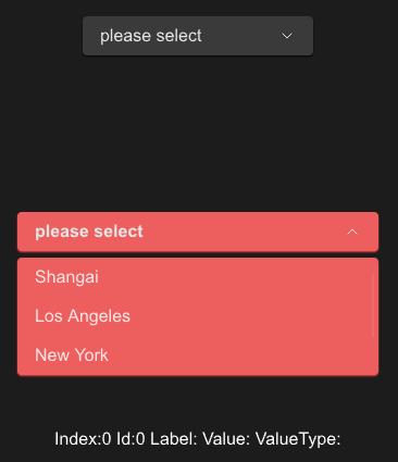
example
#![allow(unused)]
fn main() {
import {SSelect} from "../../index.slint";
import {Themes} from "../../use/index.slint";
import { SButton } from "../../src/button/index.slint";

component TestWindow inherits Window {
  height: 440px;
  width: 400px;
  SSelect {
    y: 20px;
    options: [
      {id:0,label:"Shangai",value:"s01"},
      {id:1,label:"Los Angeles",value:"l02"},
      {id:2,label:"New York",value:"n03"},
      {id:3,label:"Hong Kong",value:"h04"},
    ];
  }

  SSelect {
    y: 200px;
    font-weight: 700;
    is-show: true;
    theme: Error;
    options: [
      {id:0,label:"Shangai",value:"s01"},
      {id:1,label:"Los Angeles",value:"l02"},
      {id:2,label:"New York",value:"n03"},
      {id:3,label:"Hong Kong",value:"h04"},
    ];
    changed(index,label,value)=>{
      debug(index);
      debug(label);
      debug(value);
    }
  }
  t:=Text{
    y: 400px;
    font-size: 16px;
    in-out property <int> index;
    in-out property <int> id;
    in-out property <string> label;
    in-out property <string> vt;
    in-out property <string> value;
    text: @tr("Index:{} Id:{} Label:{} Value:{} ValueType:{}",index,id,label,value,vt);
  }
}
}
properties inherits SCard
- in property
item-font-weight : select item font weight - in property
item-font-size: select item font size - in property
item-font-italic : select item font - in property
item-font-family : select item font - in property <[SOption]> options : select options
- in property
placeholder : select placeholder - in-out property
is-show : select is show or not
functions
- public function open() : open select
- public function close() : close select
- public function toggle() : toggle status (if open then close)
callbacks
- callback changed(int,string,string) : run if you choose an item of list