STip
A tip provides supplemental, contextual information elevated near its target component
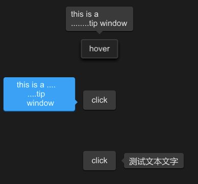
example
#![allow(unused)]
fn main() {
import {STip,SButton } from "../../index.slint";
import {Themes} from "../../use/index.slint";


component TestWindow inherits Window {
  height: 400px;
  width: 400px;
  STip{
    y: 80px;
     height:inner0.height;
     width: inner0.width;
     theme: Dark;
     position:Top;
     text:"this is a \n........tip window";
     is-show:inner0.has-hover;
     inner0:=SButton {
       text: "hover";
     }
   }
  STip{

    height:inner.height;
    width: inner.width;
    theme: Primary;
    position:LeftBottom;
    overflow: TextOverflow.elide;
    tip-width : 120px;
    horizontal-alignment: center;
    text:"this is a ....\n....tip\n window";
    inner:=SButton {
      text: "click";
      clicked => {
        parent.clicked();
      }
    }
  }
  STip{
   y: 300px;
    height:inner2.height;
    width: inner2.width;
    theme: Dark;
    position:Right;
    // wrap: TextWrap.no-wrap;
    text:"测试文本文字";
    font-size: 16px;
    inner2:=SButton {
      text: "click";
      clicked => {
        parent.clicked();
      }
    }
  }

}
}
properties
- in-out property
font-family : tip text font family - in-out property
font-weight : tip text font weight - in-out property
font-size: tip text font size - in-out property
font-color : tip text font color - in-out property
font-italic : tip text font italic - in-out property
theme : tip theme - in-out property
wrap : tip text wrap - in-out property
overflow : tip text overflow - in-out property
letter-spacing : tip text letter spacing - in-out property
horizontal-alignment : tip text horizontal alignment - in-out property
vertical-alignment : tip text vertical alignment - in-out property
position : the position of tip - in-out property
is-show : tip is show or not - in-out property
text : tip text - in property
tip-width : tip width
functions
- public function open() : open the tip
- public function close() : close the tip
- pure public function count-x(w:length) ->length : count x for angle
- pure public function count-y(w:length) ->length : count y for angle
callbacks
- callback clicked() : use to open|close the tip