SButton
SButton is a button component that you can freely perform regular properties operations on
properties inherits SCard
in property <image> icon: button icon in the left;in property <bool> show-icon: show icon or not;out property <bool> has-hover: hover button or not;in-out property <string> text: text display in button;in property <length> letter-spacing: text letter-spacing;in property <bool> round: button is round or not;in-out property <bool> disabled: disabled to click
functions
callbacks
clicked: run if you click the button
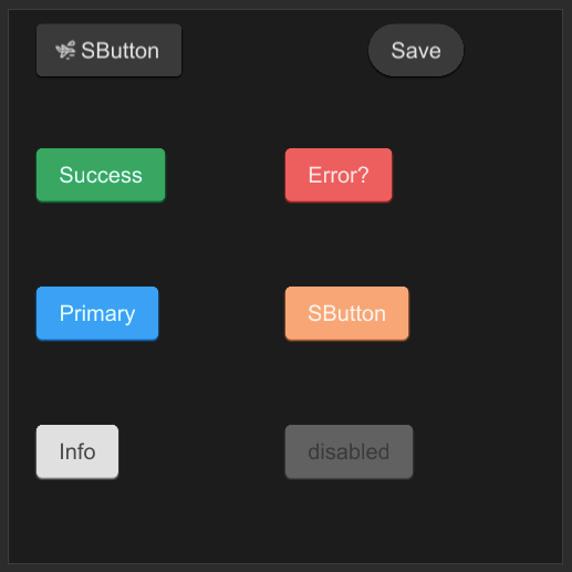
example
#![allow(unused)]
fn main() {
import {SButton} from "../../index.slint";
import {Themes} from "../../use/index.slint";

component TestButton inherits Window {
    height: 400px;
    width: 400px;
    SButton {
        x: 20px;
        y: 10px;
        show-icon: true;
        theme: Themes.Dark;
        icon: @image-url("../../icons/acceleration.svg");
        clicked => {
            self.text = "clicked"
        }
    }

    SButton {
        x: 260px;
        y: 10px;
        round: true;
        text: "Save";
        clicked => {
            self.text = "clicked";
        }
    }

    SButton {
        x: 20px;
        y: 100px;
        text: "Success";
        theme: Themes.Success;
    }

    SButton {
        x: 20px;
        y: 200px;
        text: "Primary";
        theme: Themes.Primary;
    }

    SButton {
        x: 20px;
        y: 300px;
        text: "Info";
        theme: Themes.Info;
    }

    SButton {
        x: 200px;
        y: 100px;
        text: "Error?";
        theme: Themes.Error;
        icon: @image-url("../../icons/magic-hat.svg");
    }

    SButton {
        x: 200px;
        y: 200px;
        theme: Themes.Warning;
    }

    SButton {
        x: 200px;
        y: 300px;
        text: "disabled";
        disabled: true;
        theme: Dark;
        clicked => {
            debug("cannot clicked")
        }
        pending => {
            debug("pending")
        }
    }
}
}