SLink
SLink is commonly used to represent text connections or sharing
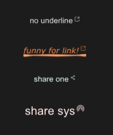
example
#![allow(unused)]
fn main() {
import {SLink} from "../../index.slint";
import {Themes,UseIcons} from "../../use/index.slint";

component TestWindow inherits Window {
  height: 420px;
  width: 400px;

  SLink {
    y: 100px;
    theme: Dark;
    text: "no underline";
    underline: false;
  }
  SLink {
    y: 160px;
    funny:true;
    theme: Warning;
    text: "funny for link!";
    font-italic : true;
    font-weight: 200;
    font-family : "Verdana";
  }
  SLink {
    y: 220px;
    theme: Primary;

    icon: @image-url("../../icons/share-one.svg");
    text: "share one";
  }
  SLink {
    y: 280px;
    funny:true;
    theme: Error;
    icon : @image-url("../../icons/share-sys.svg");
    font-size: 24px;
    text: "share sys";
    clicked(link-text)=>{
      debug("share sys!")
    }
  }
}
}
properties
- in property
icon : link share icon - in property
funny : use funny underline - in property
underline : has underline or not - out property
has-hover : link has hover or not - in property
mouse-cursor : link mouse cursor - in property
theme : SurrealismUI theme - in property
font-size : link font size - in-out property
text : link text - in property
font-weight : link font weight - in property
font-italic : link font italic - in property
font-family : link font family - private property
text-color : link text color
callbacks
- callback clicked(string) : run if you click share icon