SAlert
SAlert is used to display important prompt information on the page
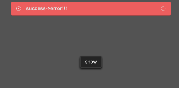
example
#![allow(unused)]
fn main() {
import {SButton, SAlert} from "../../index.slint";
import {ResultType,Themes,UseIcons} from "../../use/index.slint";

component TestAlert inherits Window {
  height: 400px;
  width: 600px;
  background: #535353;

  SButton {
    text: "show";
    clicked => {
      p.error("success->error!!!");

      debug("sds1")
    }
  }


  p:=SAlert {
    result-type:ResultType.Success ;
    text:"this is a success message!";
  }
}
}
properties
- in property
font-weight :font weight; - in property
font-size: font size; - in property
font-color : font color; - in property
font-italic : font italic; - in property
font-family : font family; - in property
overflow : text overflow; - in property
spacing : spacing among icons and text in alert; - in-out property
text : display text in alert; - in-out property
is-show : is alert show or not; - in property
alert-height : alert height; - in-out property
result-type: the result type of the alert; - in property
close-icon : close icon; - in property
icon-size : icon size;
functions
- public function open() : open alert
- public function close() : close alert
- public function success(text:string) : open success alert
- public function warning(text:string) : open warning alert
- public function error(text:string) : open error alert
- public function info(text:string) : open info alert
- public function help(text:string) : open help alert
- public function primary(text:string) : open primary alert