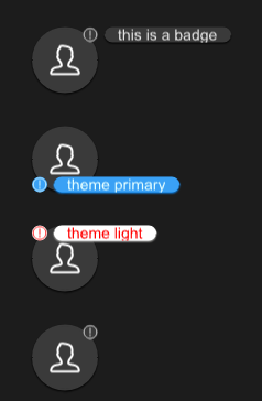
SBadge
SBadge is a quick way to display user status or events
example
#![allow(unused)]
fn main() {
import {SBadge,SAvatar} from "../../index.slint";
import {Themes} from "../../use/index.slint";

component TestCollection inherits Window {
  height: 460px;
  width: 400px;

  b1:=Rectangle {
    y: 30px;
    height: avatar.height;
    width: avatar.width;
    avatar:=SAvatar {
    }
    SBadge {
      text : "this is a badge";
      x: self.get-x(avatar.width);
      y: self.get-y(avatar.height);
    }
  }
  b2:=Rectangle {
    y: 120px;
    height: avatar2.height;
    width: avatar2.width;
    avatar2:=SAvatar {
    }
    SBadge {
      theme: Primary;
      text:"theme primary";
      x: self.get-x(avatar2.width);
      y: self.get-y(avatar2.height);
      position: LeftBottom;
    }
  }
  b3:=Rectangle {
    y: 210px;
    height: avatar3.height;
    width: avatar3.width;
    avatar3:=SAvatar {
    }
    SBadge {
      theme: Light;
      text:"theme light";
      x: self.get-x(avatar3.width);
      y: self.get-y(avatar3.height);
      position: LeftTop;
      icon-color:#ff0000;
      font-color:#ff0000;
    }
  }
  b4:=Rectangle {
    y: 300px;
    height: avatar4.height;
    width: avatar4.width;
    avatar4:=SAvatar {
    }
    SBadge {
      x: self.get-x(avatar4.width);
      y: self.get-y(avatar4.height);
      position: RightTop;
    }
  }
}
}
properties inherits SCard
- in property
position : badge position of the main component - in-out property
icon : badge icon; - in property
icon-color : badge icon color; - in-out property
text : text of the badge;
functions
- pure public function get-x(p_right:length)->length 👍
- pure public function get-y(p_bottom:length)->length 👍