SCard
A very simple universal card without any layout or restrictions
you can add anything you want to the card
properties inherits Rectangle
in property <Themes> theme: Surrealism theme;in property <length> card-height: card height (not contain padding);in property <length> card-width: card width (not contain padding);in property <PaddingType> padding-type: padding type;in property <ShadowType> shadow-type: shadow type;in property <BorderType> border-type: border type;in property <int> font-weight: font weight;in property <length> font-size: font size;in property <brush> font-color: font color;in property <bool> font-italic: font italic;in property <string> font-family: font family;in-out property <PaddingProps> card-padding: inner card padding struct;in-out property <BorderProps> card-border: inner card border struct;in-out property <ShadowProps> card-shadow: inner card shadow struct;
example
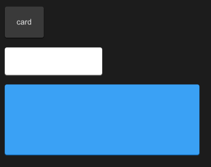
#![allow(unused)]
fn main() {
import {SButton,SCard,SText} from "../../index.slint";
import {Themes} from "../../use/index.slint";


export component TestCard inherits Window {
  height: 400px;
  width: 600px;
  VerticalLayout {
    padding: 20px;
    spacing: 20px;
    SCard {
      SText {
        text: "card";
      }
    }
    SCard {
      card-height: 36px;
      card-width: 168px;
      theme: Light;
    }
    SCard {
      card-height: 124px;
      width: 400px;
      theme: Primary;
    }
  }
}
}