SInput
This is a basic input box, often used in forms, divided into two types: text and password
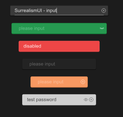
examples
#![allow(unused)]
fn main() {
import {SText,SInput,SButton, SIcon,SPopup} from "../../index.slint";
import {Themes} from "../../use/index.slint";
import { TextEdit , LineEdit} from "std-widgets.slint";
import { Invoke } from "./invoke_input.slint";

export component TestInput inherits Window {
  height: 500px;
  width: 600px;

  p:=SPopup {
    Invoke {}
  }
  SInput{
    y: 20px;
    placeholder :"please enter your username";
    card-width:300px;
    clearable: true;
    text:"SurrealismUI - input";
    accepted(res)=>{
      debug("content in input:" + res);
      p.open();
    }
    changed(change-res)=>{
      debug(change-res);
    }

  }

  w:=SInput{
    y: 80px;
    theme:Themes.Success;
    type:InputType.password;
    password:true;
  }
  SInput{
    y: 140px;
    card-width: 20rem;
    theme:Themes.Error;
    disabled:true;
    text:"disabled";
  }
  SInput{
    y: 200px;
    card-width: 18rem;
    theme:Themes.Dark;
  }

  SInput{
    y: 260px;
    card-width: 160px;
    theme:Themes.Warning;
    clearable:true;
  }
  SInput{
    y: 320px;
    card-width: 18rem;
    theme:Themes.Info;
    type:InputType.text;
    clearable:true;
    password:true;
    text:"test password";

  }
}
}
properties:
- in property
font-weight : font weight for input - in property
placeholder: default placeholder which you wanna show when no text - in property
theme: Surrealism themes - in property
input-width: Please do not use width to adjust the length of the input box , use this property to instead - in property
font-size: font size - in property
disabled: can input be edited - in property
clearable: can input be cleared - in property
password: can the password input display the password - out property
has-focus : input is focused or not - private property
placeholder-color : placeholder color - in-out property
type : input type (text or password) - in-out property
font-color : font color - in-out property
icon-color : icon color - in-out property
text : the text of the input
functions:
- pure public function get() ->string : get text
- public function set(text:string) : set text
- public function clear() : clear text
- public function select-all() : select all
- public function clear-selection() : clears the selection
- public function cut() : copies the selected text to the clipboard and removes it from the editable area
- public function copy() : copies the selected text to the clipboard
- public function paste() : pastes the text text of the clipboard at the cursor position
callbacks:
- callback accepted(string) : run when pressed down enter key
- callback changed(string) : run when text changed