SLoading
This is a loading component that you can embed anywhere you want to add a loading animation
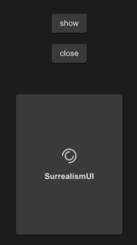
example
#![allow(unused)]
fn main() {
import {SLoading,SButton,SCard} from "../../index.slint";

export component TestLoading inherits Window {
    height: 600px;
    width: 400px;
    SButton {
      y: 100px;
      text: "show";
      clicked => {
        p.open();
      }
    }
    SButton {
      y: 160px;
      text: "close";
      clicked => {
        p.close();
      }
    }
    SCard{
      y: 260px;
      clip: true;
      card-height: 260px;
      card-width: 180px;
      p:=SLoading {
        text : "SurrealismUI";
        font-weight:700;
      }
    }
}
}
properties inherits Window
- in property
font-weight : loading text font weight - in property
font-size: loading text font size - in property
font-color : loading text font color - in property
font-italic : loading text font italic - in property
font-family : loading text font family - in property
loading-icon : loading icon - in-out property
duration : loading animation duration - in property
text : loading text - in-out property
is-show : loading is show or not - in property
theme : SurrealismUI theme - in property
easing : loading animation easing type - in-out property
iteration-count : loading animation iteration count
functions
callbacks
- callback open() : open the loading
- callback close() : close the loading