STabbar
provide bottom operation bar for page switching
example
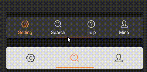
#![allow(unused)]
fn main() {
import { STabbar } from "../../index.slint";
import { UseIcons } from "../../use/index.slint";
component TestTabbar {
    height: 160px;
    width: 360px;
    VerticalLayout {
        alignment: space-around;
        // have label name
        STabbar {
            theme: Dark;
            tabs: [
                {
                    id: 0,
                    name: "Setting",
                    icon: UseIcons.icons.Setting-two
                },
                {
                    id: 1,
                    name: "Search",
                    icon: UseIcons.icons.Search
                },
                {
                    id: 2,
                    name: "Help",
                    icon: UseIcons.icons.Help
                },
                {
                    id: 3,
                    name: "Mine",
                    icon: UseIcons.icons.Avatar
                }
            ];
        }
        // no label name
        STabbar {
            theme: Info;
            show-text: false;
            icon-scale: 1.4;
            active: 1;
            tabs: [
                {
                    id: 0,
                    name: "Setting",
                    icon: UseIcons.icons.Setting-two
                },
                {
                    id: 1,
                    name: "Search",
                    icon: UseIcons.icons.Search
                },
                {
                    id: 2,
                    name: "Mine",
                    icon: UseIcons.icons.Avatar
                }
            ];
        }
    }
}
}
properties
in-out property <[MenuData]> tabs: the array of menu data for the tabs.in property <float> icon-scale: the scale factor for the icons.in property <length> tab-size: the size of each tab.in-out property <int> active: the index of the currently active tab.in property <bool> show-text: whether text should be displayed alongside icons.
functions
callbacks
callback change(MenuData): This callback is triggered when the active tab is changed.