SProgress
SProgress is commonly used to display download progress or event processing progress And you can fully control it through the progress property
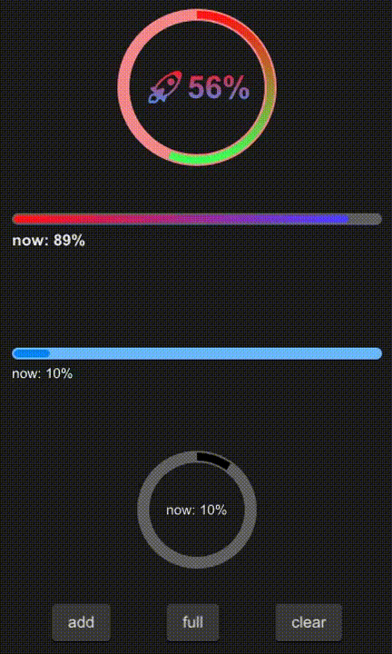
example
#![allow(unused)]
fn main() {
import {SProgress,SButton} from "../../index.slint";
import {Themes} from "../../use/index.slint";

component TestProgress inherits Window {
  height: 680px;
  width: 400px;

  VerticalLayout {
    spacing: 20px;
    padding: 10px;
    SProgress {
      theme: Error;
      height: 160px;
      circle: true;
      progress: 56%;
      font-size: 32px;
      font-weight: 700;
      stroke-color: @linear-gradient(180deg, #ff1515 0%,  #41ff57 100%);
      text: @tr("🚀{}%",round(self.progress * 100));
      font-color: @linear-gradient(180deg, #ff1515 0%,  #4193ff 100%);
    }
    SProgress {
      height: 100px;
      circle: false;
      progress: 89%;
      font-size: 16px;
      font-weight: 700;
      stroke-color: @linear-gradient(90deg, #ff1515 0%,  #4741ff 100%);
    }
    b:= SProgress {
      theme: Primary;
      circle: false;
      progress: 10%;
    }
    a:= SProgress {
      height: 120px;
      circle: true;
      progress: 10%;
    }
    HorizontalLayout {
      padding: 16px;
      alignment: space-around;
      SButton{
        text: "add";
        clicked => {
          a.add(0.1);
          b.add(0.1);
        }
      }
      SButton{
        text: "full";
        clicked => {
          a.full();
          b.full();
        }
      }
      SButton{
        text: "clear";
        clicked => {
          a.clear();
          b.clear();
        }
      }
    }
  }

}
}
properties inherits Rectangle
- in property
theme : progress theme - in property
text : display text - in-out property
stroke-width : stroke width - in-out property
stroke-color : color of the progress - in-out property
progress : progress value - in-out property
font-weight : display text font weight - in-out property
font-size: display text font size - in-out property
font-color : display text font color - in-out property
font-italic : display text font italic - in-out property
font-family : display text font family - in property
circle: use circle progress
functions
- pure public function get-progress() : get timely progress
- public function full() : make progress 100%
- public function clear() : : make progress 0%
- public function add(num:float) : increase progress