SDialog
SDialogs are used to confirm messages or events and display text
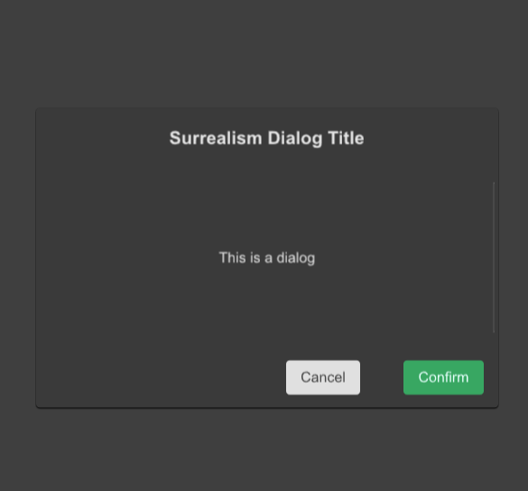
example
#![allow(unused)]
fn main() {
import {SDialog,SButton,STable,STableColumn} from "../../index.slint";
import {Themes} from "../../use/index.slint";

component TestDialog inherits Window {
  height: 600px;
  width: 600px;
  background: #535353;

  SButton {

    text: "show";
    clicked => {
      p.open();
    }
  }


  p:=SDialog {
    dialog-details : "";
    confirm-btn-theme: Success;
    dialog-width:80%;
    dialog-height:52%;
    dialog-title: "Surrealism Dialog Title";
    dialog-title-size: 20px;
    dialog-details-padding-top : 16px;
    // do after confirm btn clicked
    viewport-height : dialog-detail.height;
    // viewport-width : dialog-detail.width;
    confirm=>{
      debug("confirm btn clicked~!")
    }
    dialog-detail:=Rectangle {
      height: 200px;

    }
  }
}
}
properties
- in property
theme : Dialog mask theme - in property
cancel-btn-theme : Dialog cancel button theme - in property
confirm-btn-theme : Dialog confirm button theme - in property
cancel-btn-text : Dialog cancel button text - in property
confirm-btn-text : Dialog confirm button text - in-out property
is-show: Dialog is show or not - in property
mask-opacity : Dialog mask opacity - in property
spacing : Dialog spacing - in property
font-weight : Dialog text font weight - in property
font-size: Dialog text font size; - in property
font-color : Dialog text font color; - in property
font-italic : Dialog text font italic; - in property
font-family : Dialog text font family; - in property
dialog-theme : Dialog theme - in property
dialog-title : Dialog title - in property
dialog-title-size : Dialog title size - in property
dialog-details : Dialog detail text - in property
dialog-height : Dialog height - in property
dialog-title-height : Dialog title height - in property
dialog-view-height : Dialog view height - in property
btn-view-height : Dialog button view height - in property
dialog-width : Dialog width - in property
dialog-details-padding-top: Dialog details padding top - in property
dialog-details-padding-bottom: Dialog details padding bottom - in property
dialog-details-padding-left: Dialog details padding left - in property
dialog-details-padding-right: Dialog details padding right - in property
padding-type: Dialog padding type - in property
shadow-type: Dialog shadow type - in property
border-type : Dialog border type - in property
viewport-height : Dialog viewport height - in property
viewport-width : Dialog viewport width - in property
dialog-details-alignment: Dialog details alignment
functions
- public function open() : open dialog
- public function close() : close dialog
callbacks
- callback confirm() : run after confirm button click
- callback cancel() : run after cancel button click