Result
SResult helps you easily build a quick prompt , you can build it in popup window
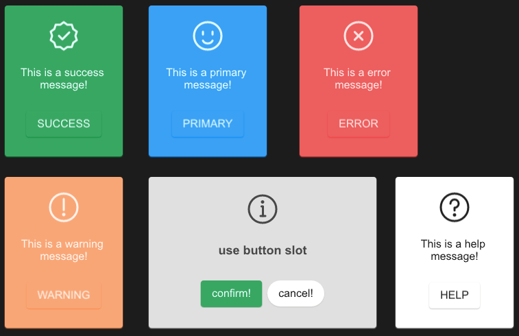
example
#![allow(unused)]
fn main() {
import {SResult} from "../../index.slint";
import {Themes,ResultType} from "../../use/index.slint";
import {DefaultSButtonProps} from "../../themes/index.slint";
export component TestResult inherits Window {
  height: 500px;
  width: 800px;
  SResult {
    x: 10px;
    y: 10px;
  }
  SResult {
    x: 220px;
    y: 10px;
    result-type:ResultType.Primary;
    clicked(e) => {
      //没有设置btns获取的是空SButtonProps
      debug(e);
    }
  }
  SResult {
    x: 220px;
    y: 260px;
    card-width: 300px;
    text : "use button slot";
    font-size: 18px;
    font-weight: 700;
    result-type:ResultType.Info;
    btns:[
      {
        font-weight : DefaultSButtonProps.font-weight,
        font-size : DefaultSButtonProps.font-size,
        font-italic : DefaultSButtonProps.font-italic,
        font-family : DefaultSButtonProps.font-family,
        theme : Themes.Success,
        padding-type : DefaultSButtonProps.padding-type,
        shadow-type : DefaultSButtonProps.shadow-type,
        border-type : DefaultSButtonProps.border-type,
        icon : DefaultSButtonProps.icon,
        show-icon : DefaultSButtonProps.show-icon,
        text : "confirm!",
        letter-spacing : DefaultSButtonProps.letter-spacing,
        clip : DefaultSButtonProps.clip,
        round : DefaultSButtonProps.round
      },
      {
        font-weight : DefaultSButtonProps.font-weight,
        font-size : DefaultSButtonProps.font-size,
        font-italic : DefaultSButtonProps.font-italic,
        font-family : DefaultSButtonProps.font-family,
        theme : Themes.Light,
        padding-type : DefaultSButtonProps.padding-type,
        shadow-type : DefaultSButtonProps.shadow-type,
        border-type : DefaultSButtonProps.border-type,
        icon : DefaultSButtonProps.icon,
        show-icon : DefaultSButtonProps.show-icon,
        text : "cancel!",
        letter-spacing : DefaultSButtonProps.letter-spacing,
        clip : DefaultSButtonProps.clip,
        round : true
      }
    ];
  }
  SResult {
    x: 10px;
    y: 260px;
    result-type:ResultType.Warning;
  }

  SResult {
    x: 440px;
    y: 10px;
    result-type:ResultType.Error;
  }
  SResult {
    x: 580px;
    y: 260px;
    result-type:ResultType.Help;
  }
}
}
properties
- in-out property
btn-text : result button text - in property
icon-size : result icon size - in property <[SButtonProps]> btns : result buttons
- in property
result-type: result type - in-out property
text : text of the result - in-out property
icon : result icon
functions
callbacks
- callback clicked(SButtonProps) : run if you click the button