SCheckbox
SCheckbox let people select multi items
example
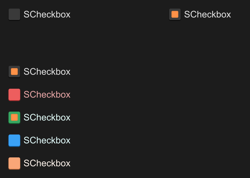
#![allow(unused)]
fn main() {
import { SCheckbox } from "../../index.slint";
component TestCheckbox {
    height: 400px;
    width: 600px;
    VerticalLayout {
        spacing: 20px;
        padding: 20px;
        HorizontalLayout {
            height: 80px;
            SCheckbox {
                height: 40px;
            }
            SCheckbox {}
        }
        SCheckbox {
            actived: true;
            clicked(text, value, actived) => {
                debug(text,value,actived)
            }
        }

        SCheckbox {
            disabled: true;
            theme: Error;
            clicked(text, value, actived) => {
                debug(text,value,actived)
            }
            pending => {
                debug("pending")
            }
        }

        SCheckbox {
            theme: Success;
        }

        SCheckbox {
            theme: Primary;
        }

        SCheckbox {
            theme: Warning;
        }
    }
}

}
properties inherits Rectangle
in property <int> font-weight: display text font weightin property <length> font-size: display text font sizein property <brush> font-color: display text font colorin property <bool> font-italic: display text font italicin property <string> font-family: display text font familyin property <Themes> theme: SurrealismUI themein property <length> card-height: radio height (contain padding)in property <length> card-width: radio width (contain padding)in property <string> text: display textin-out property <string> value: radio valuein-out property <bool> actived: is actived or notin-out property <brush> active-color: active radio colorin property <PaddingType> padding-type: radio padding typein property <ShadowType> shadow-type: radio shadow typein property <BorderType> border-type: radio border type
functions
callbacks
callback clicked(string,string,bool): run if you click the radio